
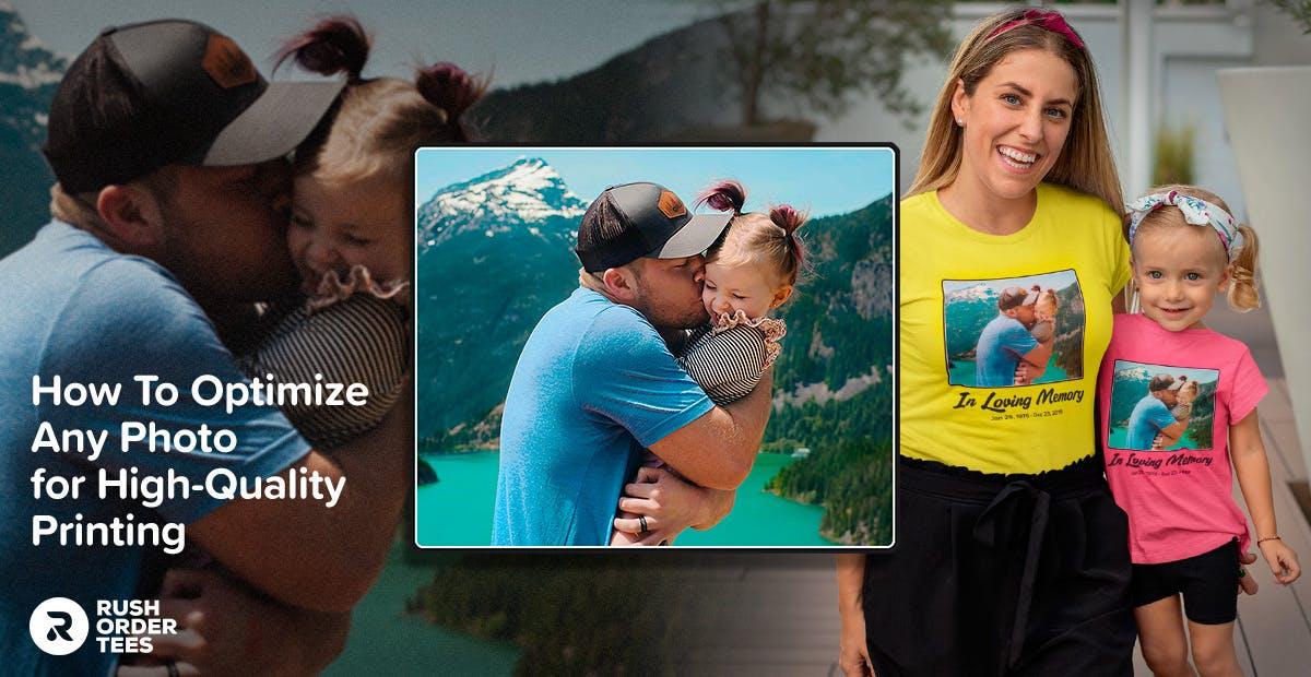
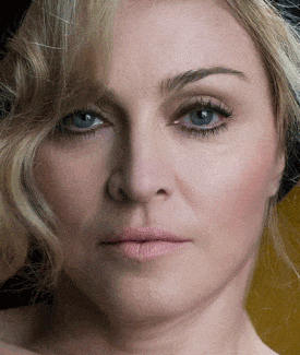
Do you want to print a photo on a T-shirt? Maybe a group shot of your family that will be a gift, or a new company logo that is colorful or photo-realistic. Maybe it’s a big picture of your own face (hey, to each their own). In all of these scenarios, your image should be optimized to get the best results for a print. This blog post will show you exactly how to do that.
Of course, our Art Department can do it for you– if you ask. But if you’re like me, and prefer to be in control of it yourself, you will need to have Adobe Photoshop or use a free tool like the Ninja Background Remover.
Otherwise, I recommend using a free program like Photopea, which has all the features of Photoshop and can be used through your browser.
It may be a good idea to familiarize yourself with the basic functions, and the layout of the various tools before getting started. And if any of these graphics programs present too much of a learning curve, try using Pixlr X, a simple online photo editor which has most of the features that I will be showing you. Now on to optimizing!
Why optimize your image?
There an acronym you might be familiar with called WYSIWYG, pronounced “whizzy-wig” and it stands for What You See is What You Get. When it comes to printing photographs and other graphic designs onto shirts, it’s more like WYSINWYG: What You See is Not What you get. Even with the best artwork possible.
A print will always have a reduction in graphic appearance, detail, and color vibrancy from what’s on your screen.
Colors will change
When looking at the colors of a computer image, you’re looking at an ideal version. Because of color modes, the image can never accurately translate to a printed image. Any honest print company should tell you that. That way, you don’t get your hopes too high. Unhappiness comes from unmet expectations– and we want you to be happy.
If we’re screen printing with Plastisol, we can print with all of the brightest colors available. The thing is, screen printing is not typically recommended for photographic images. And even when you do, it comes with its own set of challenges and drawbacks– only worth it for large orders.
This post is focusing mostly on printing photos with digital, direct-to-garment printing, or DTG. Check out my post on screen printing vs DTG for more info on both decoration methods and how they compare to each other.
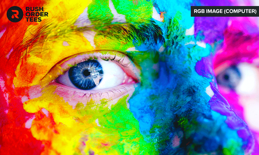
The example GIF below shows the disappointing difference in color modes when you convert. The colors in RGB mode (computer) are much more vivid and saturated because computer screens are lit from behind. In CMYK mode (printed) the light source is coming from in front of it, so you can’t get those bright colors– at least not with normal CMYK printing. Learn more about RGB vs. CMYK here.
The good news is there are things we can do to give you the best possible chance of getting the printed image to come close to what you see on the computer. For one thing, our digital printers do a better job than what you see above, by using two additional colors: bright red and green. So our machines are effectively CMYK+RG: six colors rather than four.
On top of that, we can do things to optimize your image for digital printing, some of which I’ll be detailing in this post. Again, we’re happy to do these things for you in the Art Department, but you have to ask when you put in your order.
But if you’re someone who likes taking care of things on your own so you can be in charge of the look, or you just love learning new skills, this post is for you!
How to optimize your image for T-shirt printing
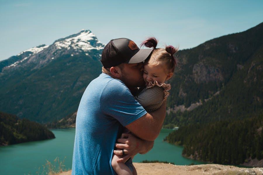
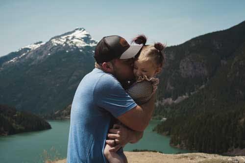
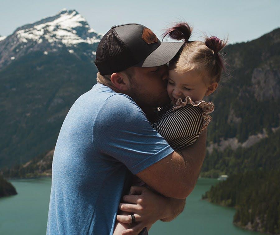
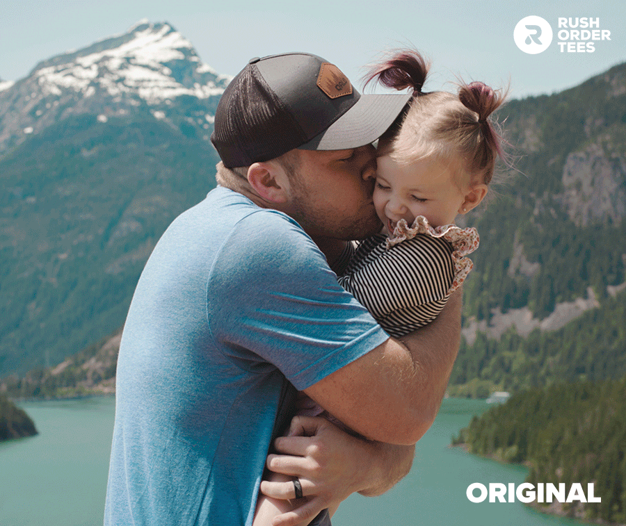
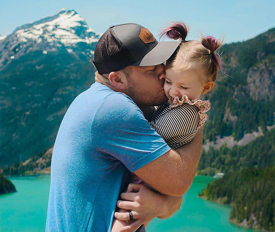
The following are my top ten steps to enhance and improve your photo, preparing it for a successful print. These steps will work with any photograph, and if you follow my instructions, I guarantee you’ll end up with something much better then you started with. Here is the example photo I will be using to go through these tips, from the free stock photo site Pexels:
1. Start with the highest resolution
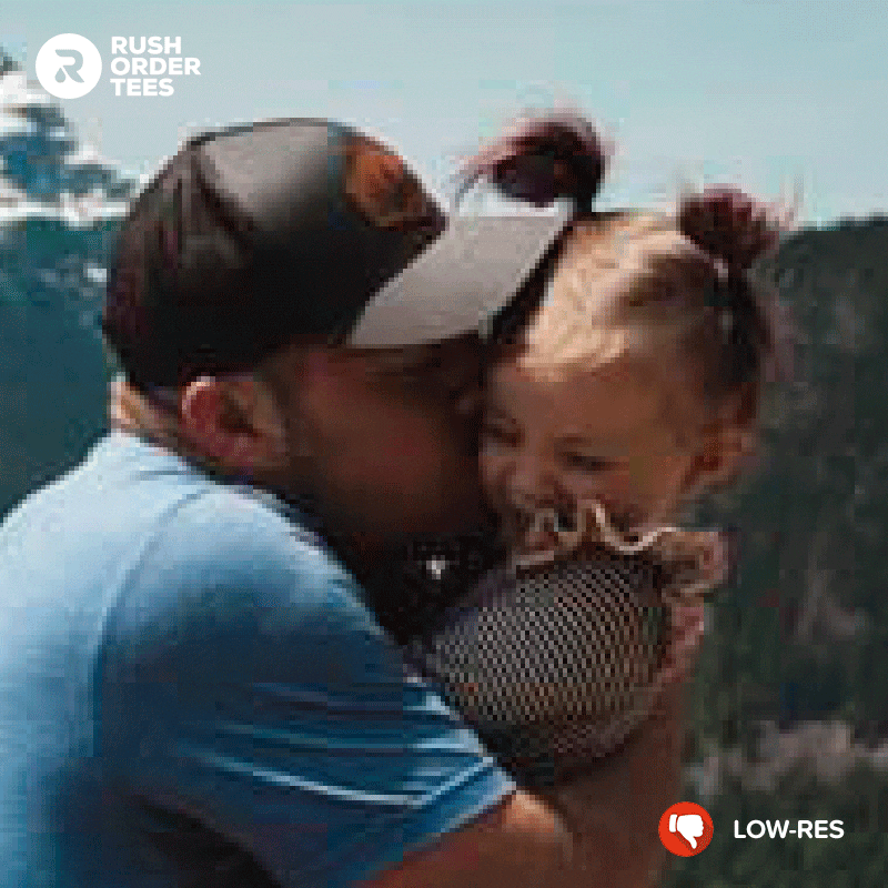
The first tip is the most important tip of all, and it’s by far the biggest issue we deal with in our Art Department on a daily basis: images submitted with a low resolution. The image below is an actual-size example of a too-small size people submit to us on any given day. While it might look okay on the screen, there is a major problem: the resolution is very low.
What is image resolution?
Resolution is essentially how many pixels an image has. Typical web resolution is 72 PPI (pixels per inch). The ideal resolution for printing is 200 PPI or more– at full size. That last bit is crucial. Even if you do have something that is 300 PPI, if its only 2 inches wide when it needs to be printed at 12″ wide, the resolution is still too low. Zoom in and take a look.
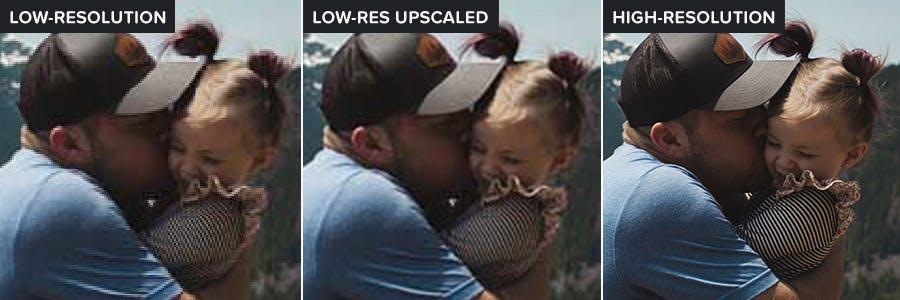
Compare the image quality in this close-up between low and high resolution and you can see why it’s so important:
A print will never be as clear and detailed as the original image, no matter how much you optimize it, or how well you print it. It’s the nature of the beast. So start out with the highest resolution possible, because it can only get worse.
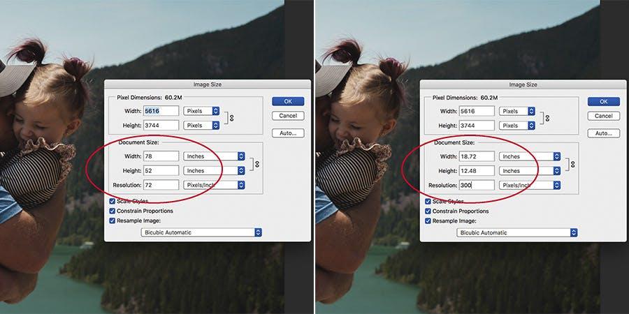
Go to the pull-down menu “Image > Image Size” to see what you’re working with. Below is what it should look like when you have a nice big file with a high resolution. As you can see, whether at 72 PPI and 78″ wide, or 300 PPI and 18″ wide, the number of pixels remains the same. (Uncheck “Resample Image” to keep the number of pixels the same as you change size.)
Do you have a vector file rather than a raster? Or some other image format? For more about the various file types, read my in-depth blog post about submitting the best file types for printing.
Can I take a small image and just increase the document size or the number of pixels?
Yes and no. Meaning yes, you can– but no, it’s not going to help much. Photoshop does a thing where it tries to compensate for scaling up a small image by adding a slight blur to the edges to mask the jagged pixels and artifacts. The zoomed-in image below shows you the difference. In the center, you can see how there is some smoothing, but the quality is still lousy.
Obviously its no substitute for a high-res photo. So make that call, send that email, do whatever you have to do to get it!
If you have multiple versions, compare them. If it’s your photo, you may want to re-download the largest format from your camera (typically RAW). If it wasn’t yours, check with the original artist or photographer. If it’s a stock photo, go back and download the biggest version. For images from the web, use Google’s Advanced Image Search to get the best file.
Once you get the highest-resolution file available, it can be sized for printing. But there is one step to do first: cropping.
2. Crop the image
Cropping is essentially chopping off areas of the image that are unneeded. With a well-thought-out crop, you can properly center your subject, increase the size of the subject relative to the rest of the photo, and frame the subject in a way that makes the most sense. In Photoshop, you simply hit the “C” button and your crop tool will appear, along with grid lines.
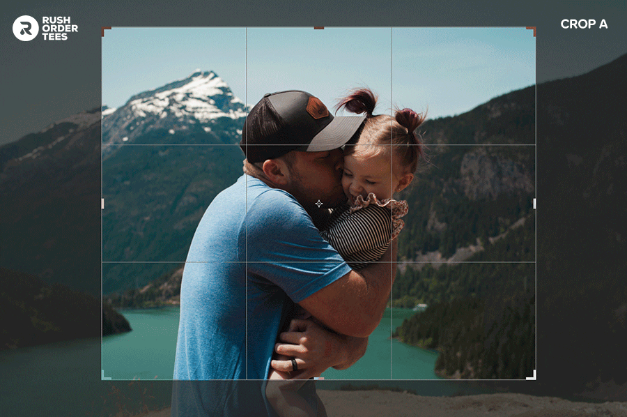
In my example crops above, there is no right answer. I’m going with crop “A” for this image, which leaves visible some of the background elements: the sky, the mountains, and the lake. Certain crops may be objectively better than others, but it’s mostly a subjective decision and based on your design, what you want to show and communicate with your image.
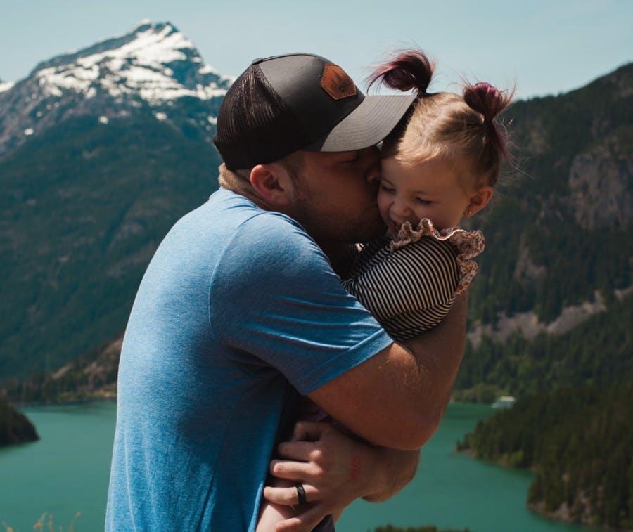
Here is our image after cropping. We lose some background, but our subject is closer and taking up more relative space.
Pro tips:
- Leave breathing room around the subject. Cropping too closely can create a slightly claustrophobic effect.
- Keep the details in mind. In this case, I felt it was important to leave the man’s wedding ring in the shot.
- Pay attention to the edges. Leaving partial elements can create unwanted visual distractions. (Do you see them?)
- Centering the subject is not necessarily the best. Use the Rule of Thirds for more interesting compositions.
3. Resize the image
Now it’s time to set the size for printing. In other words, how big or small the image will appear on the garment. And this should only come after it’s been cropped because now we know where the exact boundaries are.
Read my blog post about the sizing of standard print locations or check out my standard print locations infographic for a quick run down. For more in-depth information, read my post about layout tips which covers locations, placement, and sizing.
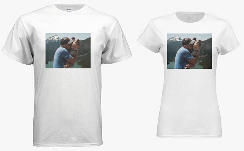
For our example, I’m going to size it at 10″ wide. This is less than the standard 12″ wide full front and much smaller than the maximum width of 14″ wide (a size I find to be way too big). At a modest 10″ wide, this print will look great on various sized garments, and leave room for any type or other elements we might like to add. Here it is shown on men’s and women’s:
Below is what that looks like under Image > Image Size. Whether you are scaling up or scaling down, start with setting the resolution to 300, then set the image width to your desired size, and then make sure you have Resample Image set to “Bicubic Automatic”. This will ensure Photoshop works its magic to optimize the quality during the resizing.
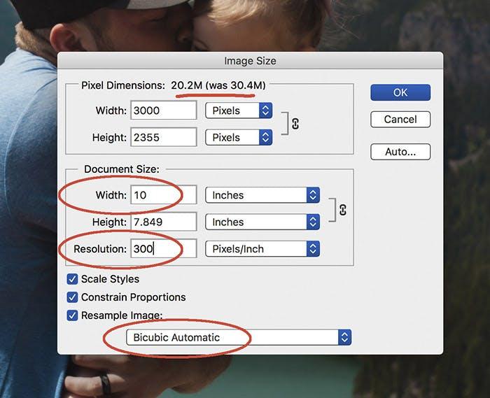
You’ll notice at the top it will tell you the difference in “pixel dimensions”, which is essentially the file size. In this case, by reducing the size of the image we are saving some space on our desktop and making the file easier to share. If you are upscaling your image, this will show an increase in file size.
As I mentioned earlier, upscaling does not increase the quality of the image file. Photoshop will smooth out the edges as we increase the number of pixels, but again, this is no substitute for starting with a higher quality image file.
4. Touch up the image
Touching up the image, also known as photo retouching, typically refers to fixing parts of it that have unwanted visual information. This can be blemishes, cracks, spots, or any undesirable elements. This can be as minor as removing a scratch, or as major as what they do for magazine ads: smoothing faces, hair, body parts, and everything else in the picture.
The key here is to not overdo it. You want the photo to look natural, without any obvious tinkering or “Photoshopping”. There are many, many ways to go about this when you have lots of tools at your disposal. For the purposes of this post, I’ll show you just one, possibly the most powerful of them all when it comes to retouching: the Clone Stamp.
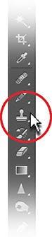
The Clone Stamp allows you to take one part of an image and put it over another part of the same image (or over another part of any open document). You can also paint part of one layer over another layer. It’s especially useful for duplicating objects or removing a defect in an image. And when you see it in action, it’s like magic.
To use it, click the stamp icon in your Photoshop tools panel. Make sure your brush is set to the size and hardness that are appropriate for the area you are working on– and be prepared to change the brush settings often as you work. You may need to go through some trial and error to get the brush settings right.
Once you have them set, hold down the option/alt key and your cursor will turn into crosshairs, then when you click, it will set the starting pixel for the area of the image you are cloning. This will typically (but not always) be an area very close to the part you are fixing, because the colors, levels, and textures will be the most similar.
In our example photo, I’m going to remove one undesirable element in the image. Do you see it? On the man’s hand, there is some kind of red stamp– a distraction that doesn’t need to be there. We’re also going to remove the foliage that is leftover on the bottom edge of the photo– another visual distraction that we’re better off without.
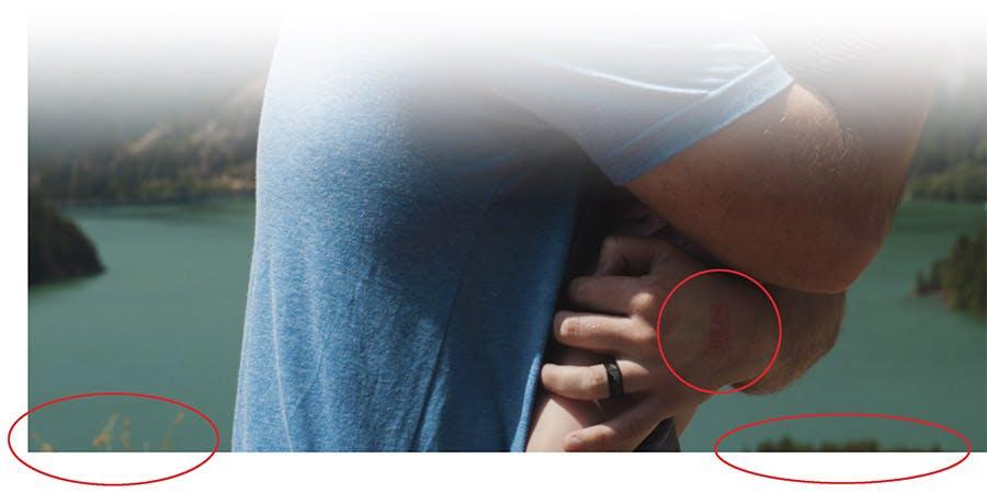
When using the Clone Stamp, it’s a good idea to zoom in close to the area you are working on. If you can make it look good close up, it will definitely look good zoomed out. Here’s the image now that I have fixed those problem areas:
For more, check out this in-depth tutorial with tips on using the clone stamp. If you’re new to this tool, my suggestion would be to take some time to practice on a separate image that you can make a mess of. Try removing various objects or even people from an image and see if you can do it seamlessly without any noticeable difference. Practice makes perfect.
5. Adjust the levels
Levels describe the range of highlights, mid-tones, and shadows in an image. This is a broad category, and there are many ways to adjust the levels. I’m going to show you just a few. While modern cameras, especially those on smartphones, have built-in features to optimize the levels of a picture you take, most photographs can use some basic level adjustments.
When it comes to setting up a photo for printing, you may want to over-correct in some ways. For example, a print will typically end up darker, so it’s important to lighten up the original image significantly. In our example photo, there are some particularly dark areas of shadow that we should be worried about, especially in the faces. Here’s how to fix that.
Levels
The most basic adjustment of levels is (unsurprisingly) called Levels. You can get to it by pressing CMD+L or by going to the menu Image > Adjustments > Levels. Doing so will pull up a map showing you the current levels of the image, along with sliders to make adjustments. There’s also a button called “Auto” to automatically adjust them but can give mixed results.
For most photos, but especially this one which is too dark, what you want to do is use the sliders to bump up the overall brightness, bringing details out of the shadows. Move the far-right slider towards the left, and also the middle slider to the left, until it looks good. The far-left slider should only come over a little bit if at all to leave room. Remember, the print will be darker.
On smartphone apps, this adjustment will typically be called Brightness, or Lightness, or Exposure.
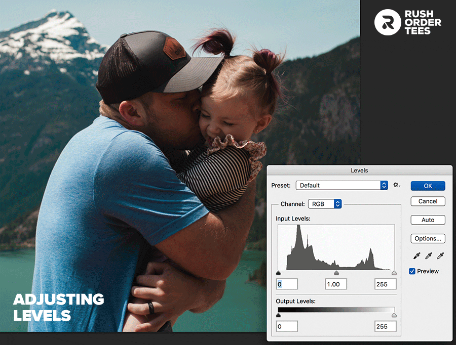
As you can see, the entire image is brightened up and details that were in the shadows became visible. This isn’t an exact science; it depends on the image and how you want it to look. You might notice the photo gets a slightly washed-out appearance. We’ll fix this with color adjustments. And we can make the shadows richer as well. Do you know Rich Black?
Curves
Another tool for adjusting tones and boosting contrast, curves is a more powerful version of levels. There is a learning curve (no pun intended) so I’m just going to give you the basics. Adobe has a more in-depth tutorial on curves for beginners.
To open the curves window, use CMD+M or go to the menu Image > Adjustments > Curves. You’ll see a histogram that represents the tonal ranges of your photo, and the diagonal line going across is the baseline. Make sure you have the button selected that says “Light (0-255)” for your RGB image.
To begin adjusting, click somewhere along the diagonal line to create a control point. You can make lots of these, but you shouldn’t need to– it gets too complicated. The most basic adjustment is to increase the overall brightness by lifting the center point up until you create a nice rounded hill. This is a good starting point to get a feel for what your photo will need.
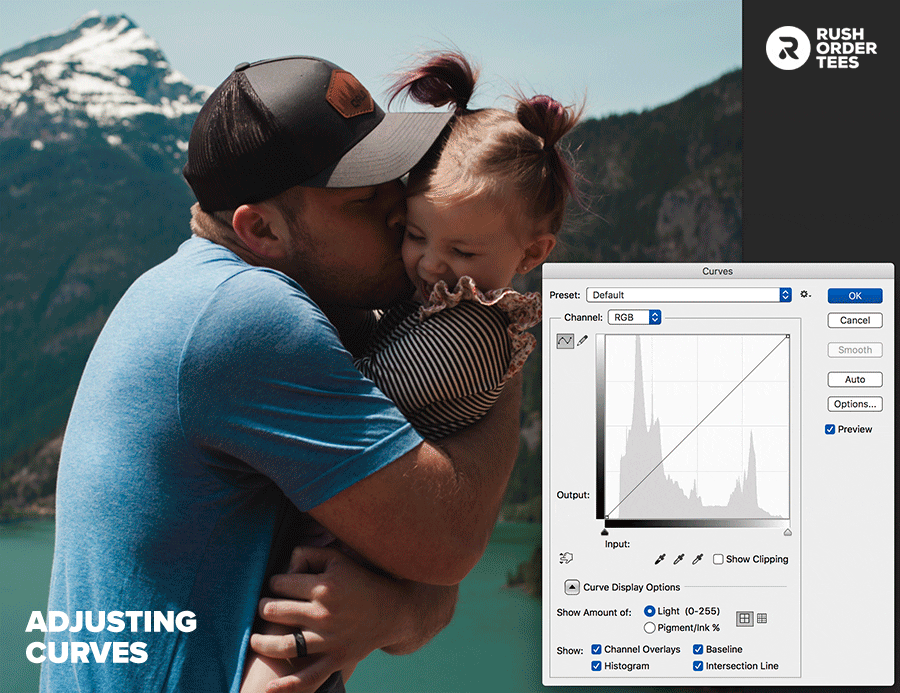
Once again though, every image is different and should require a different curve adjustment. Add a couple more points, one towards the highlights and another towards the shadows and raise or lower them accordingly. Play around until it looks good. You can also click on the little hand icon and then click somewhere on the image to adjust that particular tone.
Finally, drag the top and bottom endpoints inward to isolate adjustments to the main part of the histogram. This is similar to what we did with Levels, so again don’t bring that shadow slider all the way in. We want to leave some room there because the print will get darker than the photo looks on screen. Generally, your photo should look a little brighter than normal.
If your image is grayish or flat looking– in other words, lacking contrast– your curve should look like a lazy “S”. This is a standard curve adjustment for many images. In our example, the photo was mainly too dark (hence the hill curve with the slope). There’s a lot more you can do. For a much more in-depth tutorial, read through this piece about understanding curves.
Dodge and Burn
These Photoshop tools allow you to lighten or darken an image in specific areas. The odd names are based on a traditional darkroom technique for regulating exposure on specific areas of a print. In Photoshop, you can specify your brush size and hardness, the exposure (strength of the effect), and whether you are applying to the highlights, mid-tones, or shadows.
It’s a powerful tool, so keep that exposure setting low until you get the hang of it. I’ll typically keep it low anyway, allowing the effect to be applied gradually so it doesn’t get out of control. Keep in mind that the effect is continuous while you press down, unlike a paintbrush or some other tools. In other words, be careful how long you apply it to any given area.
In our example photo, I used these tools in two areas, as you can see in the GIF above.
- I “dodged” the mid-tones in the faces and some of the shadows of the subjects. Lightening up these areas was an important step in the whole process because those darker areas were a danger zone for getting even darker when it prints. And the last thing you want to lose is the facial features of your subjects.
- I “burned” the shadows of the mountain and trees. To the human eye, lighter things tend to come forward in space, so it was important to make sure the background looked like it’s in the background. It also proves greater contrast with the subjects in the foreground and gives the colors of the mountains and trees a deeper, richer look.
Again, the thing to pay attention to when dodging and burning is making sure you apply the effect consistently, otherwise you can get an uneven slightly cloudy look. These tools are best used when you need very particular areas or details adjusted. Or, as in our case, you need something done quickly and easily.

The longer (but more accurate) way is to make selections and then use levels, curves or other adjustment tools on those selections. In this case, it would mean carefully tracing around edges of the subjects to isolate them and select the background. It would have made for a more accurate and even adjustment– though not noticeable to the average viewer.
Here’s a tutorial on how to work “non destructively” with dodge and burn, keeping your original intact if you need to go back.
6. Adjust the colors
Now we get to the colors– adjustments that should be saved until the last steps because it can complicate things down the line if you do them first. There are many ways to adjust the colors. I could make a whole blog post about this topic alone (and I probably will). For now, I’ll touch on a few of the main ways to get this step done without spending too much time.
Hue/Saturation
The low-hanging fruit when it comes to optimizing an image for printing is saturation, which defines the intensity, or purity of the hues. When we adjusted the curves earlier, we lost a little bit of saturation, so we want to get that back and then bump it up. How much, you ask? There’s going to be a sweet spot to look for, right between too little and too much, naturally.
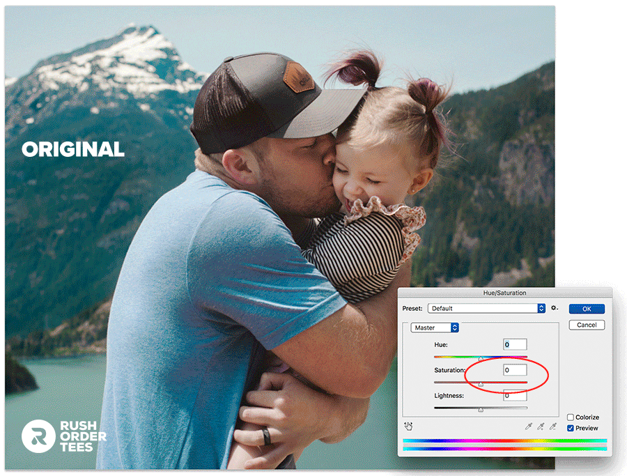
It’s easy to see when something is oversaturated, as shown in the example above. The colors start looking unnatural and finally, everything turns neon. If you go to Image > Adjustments > Hue/Saturation you can play with the slider and get a feel for your particular photo and where the sweet spot is. For printing you want it to be just a bit more saturated than normal.
The problem with Hue/Saturation is that it’s a blunt instrument, boosting the saturation of all the colors across the board. You can choose particular colors to saturate and this can be helpful but it can also produce mixed results with odd contrasts. There is another tool I would recommend for this job called Vibrance and can be found in the same menu.
Vibrance
Vibrance will boost colors relative to one another, meaning it will leave colors alone that are already saturated. It also comes with a Saturation slider in the same tool, which is helpful. I find that bumping the vibrancy fairly high and bumping the saturation just slightly does a great job. Here’s how that looks:
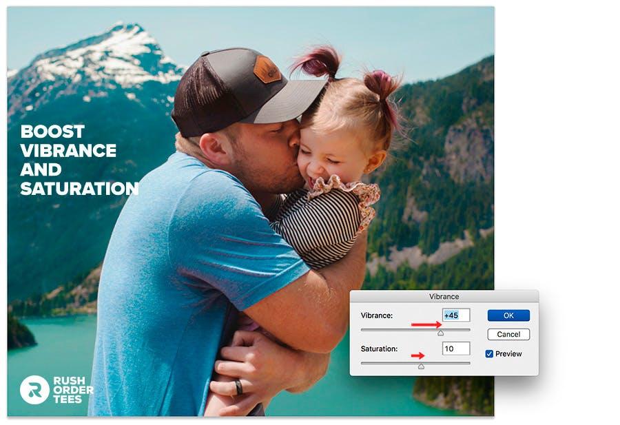
You can see the colors have become richer, but we don’t get that unnatural look which can happen from boosting up the saturation alone. In our example photo the skin tones, especially in the faces, now look a little too reddish, and there’s an easy way to solve this, and it comes in the form of a sponge.
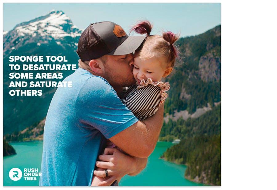
Sponge Tool
The sponge tends to be overlooked in Photoshop, but it’s a powerful and handy way to saturate or desaturate particular areas of an image. It’s found in the same toolset as dodge and burn, and works in a similar way: you can specify your brush size and softness, choose whether you are saturating or desaturating, and set your desired strength, or “flow”.
For our example image, I wanted to do three things with the sponge tool: 1) desaturate the colors in the faces and a few other areas of skin, 2) desaturate the mountain and trees just a bit, and 3) saturate the lake more to make that lovely turquoise color pop. Here’s the result after doing those things (keep in mind, at this point the changes are more subtle):
Pro tip: Color Balance
Next up, let’s take a look at Color Balance, another powerful feature that can drastically alter the look for your image. This tool can turn your colors inside-out to the point where it looks like pop art, and you have the ability to affect the highlights, mid-tones, and shadows separately. For our purposes, we don’t need to get crazy, I just want to cool down the shadows.
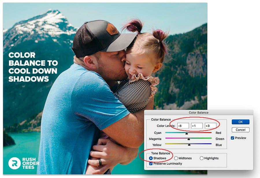
Again, this might be so subtle it’s hard to notice the difference, but I’m choosing to move the hue of the shadows just slightly from the warmer colors of reds and yellows to the cooler colors of cyans and blues. This accomplishes two things: it makes the photo look more natural and it gives a better contrast against the warmer colors coming forward, adding some depth.
All of these color adjustment tools can be learned through trial and error– you don’t need to be a photographer (but it does help). Just move those sliders around and see what happens. Create multiple layers so you can play around without messing up the original, and try different images and see what happens.
You’ll start to get the feel for what this does and how it can help.
Pro tip: Replace Color
Another powerful tool, feature, Replace Color allows you to select a particular color in the image, set the parameters of the selection (called “Fuzziness”), and then change the hue, saturation, and brightness of just that color. What I usually do is get those three sliders set to what I want, and then adjust the Fuzziness slider and see what happens in the image.
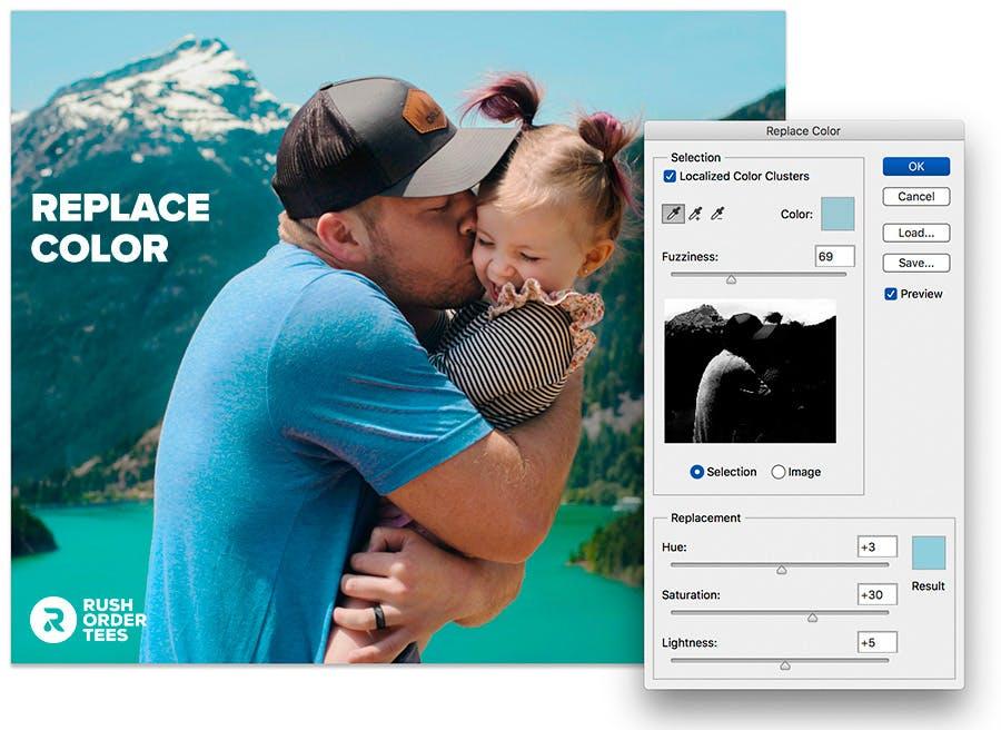
What I used it for here, shown above, is to adjust the color of just the sky alone. You can see the parameters of the selection in white, just below the Fizziness slider. As you can see my adjustment is also affecting the highlight of the man’s T-shirt, which is fine with me, as I wanted there to be a contrast between the sky blue colors and turquoise blue colors in the photo.
Pro tip: Selective Color
Last but not least (the last of what I’m showing you in this post, anyway) is Selective Color. This one falls somewhere between Color Balance and Replace Color as far as it’s breadth. It’s more specific than Color Balance but less specific than Replace Color. Still with me? Here’s how it works.
It essentially gives you CMYK (cyan, magenta, yellow, black) sliders to balance each broad color group, plus highlights, mid-tones, and shadows. You can use this to radically change the colors of your photo.
All I want it to do for ours is something of a pro tip: make our blacks richer. You might not notice the difference, but in the print, you would. In traditional CMYK printing, there’s black (K) and then there’s Rich Black, aka True Black (K +CMY).
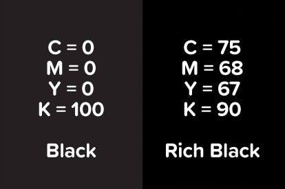
Rich Black, as you might imagine, is Black plus some amount of the other colors added to it. The reason for its existence is that when regular black doesn’t have other colors in it, it can come out looking like dark charcoal when printed and have a slight edge where it contrasts against the colors. So it’s an old printer’s trick to add colors to black when doing a separation.
We can accomplish this trick using Selective color:
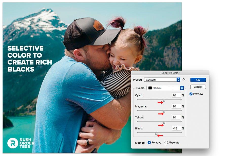
This will ensure a smooth transition between color areas into black areas and give the whole print more cohesion.
7. Sharpen the image
Sharpening is a hugely important step you can take to optimize your image for printing. It’s more than just bringing things into focus. It helps define the edges of shapes, improves the visibility of details, and prevents some of the normal blurring that will happen in any kind of printing process. Photoshop has a suite of tools to do this under the menu Filter > Sharpen.
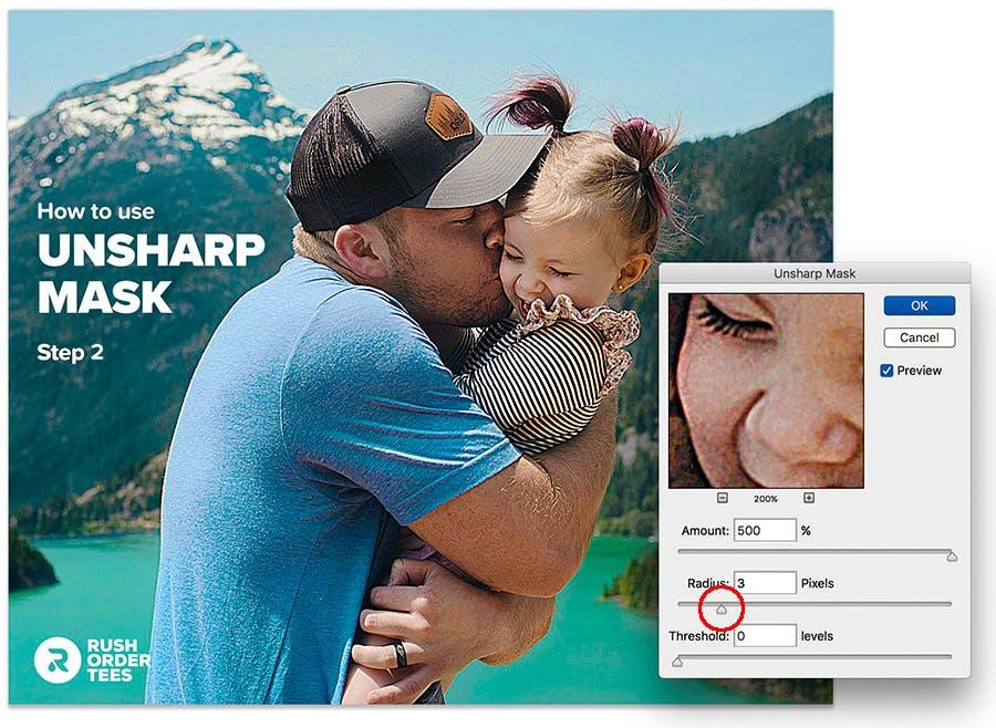
Unsharp Mask is my go-to, as it gives you the most control. Smart Sharpen also useful in particular circumstances, which I’ll get to in another post. For this one, let’s look at easy four steps that will get us where we need to be using Unsharp Mask.

Start with a radius of 1 pixel and boost the amount way up to the maximum of 500, just so you can see what’s happening.
Next, increase the radius until you can see a distinct outline around everything– not too thick or too thin.
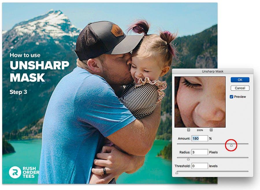
Then, decrease the amount to a more reasonable level, until the outlines are more subtle. At this point, it’s a good idea to turn the checkbox for “Preview” off and on again so you can see the difference between this and the original.
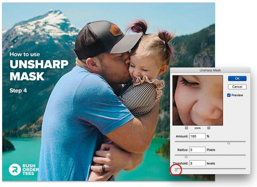
Finally, bump up the threshold a few pixels, enough to reduce some of the “noise” created in the larger areas. Now click OK.
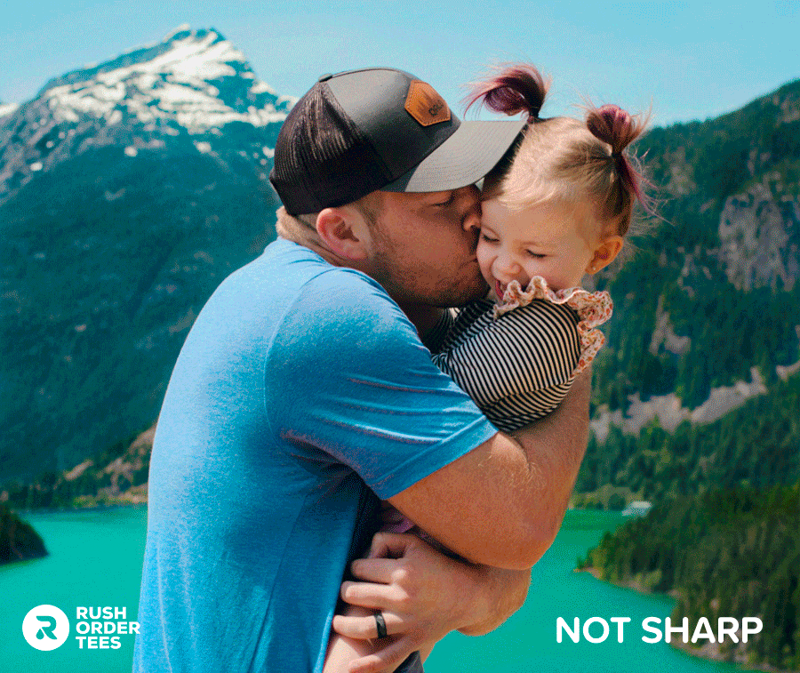
Sharpening is great, but there’s definitely a point where you can go too far…
There you have it. Those seven steps will get you where you want to be and have an image that is optimized and print-ready. I’m giving you three more optional steps, but first, let’s take a moment to see how far we’ve come.
Before:
After:
Optional adjustments
Now that we’ve gone through the main ways to prepare your image, the next three are optional ideas to make your image look good printed on a T-shirt or other garment, and more so in the design category rather than optimizing the photo quality.
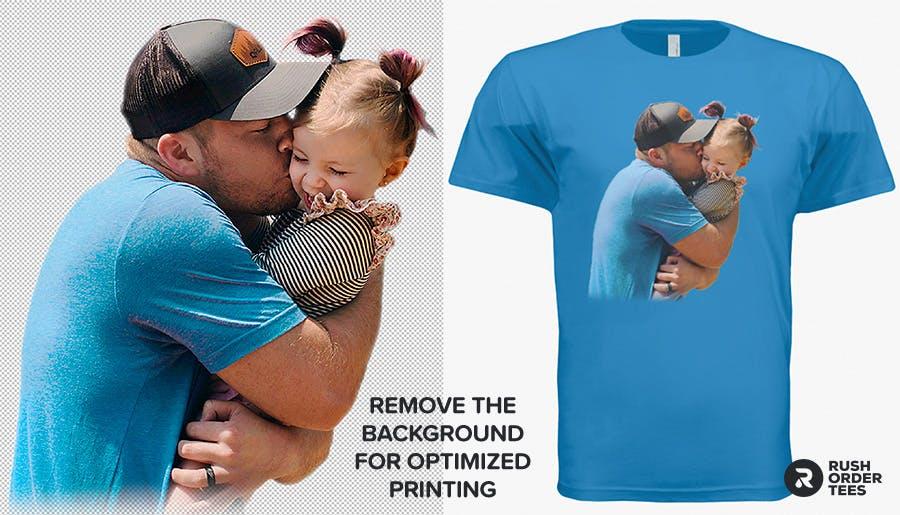
8. Remove the background
This is one of the more tedious optimizations, but the results are worth it. Designs that are masked or isolated from any background simply look better as a print. Square or rectangle designs can have a pasted-on look (or ironed-on for those of you who remember those). Removing the background takes some time and patience, so get comfortable and grab a coffee.
There are various ways to accomplish this. One is to just use the Eraser tool and get cracking. Use a softer edge brush as you get close to the desired edges. Another is to use the Background Eraser tool. It takes some getting used to and some fiddling with the settings to get right, but it does work like a charm is some areas, especially around problem areas like hair.
Then there are the selection tools. You can go old school and draw along the edge with the Lasso tool. Or give the Magnetic Lasso a whirl, which is designed to stick to edges that it detects. If you have a plain flat background you can easily select that with the Magic Wand and delete it. You can also use the Masks feature to “paint” the areas you want to remove.
For our example I faded out the bottom edge as well, rather than having it cut-off:
9. Add some effects
Now we get to a really fun one. There are dozens of preset filters in Photoshop (and other graphics programs). There are probably hundreds you can get as plug-ins. And when you start combining these things, the number of options get into the hundreds of thousands of million gazillions of possible filters and effects. Good luck deciding!
Photoshop has an entire pull-down menu dedicated to filters, such as adding noise, blurring, distorting, liquifying, pixelating, halftoning, tiling, embossing, posterizing, solarizing, you name it. They also have a Filter Gallery with lots of options to go crazy with. It’s like Instagram filters on steroids. If you like special effects, you’ll be the proverbial kid in the candy store.
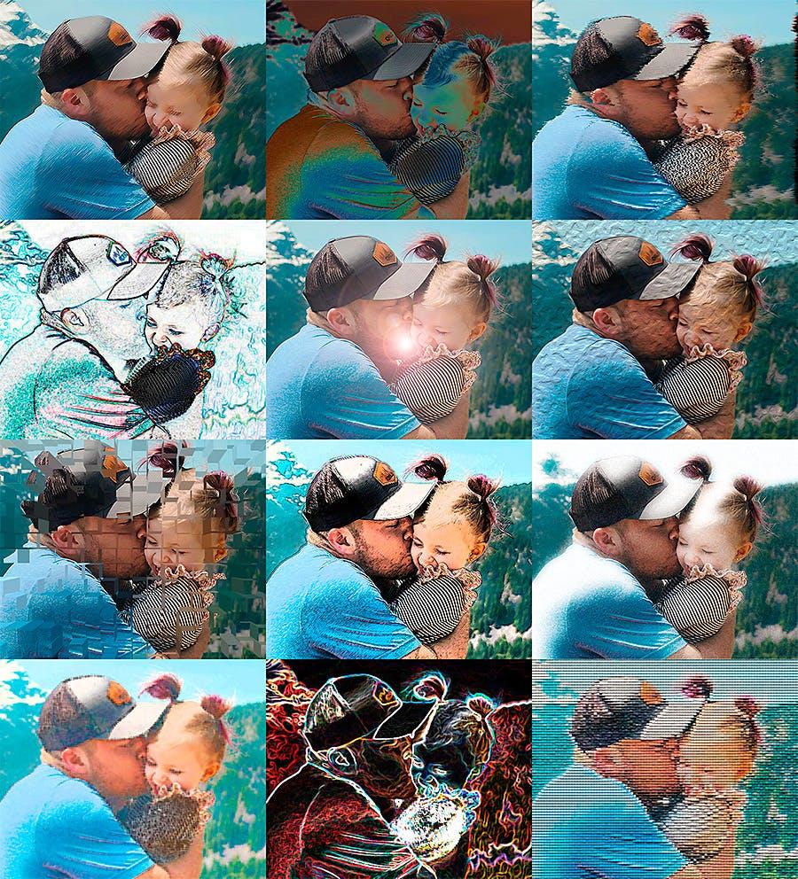
Above are a dozen filters I used right out of the box, petty much at random, just to give you some examples. Here are some free Photoshop plug-ins and there’s plenty more where those came from. Ok, maybe not the same place, but other places. The point is, there are a lot. If you can imagine some effect you want, there’s probably a filter out there to do the job.
My advice is to keep it simple and use the built-in features. It’s easy to get carried away with filters and effects, and your photo ends up looking too weird and distorted. But hey, maybe that’s what you want.
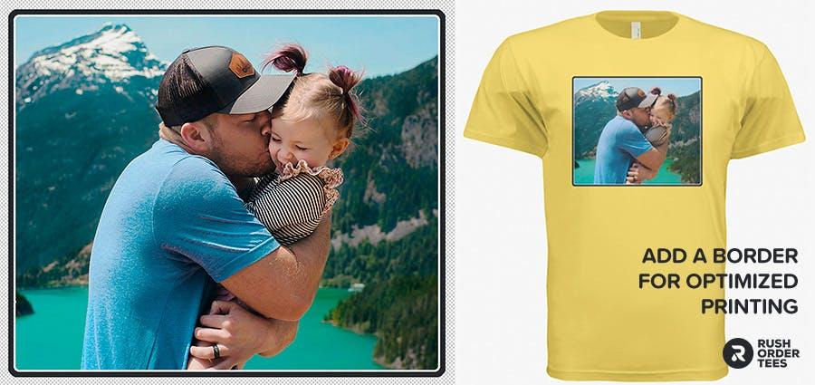
10. Add a border
This is one of my favorite things to recommend for photo prints because it’s easy to do and looks great. There are simple designs where you want an image slapped on a shirt with no border, but most of the time a border will improve the look and quality of the print, even if it’s just a thin line. And of course, there are many options for borders, which I’ve written about.
Recap:
- Start with high resolution.
- Crop the image.
- Resize the image.
- Touch up the image.
- Adjust the levels.
- Adjust the colors.
- Sharpen the image.
- Remove the background.
- Add some effects.
- Add a border.
I hope this was informative, helpful and your prints come out great. When you’ve optimized your image, upload it here!
Happy designing,
-M

About the Author
A graduate of the Multimedia program at the University of the Arts in Philadelphia, Imri Merritt is an industry veteran with over 20 years of graphic design and color separations experience in the screen printing industry.