
One thing that gets overlooked fairly often in T-shirt designs is how to treat the border of an image or photograph. You may not think it’s important, or even think about it at all. But I’m going to show you how giving some attention to the edges of your images can elevate the design significantly. As I used to say in the Art Department: put a border on it!
Let’s jump right in.
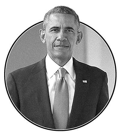
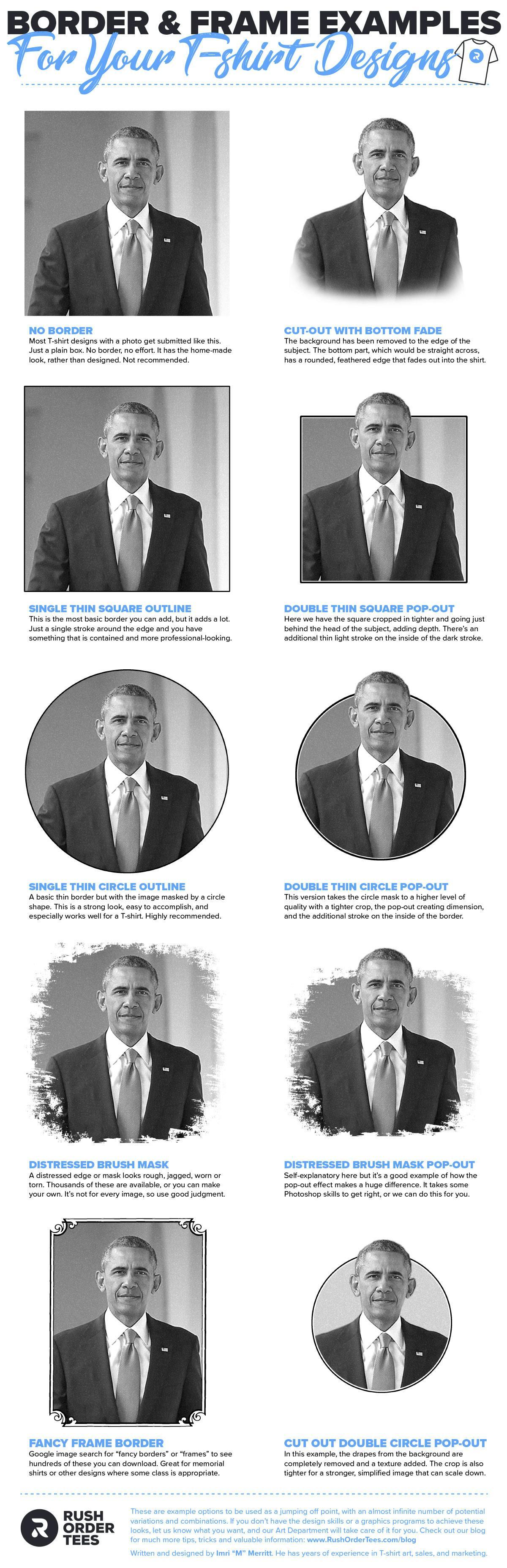
1. NO BORDER
Most T-shirt designs with a photo get submitted to us like this. Just a plain box, no border, no effort. It has a homemade feel, rather than designed. It can be fine in some cases, but I generally don’t recommend it, unless you’re going for the totally no-frills look. Even still, you want to make sure you have a crop that makes sense, without any unnecessary parts of the image.
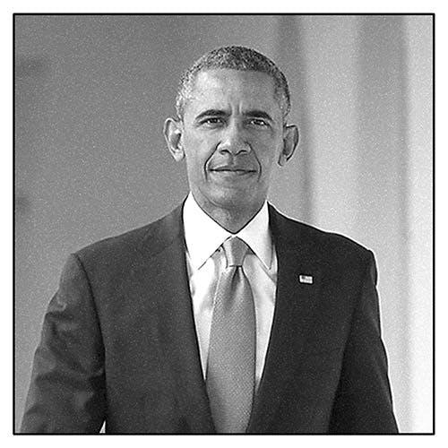
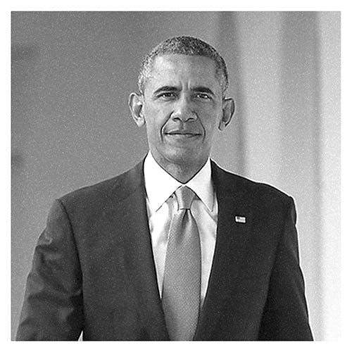
2. SINGLE SQUARE OUTLINE
This is the most basic border you can add, but it adds a lot. Just a single stroke around the edge and you have something that is neat, contained and more professional-looking. You can vary the thickness of the border to you liking. And this is something that can easily be accomplished in our Design Studio. No Photoshop skills necessary.
3. DOUBLE SQUARE POP-OUT
Here we have the square cropped in tighter and going just behind the head of the subject, adding depth. And there’s an additional thin light stroke on the inside of the dark stroke. Doing this pop-out effect does require Photoshop. If you don’t have that, you could try a free online tool. I recommend Photopea, but there are plenty of other Photoshop alternatives that are it’s pretty similar.
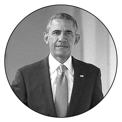
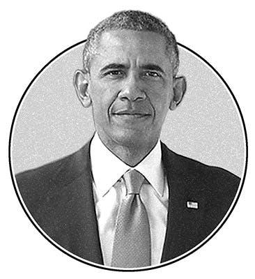
4. SINGLE CIRCLE OUTLINE
Here’s a classic: the image masked by a circle shape, with a basic thin border. This is a strong look, and easy to accomplish. You can do this in our Design Studio by using the mask tool, then select a clip art circle and line it up. This combo works especially well for a T-shirt design. Highly recommend. Just watch out you don’t crop out anything important in the photo.
5. DOUBLE CIRCLE POP-OUT
This version takes the circle mask to a higher level of quality with a tighter crop, plus the pop-out creating dimension, and the additional stroke on the inside of the border. This pop-out effect can work well with other things like a building, a tree, a sign– pretty much anything that can be isolated and that can pop out of the top of the border or frame. Try it!
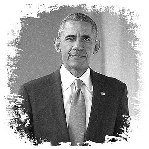
6. DISTRESSED BRUSH MASK
A distressed edge or mask looks rough, jagged, worn or torn. This adds an artistic touch, a grunge style, a messy look– whatever you want to call it. Thousands of these are available online, or you can make your own. It’s not for every image, in fact, I don’t think it works well for this photo of President Obama. So think about your target audience, and use good judgment.
7. DISTRESSED BRUSH MASK POP-OUT
This should be self-explanatory at this point, but let’s take a moment to appreciate how the pop-out effect makes a huge difference. It really does add a three-dimensional effect. Barack is coming out of my T-shirt! Again, it takes some Photoshop skills to get right. Ask about it when you place your order, and our Art Department can do this for you.
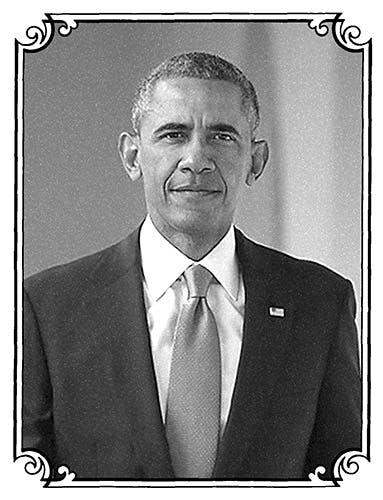
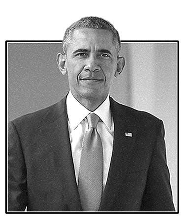
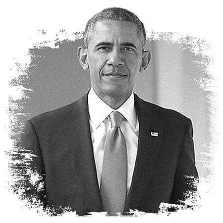
8. FANCY FRAME BORDER
Another classic and obviously something to consider. There’s a reason why people frame pictures on their walls. Same reason for shirts. Google image search for “fancy borders” or “frames” to see hundreds of these you can download. This look is great for memorial shirts, anniversary shirts, or any other designs where classing it up would be appropriate.
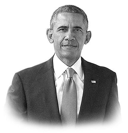
9. CUT-OUT WITH BOTTOM FADE
In this example, the background has been removed to the edge of the subject. I’m calling this cut-out, it’s also known as knocking out. The bottom part, which would otherwise be straight across, has a rounded, feathered edge that fades out into the shirt. It does away with extraneous parts of the image, making it an ideal look for T-shirt designs.
10. CUT-OUT DOUBLE-CIRCLE POP-OUT
Finally, I saved the best combo for last. With this look we start with the cut-out (the drapes from the background are completely removed) and then a background texture is added. The crop is tighter than the previous examples, for a stronger, simplified image that can scale down. This is great for profile pictures as well as a classy, professional T-shirt design.
There you have it. These are example options to be used as a jumping-off point, with an almost infinite number of potential variations and combinations. If you don’t have the design skills or graphics programs to achieve these looks, let us know what you want, and our Art Department will take care of it for you.
Download the infographic below and save it for reference or share with friends. For more tips, tricks, and information, check out my post about avoiding The 10 Most Common Mistakes of T-shirt Design.
Happy designing,
-M

About the Author
A graduate of the Multimedia program at the University of the Arts in Philadelphia, Imri Merritt is an industry veteran with over 20 years of graphic design and color separations experience in the screen printing industry.