
Everyone loves a great T-shirt design. But what makes for an impressive design that people want to repeatedly wear? Although some of the greatest designs look simple, even the simplest designs need to avoid the most common mistakes to achieve that greatness.
Here are my ten T-shirt design tips, based on 25 years of experience in the custom t-shirt and printing business.
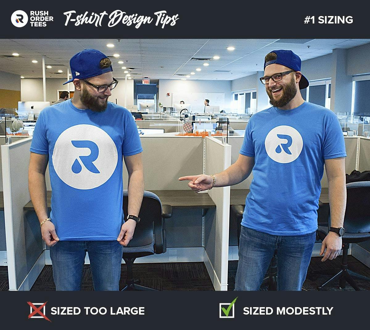
1. Set a modest print size
There may be things in life where size doesn’t matter, but a t-shirt design is not one of them. A common mistake is people set their design to standard size. But standard is close to the maximum, which can be too large for most designs.
The size of a design should be based on the purpose of the shirt, the properties of the garment, and the characteristics of the design itself.
Keep in mind that certain shapes, like circles and squares, look better when sized smaller than standard. Consider the total surface area of the print, not just the width and height.
Additional sizing considerations:
- One size doesn’t fit all. For larger orders with a variety of T-shirt sizes, consider reducing the print size on the smaller garments. Example: An 8″ wide chest print on youth tees and smalls, and a 10″ wide print on the rest.
- Certain styles have limited print areas. Set your print size to meet style-specific requirements. Examples: hoodies with front pockets have a max height of 10″ and stank tops have a much smaller print area than T-shirts.
- Consider comfort. A large print can affect breathability and weigh down a T-shirt, especially on lightweight shirts. Example: If you’re making T-shirts for a 5K run, a giant print becomes an uncomfortable “sweat patch”.
- Don’t make people into billboards. Even the most die-hard fans of your brand might be reluctant to wear a T-shirt that makes them look like a walking ad. Keep the print size modest and people will be more likely to wear it.
The bottom line: size matters. It can make or break a T-shirt design, so carefully consider the size. Smaller is usually better.
Pro tip: Sizing
Print out your design with a home printer on regular paper (you may need to split between two or more sheets and then tape them together) and cut off the excess. Then hold it up to your own shirt in the mirror to get an idea of exactly how it will look.

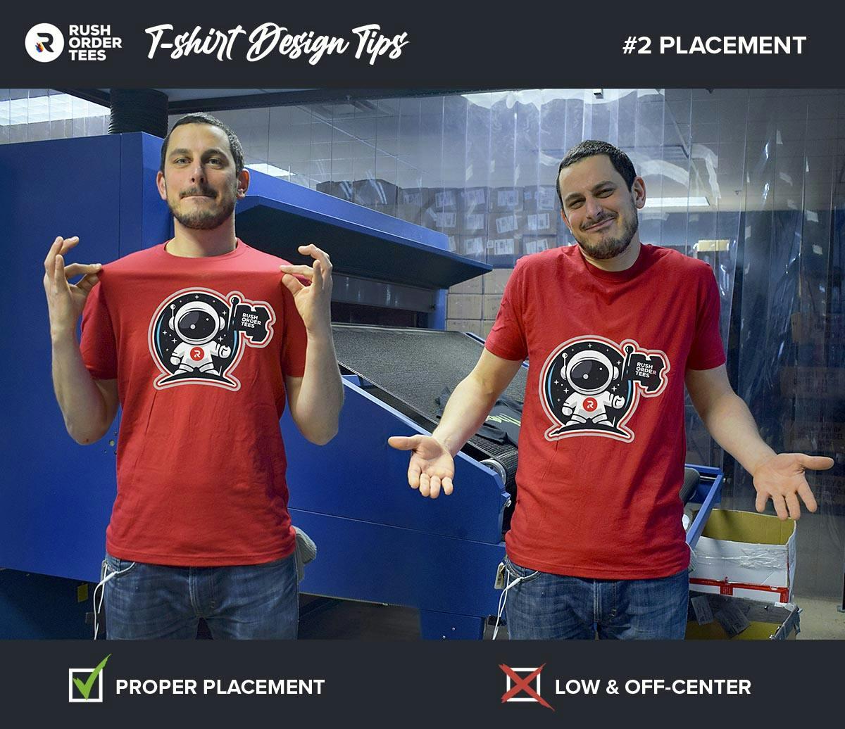
2. Get the placement right
Print placement differs from print location. It’s the exact measurement of where to print the design within the location.
If you’re choosing unique print placement, make sure you have a good reason. Many people new to T-shirt design don’t know that a standard full front placement isn’t halfway between the shirt’s top and bottom. It’s actually around 4″ from the collar. So a common mistake is the belly print, and it’s never flattering.
If your print will be a standard location such as full front, full back, or left chest, our production team ensures the placement is standard and will work across your various garment types and sizes.
For specific requests or an alternative print area, just let our art team know. They’ll ensure your request is within the limits, show you a digital proof of how it will look, and once approved, relay those instructions to our printers.
Pro tip: Placement
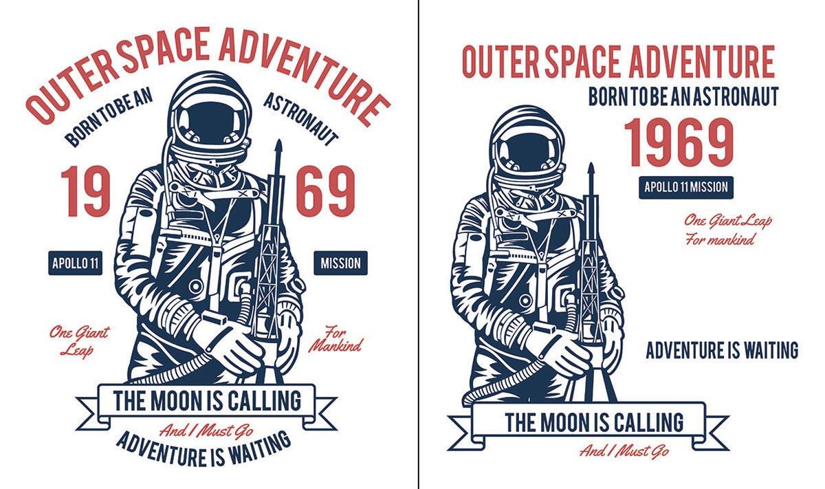
Normally, designs get centered based on the midpoint. But not all designs should. Non-symmetrical designs (like the astronaut above) need to be centered visually. Here, it’s the midpoint of the character that’s the correct center, rather than the whole design.
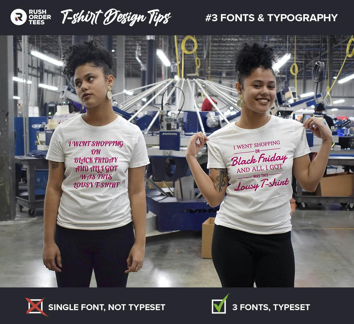
3. Focus on fonts and typography
Typography, in its most basic form, is the visual arrangement of words (not to be confused with the font, which is the style of the text). Anytime text gets printed or displayed, good or bad, there is typography involved.
In graphic design, typography is the art of typesetting: arranging type in a way that makes sense, along with choosing appropriate typefaces (fonts), making sure the letter spacing and line spacing is correct, and designing the way the words interact with the graphic elements to be aesthetically pleasing.
But you don’t need to be a trained artist to get the typography right. You just need to follow some basic rules.
Your font choice says a lot. It conveys a significant amount of information and can convey certain ideas or evoke emotions–that may not be intentional. We’re all conditioned to attribute certain characteristics to certain fonts from a lifetime of looking at logos, graphics and ads.
If your T-shirt design is for a family reunion, the “Batman” font is not the best way to convey that. If you’re going for a more corporate or professional look, avoid “Comic Sans” (real talk, always avoid Comic Sans).
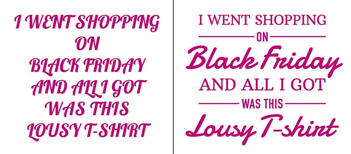
Certain standard fonts will work well for just about anything, other fonts will only look right in specific contexts. Exploring your options is well worth the extra time. For T-shirt purposes, here’s a few rules of thumb you can apply to your design:
- The most important words should be the boldest and towards the top.
- Avoid gigantic block lettering. You’re not designing the side of a bus.
- Using fonts with contrasting styles adds visual interest–just don’t overdo it.
- Consider where you put your line breaks; they instruct how your message reads.
- Thoughtfully layout how the type interacts with the imagery.
- Avoid putting type directly on top of busy images. It can make it much harder to read.
- Effects like textures and drop shadows should be used sparingly, if at all.
Want a crash course in understanding typography? Practical Typography is a great little site packed with good information that can answer your most basic questions on this topic.
Pro tip: Fonts
If you remember only one rule of typography, make it this one: never use more than three different fonts in a design. It creates a busy and chaotic look. Plus, the graphic design police will come after you.
4. Take care with composition
Composition is something you may remember from your high school art class. Every design has elements arranged in relation to each other, which makes up the overall composition. Good design is all about composition.
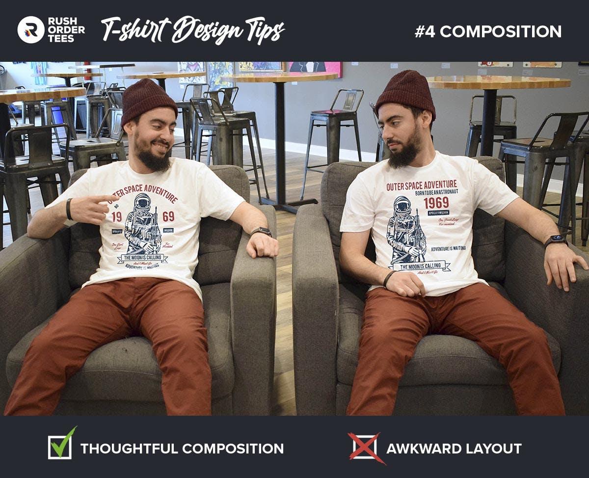
You might think an appealing composition is subjective, but following a few basic rules can improve a design. As they say, learn the rules first, then break them. There are many resources online if you want to learn to improve your composition game.
Typical mistakes include elements that are too spaced apart or bunched up together. Sometimes the entire design can be off-balance, drawing the eye to the wrong place. Or if you’re especially careless, the type reads in the wrong order and ruins the message.
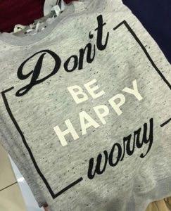
Oops. Maybe they should have worried a bit.
Bottom line: if you’re working with a variety of elements, put some time and effort into your composition. Try a few different layouts and compare them. Ask a friend what they think. Worry first, and you can be happy later.
Pro tip: Composition
Look at your design with “fresh eyes”. Take a long break and then return to it. It’s especially helpful to do if you get stuck or frustrated or made a few versions you need to decide between. Often, looking at it later–or better yet, the next day–with fresh eyes gives you an immediate impression of what to change or which one to choose.
5. Ensure image quality
One of the most common problems with customer-submitted art files is that images are “low resolution”. What that means is they don’t have enough pixel information to give us the quality and details that make for good print quality.
Ideally, images should be 200 dpi or higher at full size. Up to 300 dpi is best. Images from the web are typically 72 dpi, and not at the size to be printed.
Another problem with low-res images is visible artifacts from compression. Keep in mind, the print will only be as clear as the image we’re starting with– so starting with a high-quality image is key.
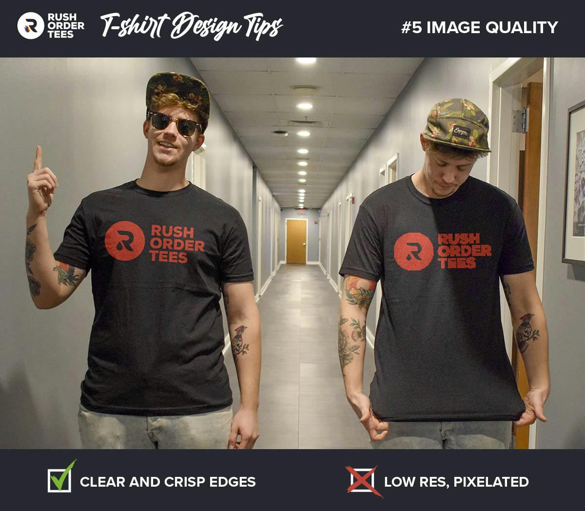
Scan photographs at a high resolution for the best results. If it’s a copy that’s been resized or re-saved, try to find the original. If all you have is low quality and it’s hard to fix, one option is to apply a distressed effect, so it looks like it’s roughed up on purpose.
Pro tip: Image quality
Use vector graphics. When you submit a vector file, the resolution doesn’t matter because vector files scale to print perfectly to any size without losing quality. And they tend to produce the cleanest, crispest prints. That’s why we love them the most. Vector files are typically PDF, EPS, AI, or SVG file types.
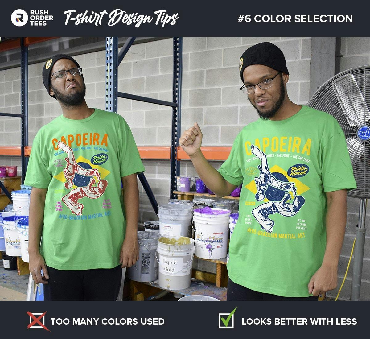
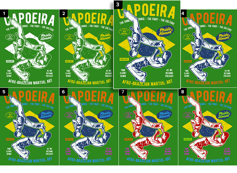
6. Be careful with colors
Color choice is one of the most important decisions. Not only for design reasons but if you want screen printing, to make sure the job fits your budget. More colors equal more cost per item. Typically, screen printing is better suited for solid colors and a limited color palette.
You can choose from our wide selection of in-house ink colors available in the Design Studio, or if you need specific colors for your brand, we offer accurate Pantone color matching.
If your print method is DTG rather than screen printing, then we’re printing in full color, so the number of colors as it pertains to the budget is no longer a consideration. It’s a superb choice for gradients and blends, and especially photographs.
No matter the print method, the way the design looks due to color choices is always a consideration, aesthetically speaking. Adding lots of colors to make the design more vivid can be tempting, but this can backfire. Use too many colors, and your design can start looking ugly, as there’s more chance of clashing.
There’s almost always going to be an ideal number of colors or a small range to choose from. Try to achieve your design goals in the least amount of colors possible; people will wear the shirt more often than if it had all the colors of the rainbow.
Pro tip: ColorsYou should think about colors from the moment you start design. Colors can actually have specific effects on people. Advertisers are well aware of this, and you should be too. It pays off to do some basic research about color theory. It will help you choose secondary and tertiary colors that will work best for your design.
7. Consider the contrast
Contrast is a part of color choice, but it’s a specific and important part to consider. What exactly is contrast? Its the degree of visual difference between the darker and lighter parts of an image, or the way shades of colors correspond to each other.
High-contrast designs are easier to read and more in-your-face, while low-contrast designs are more subtle. The strongest contrast is always going to be black-on-white or vice versa. Bright colors on a dark background are going to be high contrast.
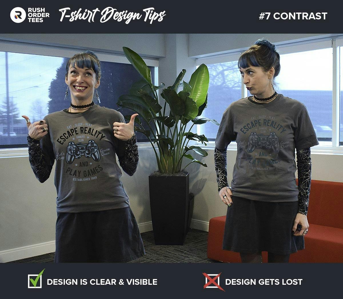
The design itself can dictate the overall contrast, as far as the content and what colors have the most surface area or are the most dominant. A crazy, eye-catching image along with saturated colors will greatly increase the contrast against a neutral background.
Achieving the highest contrast possible is not always the goal. Many people like the subtle look of a low-contrast print. Some of the best designers play with low contrast. But it’s a fine line between that and no-contrast.
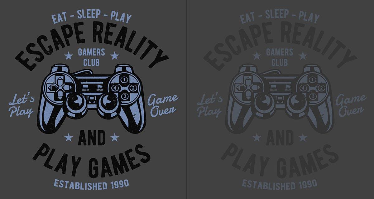
Typical contrast mistakes we see: Navy on black shirts, Light Gray ink on sport gray shirts, and Ice Gray ink on white shirts. These are low contrast and we don’t recommend these combinations.
We have printed black ink on black shirts when the customer wants an extremely subtle look (yes, you can still see it), but it’s rare. If you’re trying to set up something like that, let us know your intention so your order doesn’t get flagged for correction.
Pro tip: Contrast
On dark backgrounds, the lightest colors visually come forward in space, while darker colors recede. On light backgrounds, the effect is the opposite: darker colors will visually come forward in space. Use this effect to your advantage as you plan out your design.
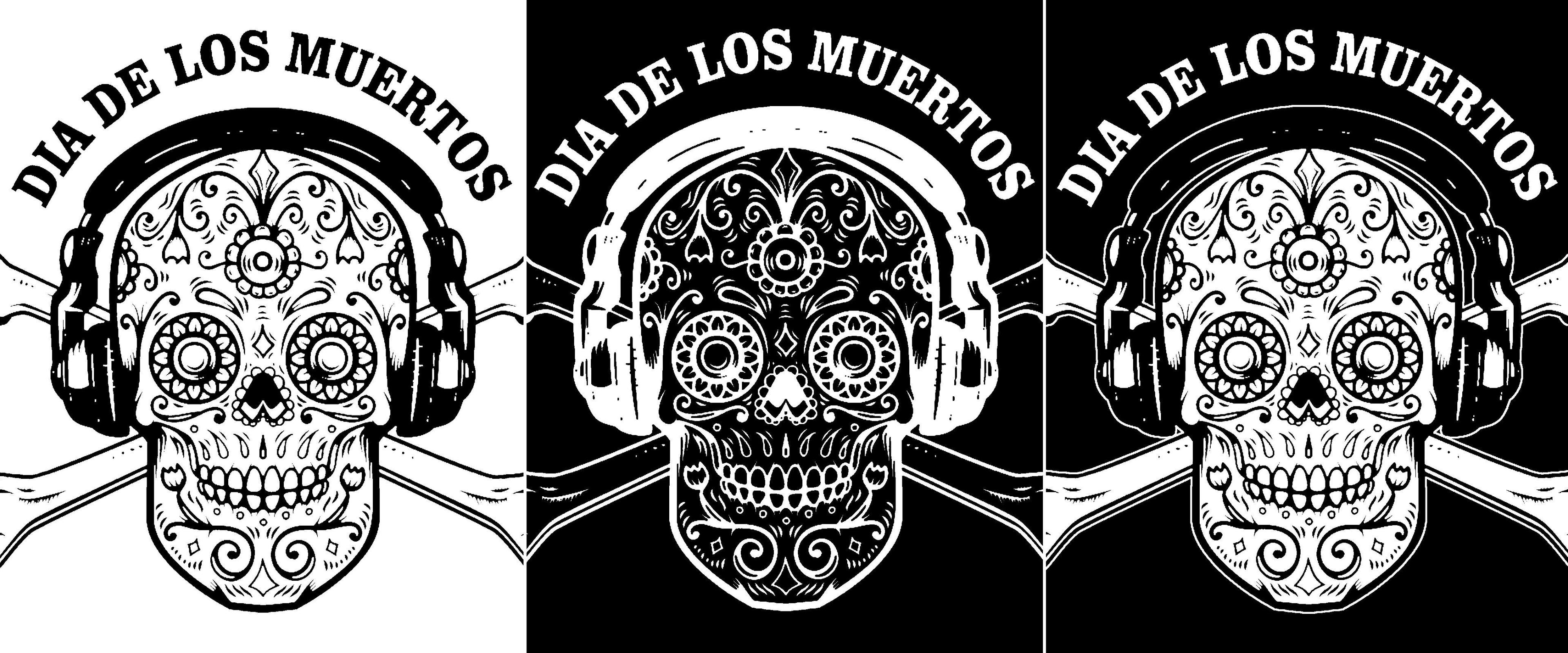
8. Invert negative images
Inversion is a fairly common step that must be done, usually when printing light ink on black garments. Unless there is a specific reason, you probably don’t want your photo to look like an x-ray.
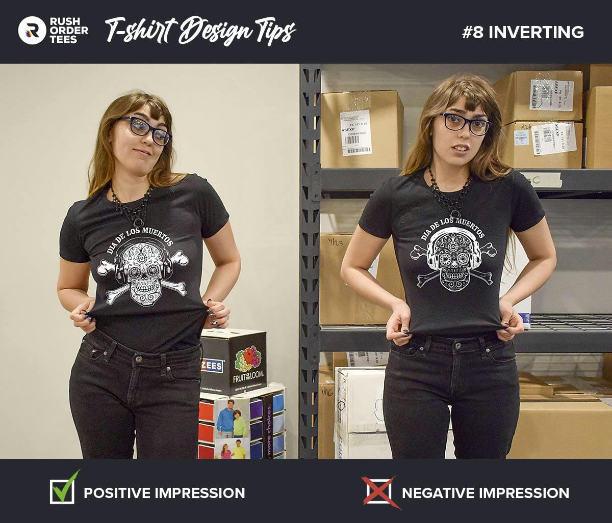
For the average person, it’s difficult to know when something needs to be inverted. Look for things that would normally be black or white. For example, a skull should be white, and the shadows in its eyes should be black. Line drawings on dark garments often should be filled with white rather than the lines being white.
When a negative needs to be switched to a positive image, it often requires adding a white outline. Unless you are a designer or at least familiar with graphics programs, it’s best to get someone to do this for you.
Our art department is happy to help with this for free. Add a note with your order describing what you’re going for, or talk to one of our project specialists who can evaluate your artwork and guide you towards the best approach.
Pro tip: Inversions
If possible, stick with either light garments or dark garments. If your garment color choices are all over the place, or a combination of lights and darks, chances are the design will not work right on all of them, and the solution would be to use two different designs. You can avoid this by sticking with one.
9. Avoid over-complexity
Everyone knows the adage K.I.S.S. (Keep It Simple, Stupid), which applies to T-shirt design as much as anything else. “Stupid” was probably added just to complete the acronym. It’s rude, but good advice.
The human eye can only process a certain amount of information at once, graphics or otherwise. And with a T-shirt design you not only have limited viewing time, but you’re usually a moving target. So keep it simple.
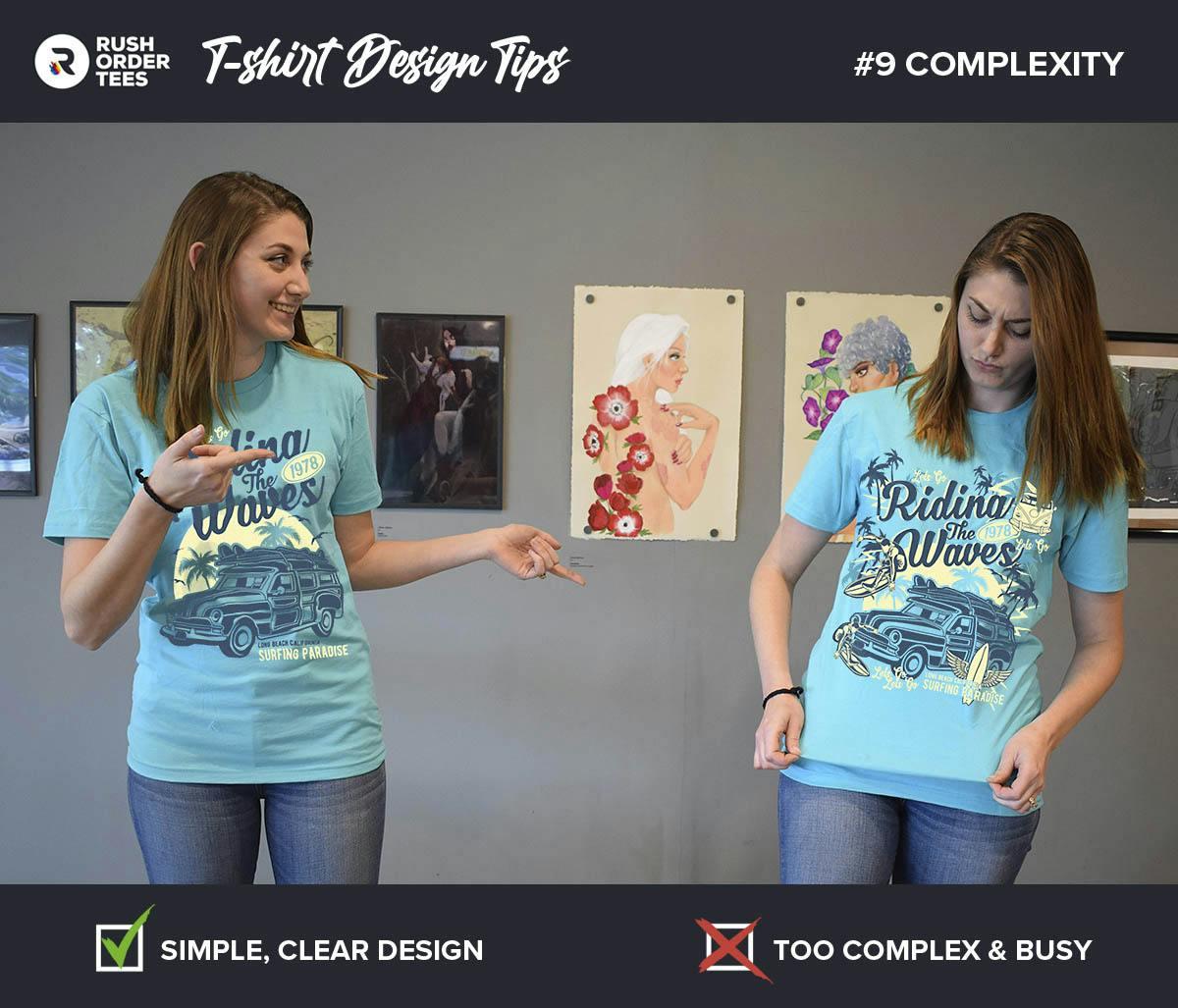
Sometimes people get a little carried away with trying to be creative by stacking things on top of each other, using weird angles and composition, and creating a chaotic mess. Other times, the design’s nature or the number of colors add to the complexity.
You don’t want to make people work hard to figure out what is on your shirt. Choose one main image or idea and then remove anything that competes with it or isn’t necessary to convey your message.
If you’re having trouble knowing when to say when, our experienced design team can help. We are experts at “K.I.S.S.”ing.
Pro tip: Complexity
When designing a T-shirt, we are often looking at it close up. But most people won’t see it that way. Step back from your design and look at it from a distance. From farther away, is it easy to make out what it is? Simplify your design until it reads quickly and clearly. If you’re stuck trying to decide what to keep or cut, our free AI T-Shirt Design Wizard can help generate clean design options that emphasize your core idea.
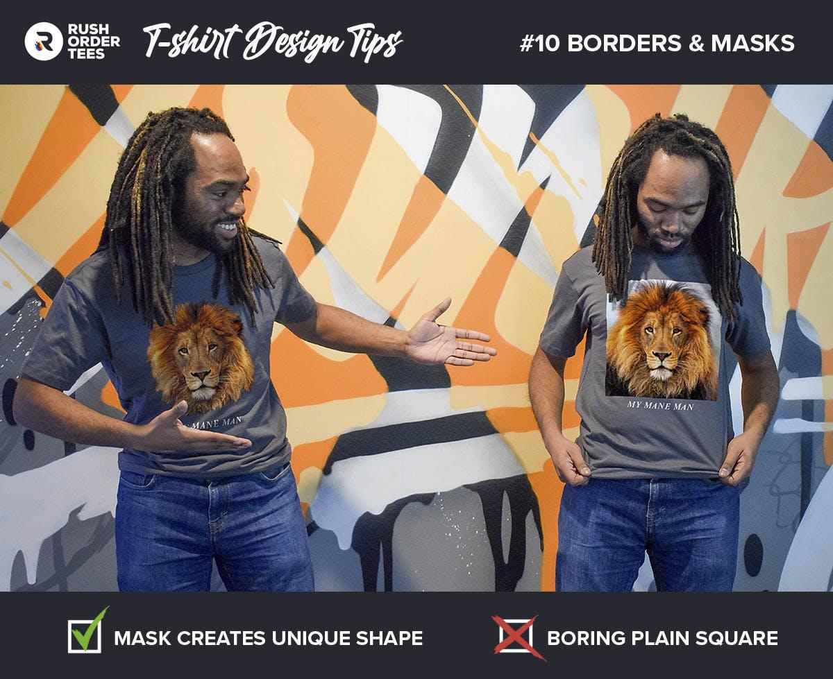
10. Add borders, masks, and edges
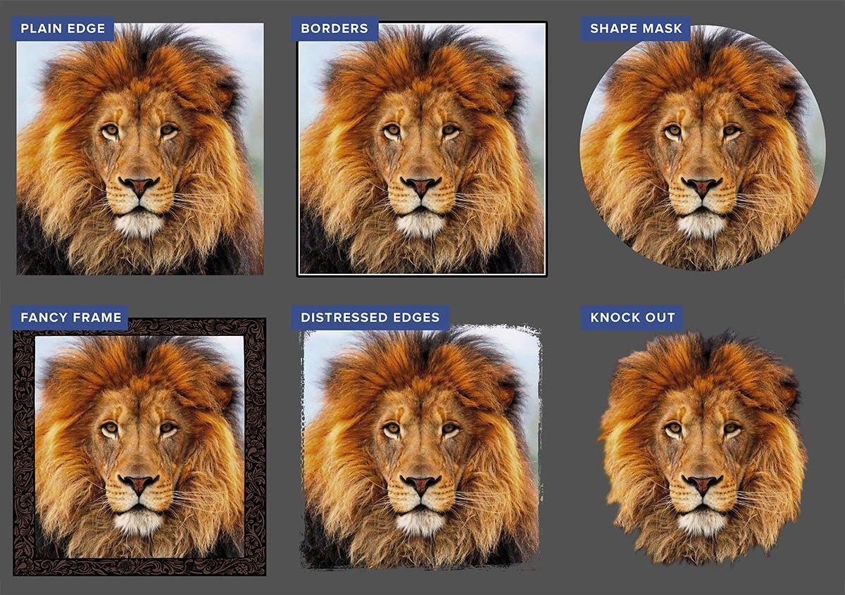
Many designs that we print feature photographs. A photo just sitting on a shirt with plain edges can look boring or even cheap and unprofessional. A straightforward solution is to put a border on it.
There are lots of options for borders and edges. The most simple is a thin white or black border, which can instantly improve the appearance. But maybe you don’t want it to be square. In that case, you can use the “mask” feature in our Design Studio, which gives you a variety of shapes to choose from.
Alternatively, you could go with more of a frame, which is a thicker border, sometimes with beveled edges or fancy details, like in the examples below. Our clip art library has a variety of edge styles you can choose from.
Consider your subject. If it’s an anniversary design, you might want a fancy frame. For a tough mudder competition, you might want distressed edges. Designing company shirt? you want something clean and professional-looking.
If you don’t have Photoshop or another image editing tool and are interested in any of these treatments, put in a request with your order describing what you want. If you want to give it a go yourself, there are free image editors online that work just like Photoshop. Check them out.
Pro tip: Borders and Edges
Instead of simply framing your subject, have the subject break through that frame for a dynamic 3D effect. There are various ways to do this. The most common is the top of the head breaking through (in front of) the top border. Look at most magazine covers and you will notice the subject is often on top of and covering a portion of the title of the magazine. The reason they do this is it adds visual interest and brings the subject forward.
For more advice and inspiration, you can look at some real-life examples of T-shirt design improvements. Once you have the knowledge and confidence for a successful design, jump into our Design Studio to create your own amazing T-shirt!
Happy designing!
-M

About the Author
A graduate of the Multimedia program at the University of the Arts in Philadelphia, Imri Merritt is an industry veteran with over 20 years of graphic design and color separations experience in the screen printing industry.