
RGB and CMYK are standards among all the color systems, but how much do you know about them?
These two models serve specific purposes and have fundamental differences to understand, whether you’re creating a design, receiving one, or just curious. This colorful post explains those differences in simple terms and gives you some tips for using them.
Color models, profiles, systems, spaces, or modes?
Some of these terms get used interchangeably, so to help clear up some confusion, here are the basic definitions of what they mean.
- Color model – The theory and foundational principles that define a color system.
- Color system – How the color model functions in practice. How it works.
- Color space – The totality of colors that can be produced by a color system.
- Color mode – The formatting of a document to adhere to a particular color system.
- Color process – This typically refers to the process of printing or displaying images.
What’s the difference between RGB and CMYK?
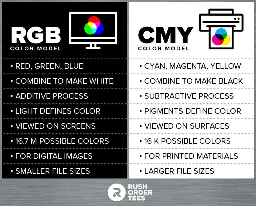
The most important difference about these color modes is that RGB is for display on electronic screens (computers, TVs, cameras, smartphones, etc), while CMYK is for printing (magazines, photographs, product packaging, direct-to-garment, etc). RGB has a wider gamut (range of colors) than CMYK.
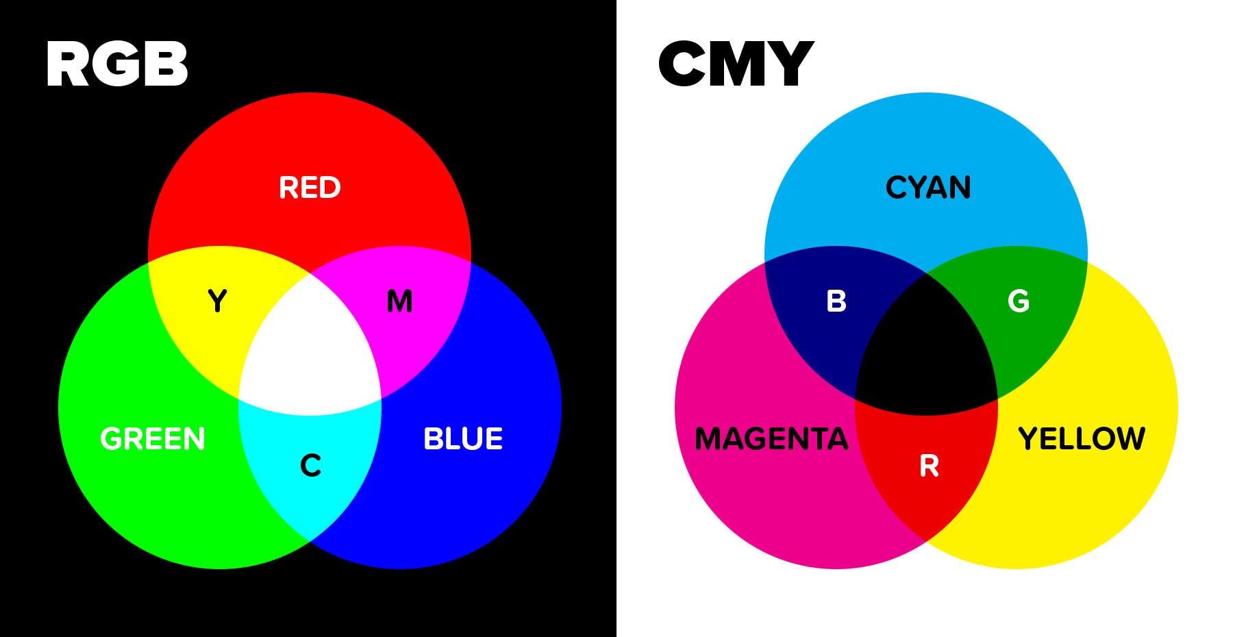
They both start with three primary colors that are combined to make all the other colors. For RGB it’s red, green, blue. For CMYK it’s cyan, magenta, and yellow. RGB is an additive process using colored light, and CMYK is a subtractive process using the pigment of inks, dyes, or paint.
These two systems are fundamentally different– you can call them opposite– so it’s important to know the difference. Since most printers and commercial print companies will convert your file for you, the only thing to worry about is if you are working in CMYK mode when it doesn’t need to be (your colors will be somewhat limited).
What is RGB?
RGB stands for red, green, blue and is the color mode for computer screens, TVs, smartphones, and more. RGB has a wider gamut (range of colors) than CMYK and includes bright, saturated, and fluorescent colors. All RGB images must eventually be converted to CMYK+ to be printed.
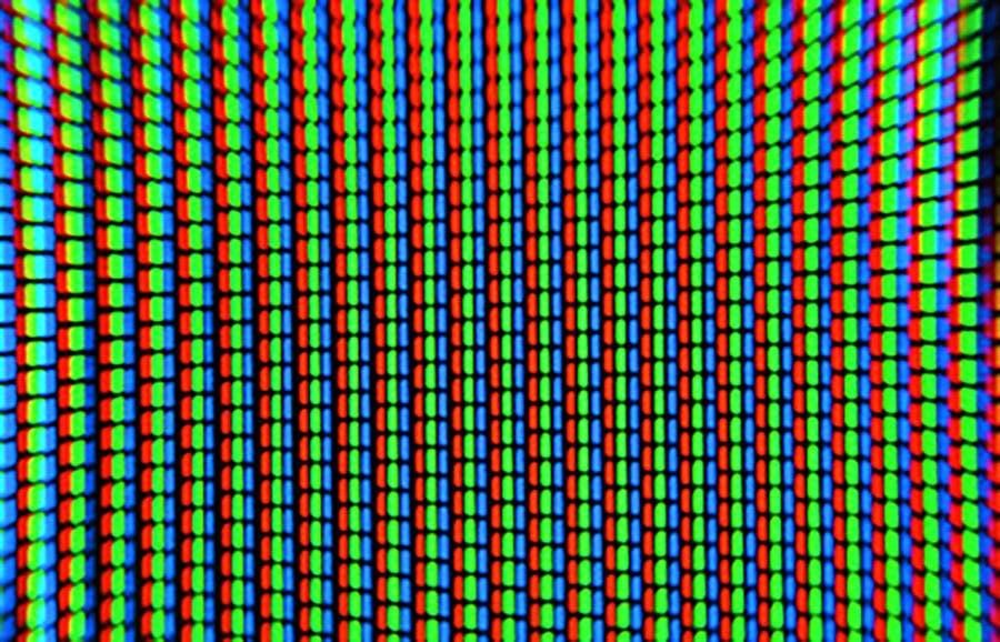
RGB is an additive color system that uses the emitted light from a screen or projection. It starts out with a base of pure black when there is zero light, and produces pure white when all of the colors are combined at full intensity. Each color has a brightness level that goes from 0 to 255.
Theater lights work on the same principle. If you point red, green, and blue colored lights at the same spot, you will get something close to white. If you spin a color wheel very fast, you will also see white.
On a computer screen, each of the millions of pixels has three subdivisions, which are lit with the colors red, green, and blue to varying degrees, which combine to create a wide variety of colors that our eyes can recognize from a normal distance.
When to use RGB
If you’re creating a print design, the common wisdom is to work in CMYK to avoid a color shift when it goes to print or to convert it before sending. With modern printing technology, it’s no longer an issue. Most commercial printers not only accept RGB files but prefer them.
If you’re creating a design that will only be seen on an electronic screen, you should work in RGB. This will allow you to access the full range of bright colors this model can achieve. And after all, CMYK on the computer is just an approximation of the color model– displayed in RGB.
How to use RGB
Each color of RGB is given a value of 0 (least saturated) to 255 (most saturated), making a total of over 16 million colors that can be represented in the color space. In Photoshop and other image editing software, you can set these values, or choose your color first and make a note of the numbers. Better yet, save it as a swatch.
What is CMYK?
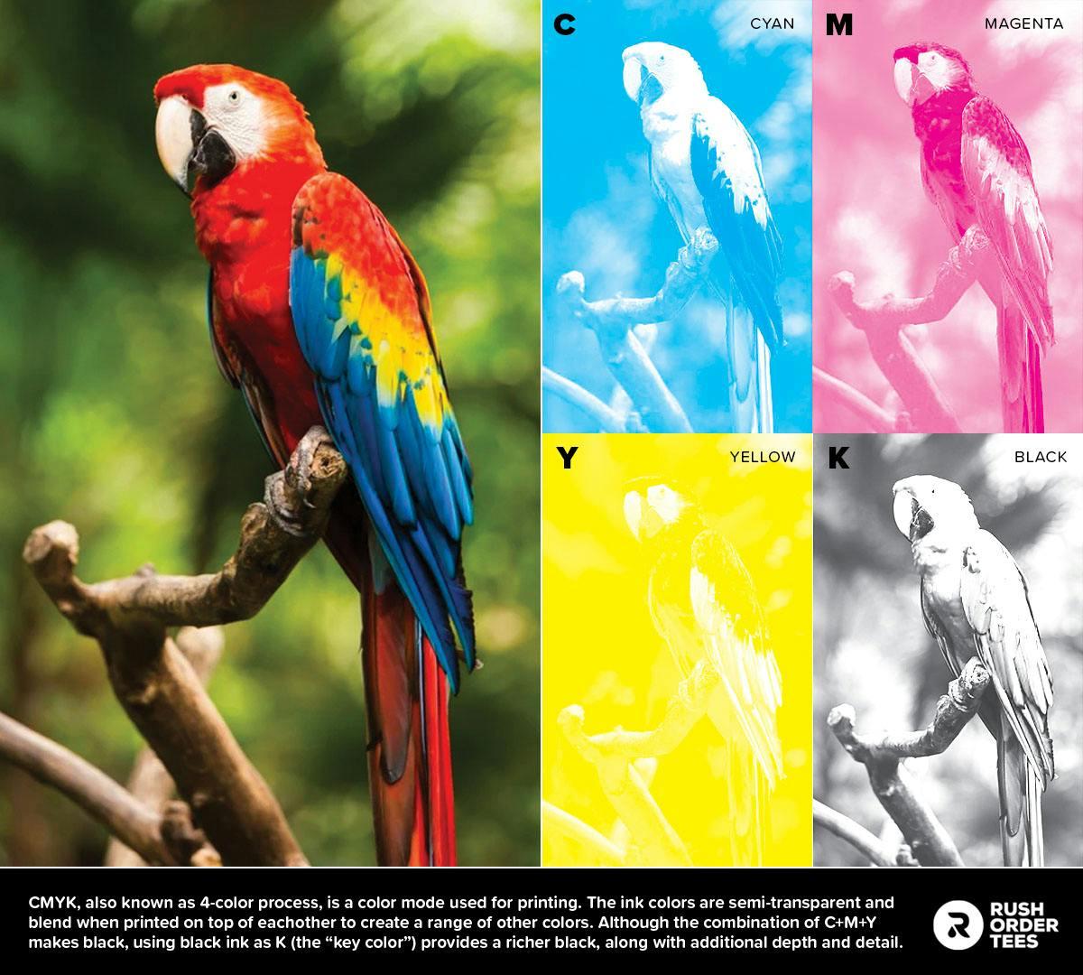
CMYK is a color process used for printing, especially for photo-realistic images and those with lots of colors. The inks are semi-transparent and blend together to create a range of colors. It’s based on the CMY model in which cyan, magenta, and yellow are the primaries.
The CMY model is similar to the basic color theory that most people learned in school, and based on the same principles that artists use when mixing colors with paint. If you remember the color wheel, secondary and tertiary colors, you have a head start on understanding CMYK.
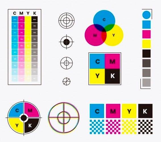
In the printing world, CMYK is also known as “4-color process”. Because of the transparency of the inks, the full combination of C+M+Y isn’t quite dark enough, black ink is used for the 4th color, represented by K.
How to use CMYK
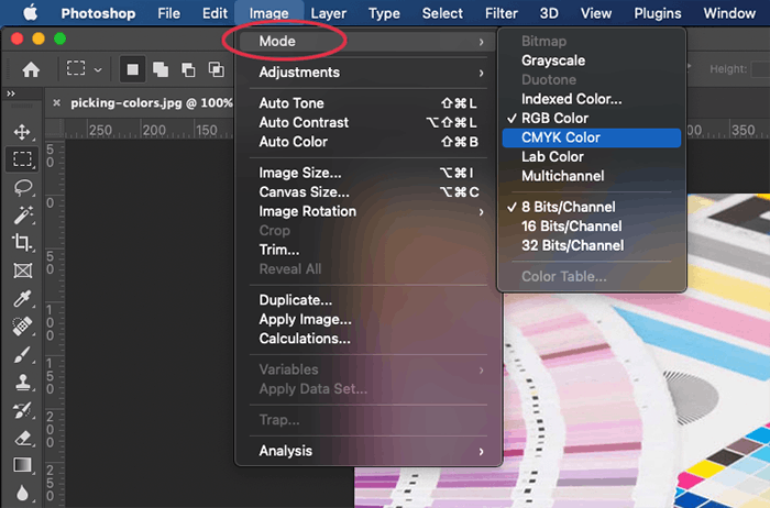
If you use Adobe Illustrator, new files will default to CMYK, so you’ll already be in that space. InDesign operates independently of color modes. Adobe Photoshop defaults to RGB, so start by switching to CMYK under Image > Mode before creating your design. That way none of the colors you choose will change when printed.
How does CMYK work?
CMYK is known for reproducing photographic and photo-realistic images. These types of images have subtle blends, gradients, and details. So how does CMYK do that with just 4 colors? This is where halftones come in.
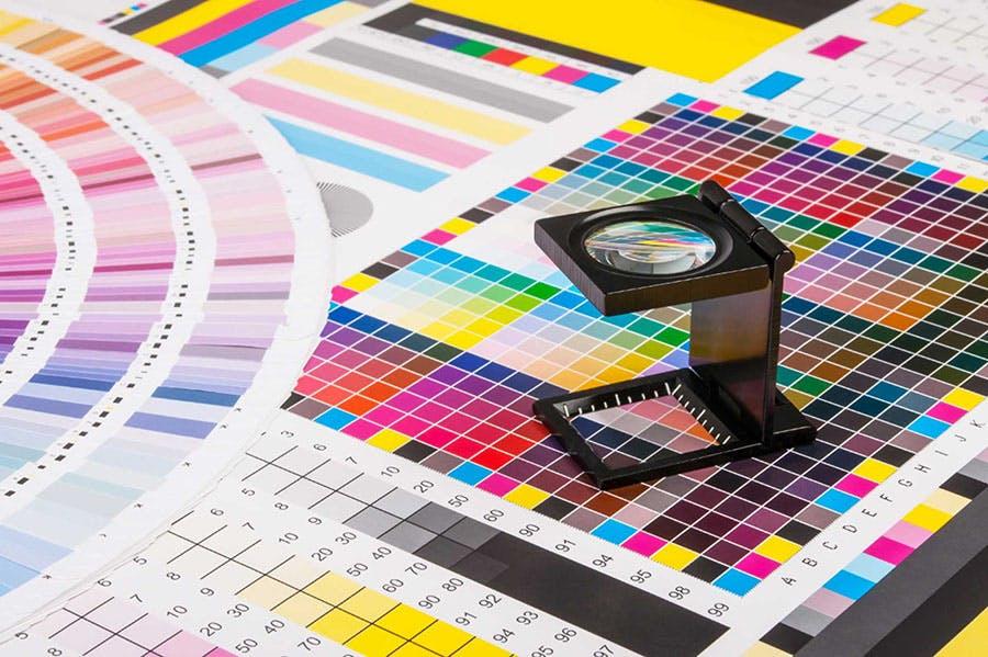
Halftones are basically just tiny dots that create an optical illusion. If you look very closely at any magazine or printed item (like magnifying glass closely) you will see the halftone patterns.
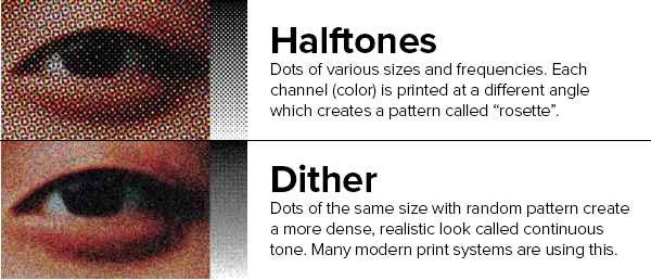
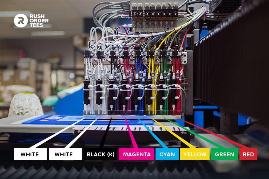
Dither is a different form of halftones that uses tiny dots of the same size in a randomized pattern (aka frequency-modulated) for a natural continuous-tone look. More advanced print systems are adopting this format. Our DTG machines use dither for a more detailed and accurate print, especially with photographs.
Check out my previous article for more about print methods.
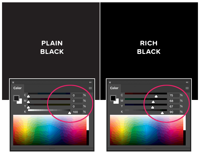
How to make a rich black
If you have black areas in your CMYK printing design that you want to be darker, here’s how to do it. Plain Black is just 100% K and looks like a dark warm gray. Set your sliders to these percentages for rich black, as shown below: C=75%, M=68%, Y=67%, and K=90%.
You might be wondering why not just max all the colors out to 100%. While you can do that, it’s not recommended because it becomes too saturated with ink. Problems can arise, like ink gain, smudging, blown out shadows, and even damage to the paper it’s being printed on. The point is to have all the colors doing work to make the black, but just don’t overdo it.
FAQs about working in different color systems
Now onto some of the most frequently asked questions about working within color systems.
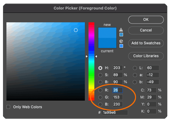
While RGB is an incredibly powerful color model for computers, it’s not the most intuitive system for humans to pick and adjust colors. Even experienced designers are not going to pick colors based on the numeric value. (What’s your favorite color? 26, 153, 230? Mine, too!) That’s where HSB comes in.
What is HSB?
HSB stands for hue, saturation, brightness and is a more user-friendly system of picking and adjusting colors. It operates within the RGB color space but gives you a much easier way to choose. You can use the sliders to set the level of each variable, and when you’re happy, there will be RGB values you can save.
The Hue slider is based on a number out of 360 degrees (think of the rainbow in a full circle). Saturation is the richness of the color (go to 0% and it’s gray), while Brightness is like a lightbulb (go to 0% and it’s black). You can click anywhere on the color field below the sliders to get a starting point and adjust as needed.
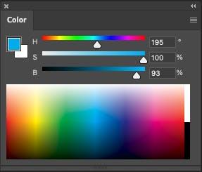
With these controls (found in most graphic design or image editing software) you can easily find the exact color, shade, and tint your heart desires, and not worry about RGB numbers at all– only how your image will print.
Can RGB images be printed?
Technically, no– RGB must be converted to CMYK mode first; either by you, your home printer, or the printing company you send it to. A new and novel technique is being developed to print using an RGB process, but it’s not widely available (and probably expensive).
What file formats are best for RGB?
PNG is the best format for RGB images because it allows for millions of colors, a transparent background, is compatible with most systems for digital display, and has a small file size.

JPG or JPEG is also an excellent format for RGB images. Universally compatible and the most popular image format. It allows for a variety of compression settings for smaller file sizes.
GIF should be used if your image is animated, or you’re looking for the smallest file size possible. The compression can change the look as it drastically reduces colors, depending on the settings.
PSD (Adobe Photoshop) s the standard file format for graphics in RGB format. You can convert to almost any color space and format for any platform or media.
What file formats are best for CMYK?
AI (Adobe Illustrator) is the standard file format for CMYK images. It’s a vector program so there are no issues with resolution or resizing graphics. Opening a new file defaults to CMYK.

EPS is a great format for CMYK because it has all the benefits of a vector file type but is compatible with other vector programs. It also has great compression for smaller file sizes.

PDF is another standard and great for CMYK files. It has many options for saving, file type, and compression. It saves bitmaps, vectors, and combination files. It also has a robust compression engine, just be careful. You may want to look into some of the save settings to get familiar.

For more info, check out my previous article about the four best file types for printing.
Should I convert my RGB image to CMYK for printing?
If you’re printing at home, your printer should automatically do the conversion for you. If you’re using a commercial print company, they will typically prefer to do it themselves, because they have more sophisticated conversion methods that are specially calibrated for the best print possible.
Here at Rush Order Tees, we are happy to accept images in RGB mode (as well as CMYK) and will covert and optimize your image for the best print result. Simply upload your artwork to our Design Studio and you’ll be on your way.
We also use two extra inks in our process: red and green, which help to give a more accurate representation of your original RGB image. The gamut (range of colors) is still not as wide as RGB, so there may be a slight shift, but it’s wider than regular CMYK.
Check out my previous article featuring an interview with experts for more about DTG printing.
How to convert your RGB image to CMYK in Photoshop
If you need to convert your RGB image to CMYK mode, the easiest way is to go to Image > Mode and select CMYK. But again, your document should not be converted unless it’s requested by your printing company.
The more advanced method is to go to Edit > Convert to Profile, and under “Destination space” there is a pull-down menu that will give you a dizzying array of selections to choose from. Under Conversion Options, specify a color management engine, a rendering intent, and black point and dither options (if available). Adobe recommends that only advanced uses convert their color profile.
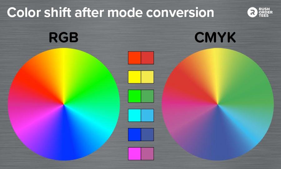
The better way to work is to keep your document RGB and preview your image in CMYK mode and then make color adjustments. You can do this under View > Proof Setup > Working CMYK. To switch to it, go to View > Proof Colors (or CMD+Y). Switching between modes will show you how the difference in gamut will affect your image.
What is a color gamut?
Color gamut refers to the range of possible hues within a color space. Different electronic devices (such as cameras, TVs, and smartphones) may use different color models and therefore different gamuts. Any color system which has numerically defined values will have its own gamut, including CMYK.
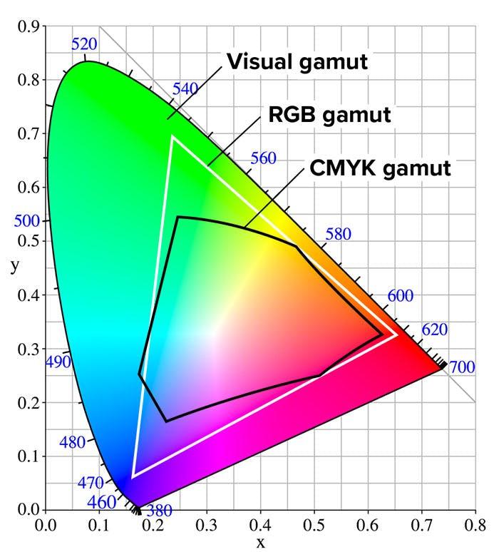
Ideally, we could reproduce all the colors seen by the human eye, which has the widest gamut of all. But no color system has achieved that. They are all limited to some degree. There are, however, different versions of RGB (sRGB, Adobe 1998, PhotoPro RGB, etc) which have increasingly wider gamuts.
Why does the K stand for black in CMYK?
Contrary to a popular belief that K is used instead of B so it’s not confused with blue, the K stands for “key”. In the printing process, the key plate or screen is used to line up (or register) the plates or screens to each other.
The black plate or screen is ideal as the key because it tends to hold more detail and data than the others.
What are spot colors?
The term spot colors come from the printing world and are specific colors you can choose for your design. Think of spot colors like individual crayons, paint tubes, or in this case, inks in buckets. Spot colors can be used individually or in addition to CMYK.
For example, let’s say you have a photographic image you want to print along with your logo, and your logo is always a particular green color. You will need the CMYK process for the photographic image, but you may want to add a spot color for the green, either because need the exact green for brand consistency (CMYK is not always accurate), or your green is very bright and out of CMYK’s gamut (range).

Normal screen printing jobs are typically done with spot colors because they are simple designs requiring only one or two colors. As the number or range of colors required increases, that’s when we start looking at CMYK as the print method.
There is also an advanced method called simulated process which uses spot colors with halftones, in a similar technique to the CMYK process.
Using the Pantone Matching System for specific spot colors
The Pantone Matching System is the premiere color matching system, widely used among industry professionals, and has 1,867 spot colors (and growing every year) in its catalog. Each color is designated with a numerical value followed by a C (coated) or a U (uncoated).
You can use their website to choose your colors, where you can find other useful tools, tutorials, and info. And make sure to look for their annual “Color of The Year” announcements, which usually become a news item.
We hope this quick guide helped you understand the two major color modes better. If you need any help setting up your design or have any questions about colors or inks, don’t hesitate to give us a call or chat.

About the Author
A graduate of the Multimedia program at the University of the Arts in Philadelphia, Imri Merritt is an industry veteran with over 20 years of graphic design and color separations experience in the screen printing industry.