
From the time Run-DMC hit the scene with their classic block logo three decades ago, to the popularity of Tech N9ne’s Strange Music gear today, hip hop has produced some of the most iconic, striking, and memorable logos in the history of the music business. Rap groups like Naughty by Nature and Wu-Tang Clan were early adopters of the idea of selling merchandise to fans directly, and in the process, turned their logos into instantly recognizable images of the era that still resonate with fans today.
Strong branding, that ability to create products that match the music, and continuous appeal to fans is more important than ever in today’s Internet era. In a world where selling music is a thing of the past, musicians need to supplement their income any way possible.
Hip hop is responsible for some of the most classic artist logos of the last several decades, and while almost all rappers visually brand themselves to some extent, here are 10 of the best to ever do it:
10. A Tribe Called Quest
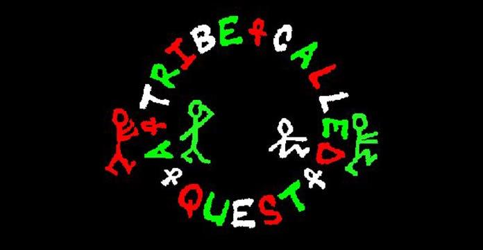
A Tribe Called Quest hit the scene in the late 80s with a jazz-influenced sound, a laid-back vibe, and an affiliation with the Native Tongues crew. They immediately became popular with hip hop heads, suburban kids, and college radio DJ’s alike. In 1991, ATCQ’s second album, The Low End Theory, featured the first appearance of the logo that would define the band for the next 25 years.
The logo, as seen above, featured playfully-drawn stick figures, each representing one of the original four members who appear to be on some kind of “quest.” The logo also features the red, black, and green color combination that was popular among Afrocentric artists of the time. The solid emblem truly gained ‘classic’ status over the next few years, as it was seamlessly worked into three of the most memorable album covers of the 90s. The Low End Theory (1991), Midnight Marauders (1993), and Beats, Rhymes & Life (1996) all featured the original design, in increasingly elaborate layouts. Collectively, these album covers elevated the original logo to its current popular state, which is still being sold on t-shirts, stickers, and hats today–almost two decades after ATCQ disbanded in 1998.
9. Naughty by Nature
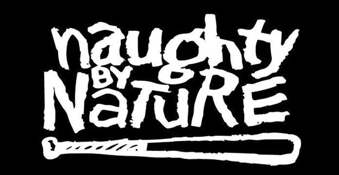
In the early 90s, Naughty by Nature found out that not only were a ton of people “Down with OPP,” they were also down with buying the band’s logo on everything, from t-shirts to bedsheets. The most notable rappers to emerge from East Orange, New Jersey will most likely be remembered for a string of party anthems including “OPP” and “Hip-Hop Hooray”, but they should be equally credited as being one of the first urban acts to truly capitalize on producing, marketing, and distributing their own merchandise directly to fans.
The logo itself is fairly simple, featuring the band’s name in a font that could be written either by a child (invoking the “naughty” part of the name) or an adult psychopath (more in line with lead rapper Treach’s image). The hand-drawn baseball bat reflects the one the band would carry on stage during shows. The logo was so popular as the group’s star rose in the early 90s that they decided to cut out the middle man and start Naughty Gear to make band merchandise. They soon began selling their rabid fans any merchandise they could possibly brand: t-shirts, sheets, comforters, towels, etc. This model became the prototype for every group attempting to capitalize on their logo, from Wu-Tang’s Wu-Wear in the mid-90s, to Tech N9ne’s Strange Music conglomerate today, and everything in between. It’s safe to say that without Naughty Gear the entire landscape of urban music marketing would look different today.
8. Eminem
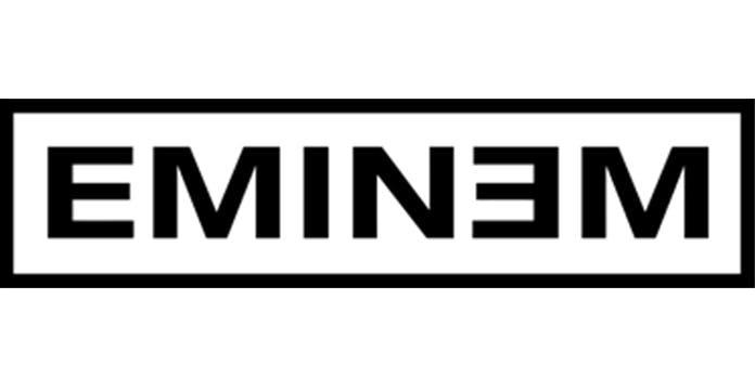
The best logos don’t have to be elaborately designed by the world’s greatest artists, but they do have to be recognizable, memorable, and unique to the artist. Eminem accomplished all of this, despite arguably having the most basic logo on this list.
By using the font commonly associated with an eye chart and reversing the second “E” on the artwork for his 2000 release The Marshall Mathers LP, Slim Shady finally had a logo that matched his unmistakable personality. The font related to his constant references to the medical profession (mental institutions, pharmaceutical drugs, etc.) and the backwards “E” became as identifiable with Eminem as the red & yellow “S” was with Superman.
7. Outkast
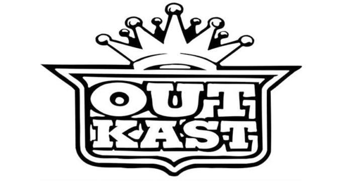
Outkast exploded on the hip hop scene in 1994, armed with a logo that immediately let the general public know they were bringing something new to the table. The artwork features the band’s unique spelling inside a slightly modified version of the Cadillac emblem. Their logo signified that, while the rest of the map was obsessed with foreign luxury cars (Acura, Lexus, Mercedes, etc.), the “Dirty South” was still into America’s original luxury vehicle.
Over the next decade, Outkast would release five classic albums that all featured the original logo in some capacity–an impressive feat, considering how unique each cover is compared to the others. The band would eventually experiment with alternative images (most notably an “O” with wings on their short-lived clothing brand), but the original Cadillac-inspired logo remains the one most fans remember as their introduction to Southern hip hop.
6. Roc-a-Fella
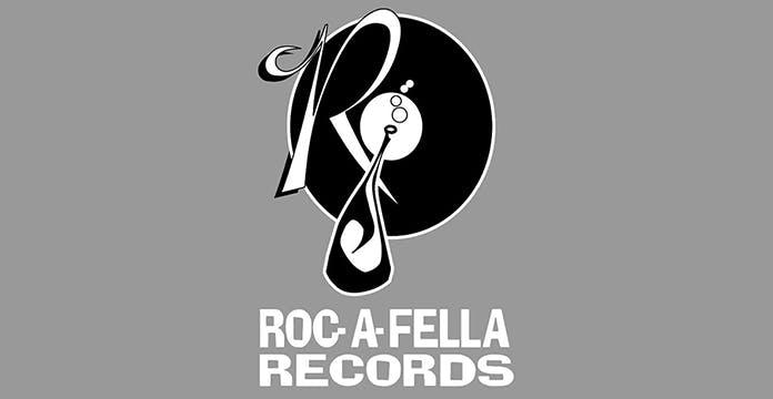
While Roc-a-Fella was technically a record label, it was also the name of Jay-Z and business partner Damon Dash’s clique. Debuting in the mid-90s, the label/crew’s logo featured imagery associated with both classic hip hop, and the generational wealth of the label’s namesake. The vinyl represented many DJs’ music during the era, the elegant cursive “R” looked like it came from the original Rockefellers, and the champagne bottle was the symbol of urban youth aspiring to higher levels of wealth and influence.
Jay-Z’s first recordings were released on the Roc-a-Fella imprint and as the artist and label ascended to near ubiquity in pop culture, the logo became a symbol of the kind of success possible for urban entrepreneurs and the entire hip hop generation.
5. Cypress Hill
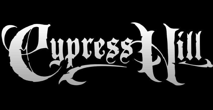
Cypress Hill was one of the first hip hop acts to rely on touring and merchandise sales for the majority of their income. By taking this cue from rock bands, they have remained a force in the music business for over 25 years and probably have more money than your favorite rapper.
The logo incorporated a slightly more “rock-n-roll” look than most graphics on this list, which made it appeal to a wide spectrum of consumers that might not normally be interested in rap music. The group expanded on the idea over the next few years by putting out albums by their Soul Assassin compatriots House of Pain and Funkdoobiest that featured unmistakable branding and logos still worn by fans today.
For proof of how successful Cypress Hill’s marketing plan has been, go to any of their sold out concerts and check out the long line at the merchandise table. There are not many rap groups that debuted during the first Bush administration that can say that.
4. Strange Music
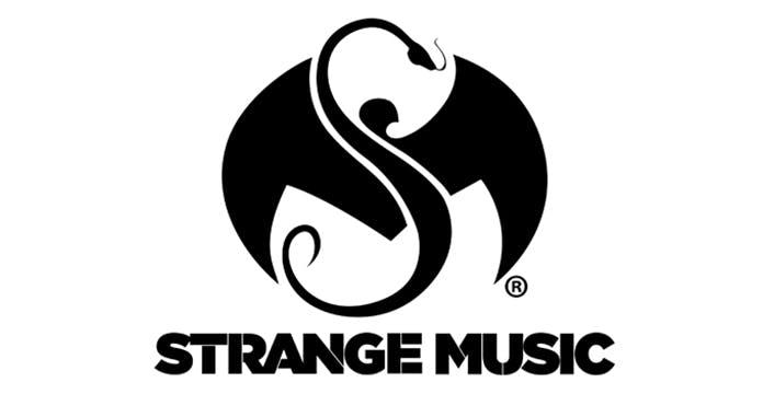
Kansas City’s Tech N9ne has dominated the Midwest rap scene for most of the 2000s with an aggressive merchandising campaign which allows fans to buy everything from winter coats to underwear with the Strange Music logo. The label’s name was inspired by classic rock band The Doors and the graphic features a snake in the shape of an “S” and a bat in the shape of an “M.” The logo and much of the merchandise looks more heavy metal than hip hop, but by sticking to the aesthetic for well over a decade, Strange Music as carved out a niche in hip hop merchandising that is as recognizable as any brand in the business.
Clearly influenced by Cypress Hill’s business model (see #5), Strange Music has become the most successful independent label in hip hop history. By supplying their hardcore supporters with an endless stream of quality releases and varied merchandise, Tech N9ne and his business partner Travis O’Guin have quietly created one of the biggest empires in the music business.
3. Public Enemy
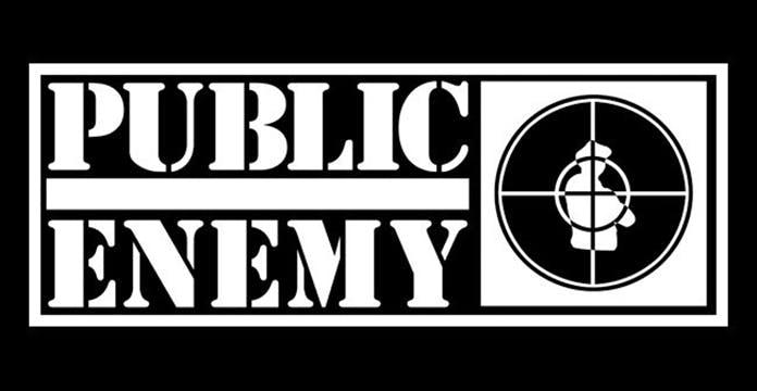
Strong stenciled letters. An iconic name. A B-Boy (break dancer) in the crosshairs of a gun. Is anything else really necessary?
Public Enemy has been making politically charged and socially conscious music for four decades. While frontman Chuck D. has rapped about hundreds of topics, the band’s classic logo has always stayed the same. Before becoming an MC, Chuck D. studied graphic design and was instrumental in the design of his band’s logo. The emblem has clearly stood the test of time and is arguably just as relevant in the current political climate as it was when it debuted in the 80s.
Public Enemy merchandise has always been popular as a symbol of protest. It has also been worn by diverse individuals such as Edward Furlong in the blockbuster T2: Judgment Day and Guns-n-Roses lead singer Axl Rose. PE gear is stills somewhat popular in the U.S., but sells even better overseas where the band continues to tour extensively.
2. Wu-Tang Clan
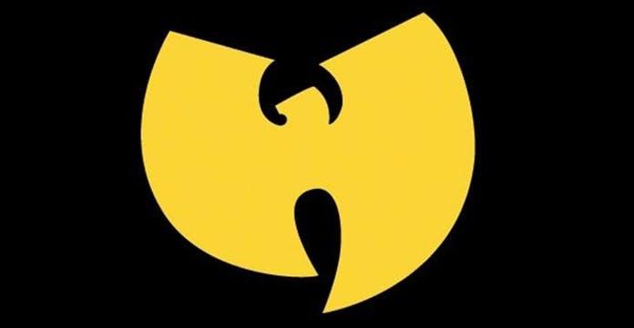
Few bands have ever attacked the music scene the way Wu-Tang Clan did in the 90s. Their assault included a classic debut album, solo albums from several individual members, a clothing line, a video game, limited edition sneakers, skateboard decks, and as much crossover success as any hardcore NYC rap group of all time. In the center of all of this was the iconic “W” that remains one of the most archetypal logos in all of music.
Simple in design, but powerful in impact, the “W” was eventually used in several incarnations to represent the individual members (upside down as an “M” for Method Man, Sideways as a “G” for The GZA), but always remained a symbol of the mighty clan from Staten Island that emerged “up from the 36 chambers” and took over hip hop.
The logo remains popular today, and is even sold on custom t-shirts in chain stores like Hot Topic and Target to a whole new generation that still knows “Wu-Tang is for the children.”
1. Run-DMC
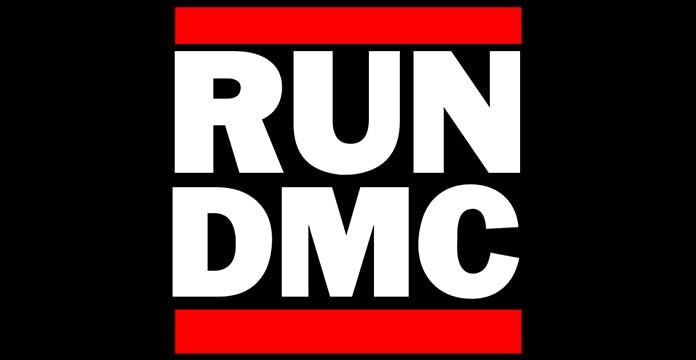
It’s widely accepted that Run-DMC ushered in a new era of hip hop. It should also be acknowledged that with their classic logo design, they ushered in a whole new era of hip hop marketing. The logo was bold, brash, simple, and most importantly, strong. Whereas earlier rappers tried to soften their image and align their sound and branding with the world of disco and R&B, Run-DMC went in the complete opposite direction and proudly displayed their connections to NYC’s punk rock and graffiti scenes.
The logo was such a hit during Run-DMC’s run in the 80s, that eventually Adidas picked them up as their first non-athlete endorser and put Run-DMC merchandise (sweat suits, t-shirts, and of course, Shell Toe Sneakers) in malls across America. This intersection of music and merchandise would be repeated countless times over the next several decades, best exemplified in Adidas’s 2015 collaboration with Kanye West that produced one of the most sought after shoes of the decade.
Run-DMC brought hip hop to the mainstream in an unprecedented manner, and their logo and partnership with Adidas still remains one of the most important moments in music history over three decades later.
About the Author
RushOrderTees is a nationwide leader in custom apparel. Our screen printing, digital printing, and embroidery services create t-shirts, hoodies, hats and related apparel for individuals as well as group. Our staff regularly contributes knowledge and expertise to our blog to help those interested in creating custom apparel.