

T-shirts are a uniquely American fashion item that spread to the rest of the world, and the famous designs emblazoned on them each have a history of their own. In this series, I’ll be highlighting the most iconic designs in the T-shirt universe, diving into their origin stories, what made them so popular, then taking a look at where they are today and what they inspired.

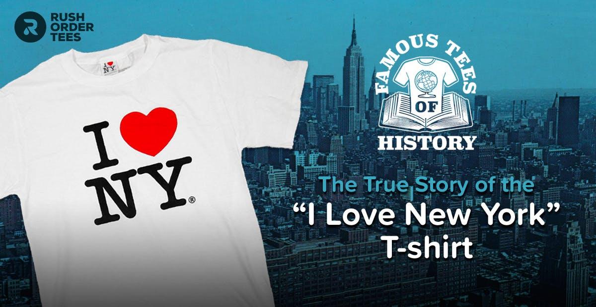
I Heart New York
As we approach Valentine’s day, it seemed like the perfect opportunity to start this series off with what is arguably one of the most iconic T-shirt designs of all time, and widely considered to be the most influential branding campaigns in history. And like many great things, it started out as a napkin sketch. Or in this case, an envelope.
As the story goes, it was a dark time for New York City in the ’70s. Crime was up, and tourism was down– along with the economy. Times Square was not seen as the center of the world as it is today– more of a seedy and sketchy place to avoid, especially if you were with your kids. New York desperately needed a makeover, especially in the public consciousness.

The ad agency Wells Rich Greene had been hired to create a campaign that would cast the city in a positive light, therefore boosting tourism and the economy. They came up with the slogan “I Love New York” along with a broadway-inspired song and a TV commercial. But there was something conspicuously missing– they needed a logo.
Before we get to that, let me share a lesser-known part of this origin story.
Meet Mary Wells Lawrence
The original creator of the “I Love New York” campaign was a pioneering female professional. Mary Wells Lawrence was the founding president of Wells Rich Greene, and the first female CEO of a New York Stock Exchange-listed company. By 1969, Lawrence was reportedly the advertising industry’s highest-paid executive, and she went on to have a distinguished career.

Back to the ad agency needing a logo for their campaign.
Enter the graphic designer Milton Glaser. In his first meeting with the agency in 1976, he produced a torn envelope in which he had scribbled out the logo idea. In red crayon. While in a cab. On the way there. That simple idea would end up becoming a cultural phenomenon, a global icon, and helped make New York City the beloved metropolis it is today.

He essentially used an emoji before emojis were a thing. By using this ideogram (emojis before they were called emojis) along with NY, the shorthand for New York, Glaser simplified the message to three letters and a symbol.

To be fair, people have used the heart shape as a shorthand for love for centuries, and it has its own interesting history.
But it was a first: The I ❤ NY logo was the first instance of an ad campaign using a heart in place of the word love.
When it came time to create the design, he stacked the “I ❤” on top of the “NY”, which he later admitted was inspired by Robert Indiana’s famous LOVE sculpture. This turned the graphic into a classic: elegant in its simplicity, yet unpretentiously earnest. It works at sizes large and small. It works on a black background as well as white. It also worked for the city.

An icon was born
Simple white T-shirts printed with the pop-art style logo became a huge hit and helped rapidly spread the image and the message in a way that would be akin to a meme going viral today. It began appearing on everything from stickers to mugs to license plates and much more.
With so many people trying to move out of the crime-ridden city, the heart design struck a chord with those who didn’t want to go, and became somewhat of defiant rallying cry.
“People were moving out and the people who were here wanted to be able to say ‘I Love New York’.” he explained. It was a real, deeply-felt desire and there were so few opportunities that any of us have to express the deepest things we feel.”
Soon it seemed like everyone wanted to proclaim that they, too, loved New York– in the city, and beyond.
Tourism was suddenly on the upswing, thanks in no small part to the campaign, helped along by economic initiatives and a crackdown on crime. The New York State Department for Economic Development, which holds the trademark to the “I Love New York” logo and licenses its use, reportedly generates more than 0 million a year to this day.

Ironically, Glaser’s love letter to New York in the rounded slab serif typeface American Typewriter was created entirely pro bono (free), as his way of helping the city get back on its feet. “That’s what it should be,” he told graphic designer Chip Kidd in an interview. “You want to do things like that, where you feel you can actually change things.”

A meme before there were memes
The campaign, which was expected to go for months, ended up sticking around for years. It became ingrained into the public consciousness and New York culture, going from sitting solely on marketing materials to living on a variety of promotional materials and souvenirs. The “I ❤” phrase has become a staple in souvenir shops and stores across the globe.
Ever since it was first created, many retailers and organizations have co-opted the concept to inspire those same feelings. From blatant knock-offs being sold by vendors on street corners to high-profile brands co-opting it for their purposes, to endless parodies and references, this simple graphic has truly taken on a life of its own.

Inspiration from tragedy
Following the events of 9/11, Milton Glaser returned to his most famous work. In this new version reaffirming love for the city, the heart represents Manhattan and the black mark, the area of the attack. He explained that it was a reflection of “what all of us were experiencing after the tragedy, a deepening of our sense of love and commitment to the city that is our home.”
The updated design appeared on the cover of the Daily News and on posters for the School of Visual Arts around New York.

Milton acknowledges that he’s put his stamp on the city in a way that few other natives have had, but he takes it all in stride, and attributes much of it to the inspiration of his true love of the city. And what he loves about it is its diversity.
“The great thing about New York is it’s not a single place. New York has a kind of mind set,” he says proudly. “Anywhere you are in Paris, you know you are in Paris. But if you are in New York, you turn a corner and you are some place else. It’s so complex and has so many attributes that you have to invent it.”
How about now?
Recently, New York pulled out all the stops to woo Amazon into building a new headquarters in the region, even offering billion in subsidies to make the deal happen. But nothing shows just how much the state was prepared to give away than what it did to its own logo. In its submission to Amazon, the city replaced the famous “I Love NY” logo with “I Amazon NY.”

What did Milton Glaser think of it?
“Outside of copyrighting everything you do, there is almost no way of protecting your work from being imitated,” said Glaser in a statement. “In this particular case, the Amazon logo is not very harmonious with the rest of the logo.” In design speak, that’s throwing some shade. And his team implied that he would have said no to this– if he had been asked.

Glaser takes on limited projects at this point in his career, but if anyone can rest on their laurels, it’s him. He’s widely considered to be among the greatest graphic designers and the godfather of modern design. Now that’s love.
To this day, the trademark owner, Empire State Development Corporation, continues to sell the “I ❤ NY” design on any swag they can print on, while tirelessly chasing down copyright infringements.

Hope you enjoyed this. Look for more entries in my Famous Tees of History series coming soon.
Ready to create your own iconic graphic? Start designing now.
Love,
-M