
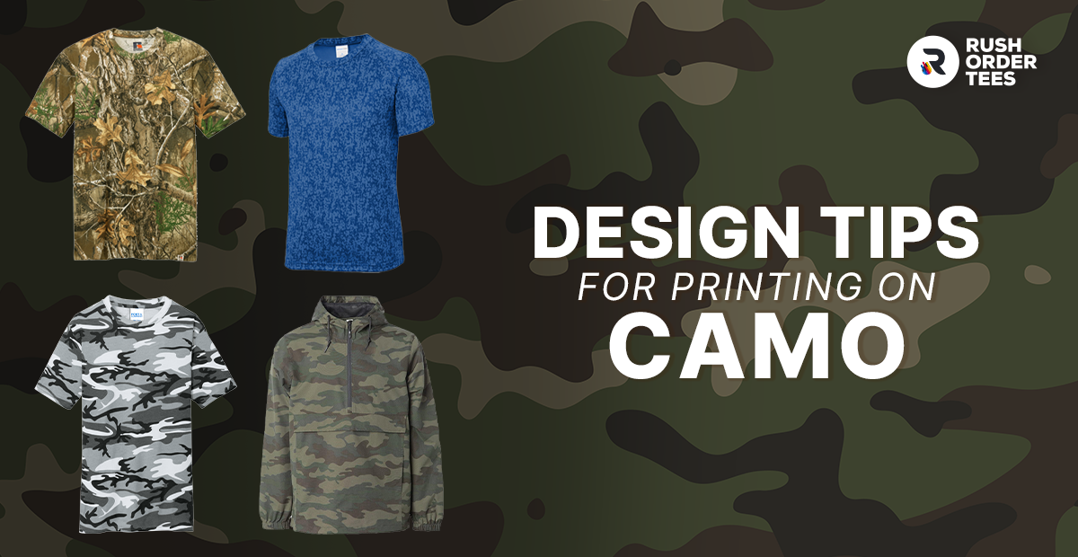
Camo has come a long way from its military roots. The origins were about blending in—now it can be about standing out. What started as tactical gear has become a staple in streetwear, workwear, and custom apparel, showing up on everything from hunting jackets to fashion hoodies. The bold, complex patterns that once helped soldiers disappear now help brands and individuals make a statement.
As you might imagine, printing on camo isn't like printing on a solid-colored shirt. Those intricate patterns create unique challenges that can make or break your design. Get it wrong, and your logo disappears into the background or clashes with the pattern. Get it right, and you've got custom apparel that looks intentional, professional, and genuinely awesome.
This guide breaks down exactly how to design for camo: which patterns work best with different decoration methods, how to make your artwork pop without fighting the background, and the technical considerations that separate amateur attempts from pro results. Whether you're creating team gear, branded workwear, or street-ready merch, these tips will help you nail the execution.
Know Your Camo Type Before You Design
Camouflage patterns were originally engineered to disrupt the human eye's ability to recognize shapes and forms—blending wearers into their surroundings through irregular patterns and varied tones. While dozens of specific camo designs exist, they generally fall into five main categories based on their visual characteristics and intended environments. Understanding which type you're working with is the foundation for making smart design decisions.
What all camo patterns share is a careful balance of randomness and repetition, combined with multiple tonal values—lights, mids, and darks—that create visual complexity. This multi-tonal nature is exactly what makes printing on camo challenging; your design needs to work across all those shifting values simultaneously. That original military purpose of disrupting visual recognition means you're essentially competing with a pattern designed to hide things. Here's a closer look at each main type and what it means for your custom printing project.
1. Woodland/Traditional Camo
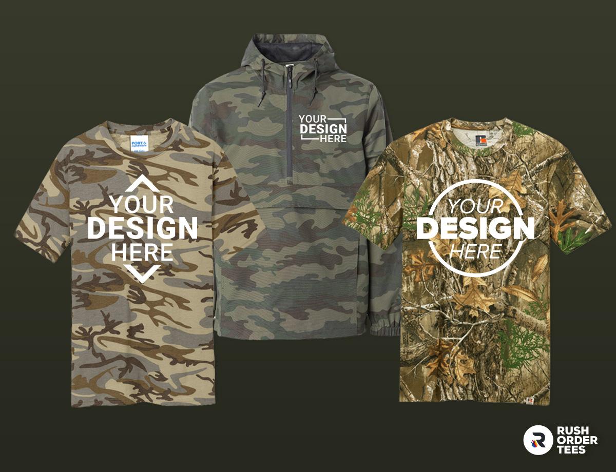
The classic. Woodland camo features large, organic blobs in greens, browns, and blacks that mimic forest environments—think thick branches, leaves, and shadows. The shapes are bold and irregular with high contrast between the darkest and lightest areas, creating that iconic military and hunting look. This pattern also comes in desert/tan colorways (same shapes, different palette), which has become popular in workwear and tactical gear. The chunky pattern provides plenty of visual breathing room for designs, and the distinct color zones make it easier to find spots where your logo can land without fighting too many competing values at once.
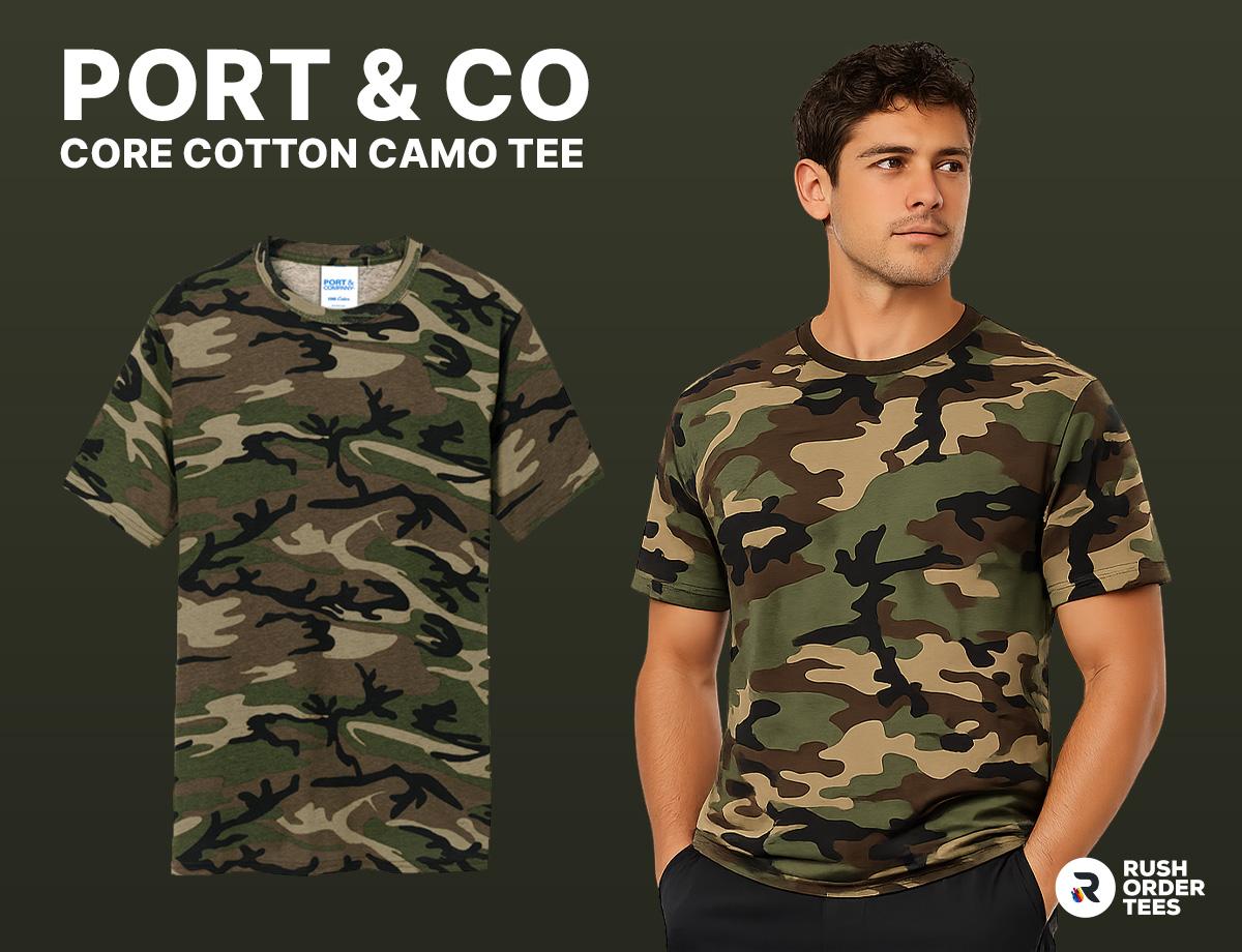
Example: Port & Co Core Cotton Camo Tee (Style: PC54C)
2. Digital Camo
The modern, tactical evolution. Digital camo uses small squares or pixels to create a fragmented, almost computerized appearance—think Marine Corps MARPAT or various military digital patterns. These geometric patterns have tighter, more uniform repetition than traditional camo, creating what can look like visual static up close but blends effectively at distance. The pixelated structure gives it a contemporary, tech-forward vibe that works well for law enforcement, security, and brands going for that tactical aesthetic. The smaller pattern scale means your designs need to be bolder and simpler to avoid getting lost in all those tiny squares.
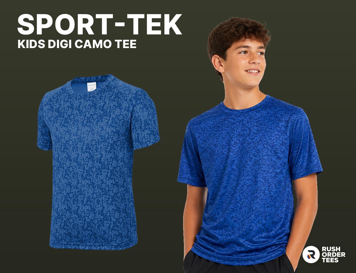
Example: Sport-Tek Kids Digi Camo Tee (Style: YST460)
3. Stylized/Urban Camo
The fashion-forward wild card. This category includes everything from geometric hex patterns to abstract gradients to barely-recognizable interpretations of traditional camo. Urban camo might use grays, blacks, and whites in angular shapes for a city-tactical look, while fashion camo can incorporate unexpected colors like pink, blue, or purple. Some patterns like hex-camo create a honeycomb structure that's more graphic design than actual camouflage. This is where camo becomes purely aesthetic rather than functional—funky, experimental, and designed to make a statement rather than hide anything. The variety here is huge, so print considerations depend entirely on your specific pattern's density and color palette.
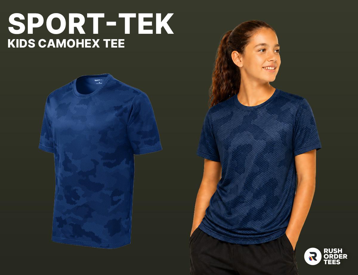
Example: Sport-Tek Kids CamoHex Tee (Style: YST370)
4. Hunting Camo (Realtree)
The hyperrealistic approach. Realtree and similar hunting-specific patterns use photographic or illustrated elements—actual leaves, branches, bark textures—to create incredibly detailed, naturalistic camouflage. These patterns are dense and intricate with tons of fine detail and color variation, designed to genuinely fool animal vision in the field. The busy, lifelike nature makes this the most challenging camo type for custom printing because there's so much visual information competing for attention. Your design needs serious contrast and simplification to read clearly against all that realistic detail.
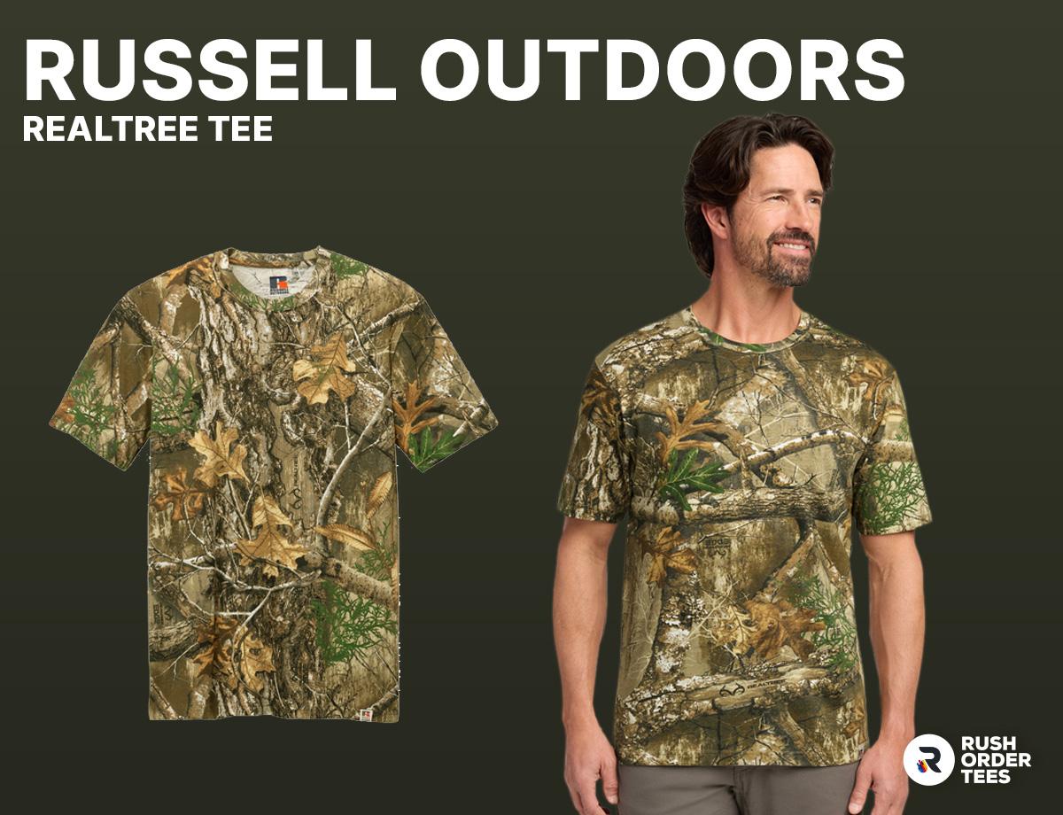
Example: Russell Outdoors Realtree Tee (Style: RU100)
5. MultiCam/Hybrid Camo
The sophisticated option. MultiCam and similar hybrid patterns layer multiple colors and scales to work across varied environments—blending elements of woodland, desert, and transitional terrain into one complex pattern. You'll see more color variation here than traditional camo: greens, tans, browns, and even hints of pink or orange, all working together in smaller, more intricate shapes. This is optimized camouflage for actual field use, which means it's visually busy and requires careful design choices. The pattern density and color complexity demand bold, simplified artwork, but when done right, it looks incredibly professional and current.
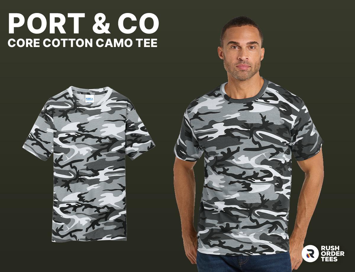
Example: Port & Co Core Cotton Camo Tee (Style: PC54C)
Pro Tip: Know Your Audience
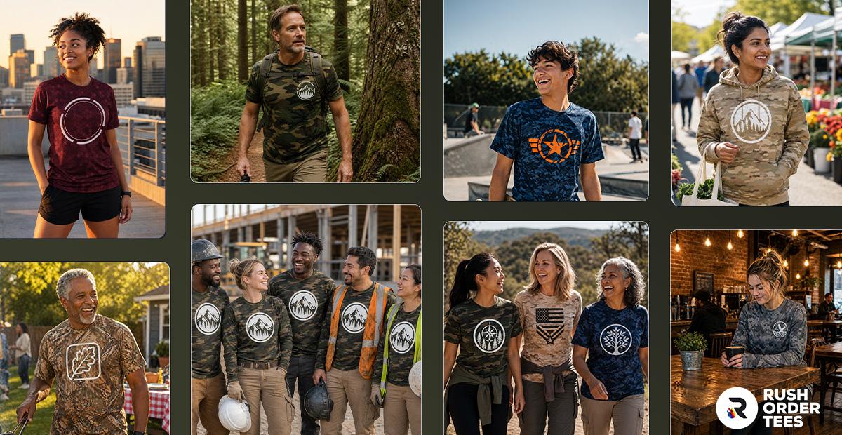
Different camo types signal different things to different audiences, and getting this wrong can undermine your project. For serious tactical and outdoor professionals, traditional/woodland camo can look dated and generic—the kind of stuff you see at boardwalk t-shirt shops. But flip it around: stylized urban camo won't fly with hunters or military-adjacent buyers who need patterns that communicate authentic function. Digital and MultiCam work well for law enforcement, security teams, and contemporary tactical brands.
All these camo types—even hyperrealistic Realtree—have found their place in fashion and streetwear. The difference isn't whether you can use hunting camo for streetwear (you absolutely can), it's how you approach the customization. A bold graphic treatment on Realtree can look fresh and intentional, while the same design on traditional woodland might read as generic outdoor merch. Match the camo type to your audience's expectations, then use your design approach to make it yours.
Making Your Artwork Stand Out
The fundamental challenge with camo is that it's designed to disrupt visual recognition—which means your design is fighting an uphill battle from the start. Success comes down to creating enough contrast between your artwork and the pattern beneath it. This doesn't mean your design has to scream; it means you need deliberate strategies that let your branding cut through all that visual complexity without getting swallowed by it.
Recommended Contrast Strategies
- Use bright white ink or transfers - White creates the strongest contrast against camo's typically dark and mid-tone values, giving your design maximum pop. Whether you're screen printing or using DTF transfers, white is your most reliable weapon.
- Add bold, vibrant colors - Bright oranges, electric blues, hot pinks, and other saturated colors create instant separation from camo's natural, muted palette. These eye-catching hues demand attention and keep your design from blending into the background.
- Avoid mid-tones that blend with the camo palette - Stay away from colors that touch greens, browns, tans, and grays—these will merge with the pattern underneath and disappear. Stick to extremes: bright, saturated colors or stark black and white.
- Put your design in a shape or outline - Placing your artwork inside a circle, square, or oval breaks up the camo pattern and creates a defined space where your design lives. This containment makes everything read cleaner, almost like creating a patch effect on the garment.
- Use thick typography strokes - Add a substantial outline or "moat" around all lettering—black stroke around white text, white around black, or contrasting colors. This buffer zone prevents letters from disappearing into similarly-valued areas of the camo pattern.
- Simplify and enlarge your design - Intricate details get lost against busy camo. Go bigger and bolder than you normally would, stripping away fine lines and small elements that won't register clearly.
- Leverage negative space strategically - When the camo pattern shows through parts of your design and creates visual interference, fill those problem areas with solid color. Being selective about where the pattern peeks through versus where it stays covered gives you control over the final look.
- Create a solid background panel - Place your entire design on a solid-colored rectangle or banner that completely blocks the camo underneath. This gives you a clean canvas to work on while still showing enough camo around the edges to get the aesthetic benefit.
- Use high-contrast graphic elements - Bold geometric shapes, thick borders, and strong graphic frames all help separate your design from the complexity beneath it, creating a clear visual hierarchy.
Pro Tips
- Make your design look like a patch - The shape and border naturally create contrast even before you add graphic treatments like bevels, highlights, or shading. Think emblems, badges, or tactical insignia—that defined perimeter solves the visibility problem from the start. Better yet, you can use actual DTF patches for this effect, which we'll cover in the printing methods section.
- The 10-foot test - Step away from your computer screen. Can someone read your design from across the room? If it doesn't pass this distance test on your monitor, it definitely won't work on actual camo fabric. You can also print your design to size on a home printer, cut it out, and tape it to a sample garment to preview the real-world result. Our advanced Design Studio gives you accurate mockups too.
- Don't try to work with the pattern - Treat camo as a textured background rather than trying to blend with it or design around specific pattern elements. Every camo garment is cut differently from the fabric roll, so pattern placement varies from piece to piece and across different sizes. What looks perfectly aligned on one shirt will be completely off on another, making any attempt to coordinate with the pattern impractical and ineffective. Your design should float on top of the camo, not interact with it.
Design Styles That Work Best on Camo Apparel
Not every design style cuts through camo effectively—you need approaches that aggressively stand out against the pattern's visual complexity. Here are the styles and techniques that consistently deliver clean, readable results on camouflage fabrics.
- Thick line art - Bold, solid linework reads clearly against camo's complexity, while halftones and gradients can get muddy and lost. Stick to strong, defined edges that won't blend into the pattern's tonal variations.
- Bold typography - Chunky, substantial letterforms cut through visual noise better than thin, delicate, or script fonts. Sans serif generally outperforms serif typefaces, especially when text sits directly against the camo pattern without a background shape.
- Icon-driven graphics - Simple, recognizable symbols and icons work far better than detailed illustrations or photographic elements. Think logos, emblems, and graphic marks that communicate instantly rather than imagery requiring close inspection.
- Solid shapes over thin strokes - Filled shapes and thick forms provide more visual mass than outline-based designs. While outlines can help define edges, solid backgrounds and substantial graphic elements deliver stronger contrast and clearer recognition.
- Minimalist designs with high contrast - Clarity beats complexity every time on camo. Strip your design down to essential elements with maximum contrast between light and dark values, keeping it simple rather than trying to pack in too much detail.
- Detailed art needs extra support - Complex artwork can work on larger-scale designs if you give it thick outlines or place it on solid background shapes. The detail itself won't carry the design—the contrast framework around it will.
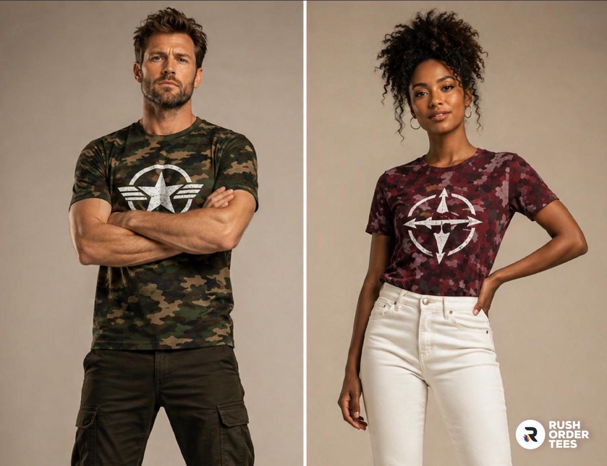
- Juxtaposition creates natural contrast - Designs that look like they weren't meant for camo—clean geometric patterns, refined corporate logos, elegant script on solid panels—create interesting tension that makes both the design and the camo pop. The unexpected pairing works in your favor.
- Style inspiration - Look to military insignia, stencil art, tactical badges, graffiti lettering, and block fonts for proven approaches. These aesthetics evolved specifically to read clearly in tactical and street contexts, making them natural fits for camo applications. Current fashion trends in streetwear also offer strong reference points for what resonates.

Print Size and Placement for Maximum Visibility
Print placement on camo isn't dramatically different from solid-colored garments—any standard location can work as long as you're following the design principles we've covered. Start by testing your artwork at the left chest, center chest, full front, and full back to see where it reads best. If a smaller placement like the left chest gets lost in the pattern, move up in size: left chest to center chest to full front.
Tips
- Keep in mind the tradeoffs that come with larger prints—more surface area means heavier ink coverage that affects the garment's drape and breathability, especially with screen printing.
- Rather than automatically scaling up when a design isn't working, it's usually better to adjust and simplify your artwork first. A cleaner, bolder design at your preferred size will outperform a complex design blown up to compensate for poor contrast.
Printing on Camo with RushOrderTees: What You Need to Know
Screen printing delivers the best results for larger orders with simpler designs and limited color counts. The process creates vibrant, durable prints that hold up through countless washes, making it ideal for team gear, event apparel, and bulk orders where you're using one to three colors. White ink performs exceptionally well on camo through screen printing, giving you that strong contrast needed to cut through the pattern. Setup costs make this method most economical when you're ordering in volume.
DTF (Direct-to-film) transfers excel with smaller order quantities, full-color designs, and artwork featuring photographic elements or gradients. DTF handles complex graphics that would be cost-prohibitive with screen printing, offering unlimited colors without additional setup charges. The prints are soft, flexible, and durable, working beautifully on the synthetic and cotton-blend fabrics commonly used in camo apparel. If your design has intricate detail or you're only ordering a few pieces, DTF is your best option.
Embroidery brings a premium, dimensional look to hoodies, sweatshirts, jackets, and hats—perfect for upscale merchandise or company swag where quality perception matters. The raised thread work naturally creates contrast against camo patterns, and the durability is unmatched for items that see heavy wear. Keep designs simple and moderately sized; embroidery works best with bold, clean artwork rather than fine details. This method elevates any camo piece into professional-grade branded apparel.
DTF patches offer incredible versatility as a strong alternative to embroidery across virtually any garment type. These heat-applied patches can go on t-shirts, hoodies, jackets, bags, and hats with consistent quality and appearance. They deliver that premium patch aesthetic without the limitations or cost of embroidered patches, and they're particularly effective on camo because they create a defined design area with built-in contrast. One patch design can be applied across your entire product line for cohesive branding.

Camo Done Right: Contrast, Clarity, and Confidence
Camo design succeeds when you choose the right pattern for your audience, prioritize contrast at every decision point, use bold and readable artwork that fights the visual complexity, place your design thoughtfully, and match your print method to both your artwork style and order size. These aren't optional considerations; they're the fundamentals that separate professional custom camo apparel from designs that disappear into the background. Get these elements right, and you'll create gear that looks intentional, stands out in the right ways, and actually gets worn.
RushOrderTees handles thousands of camo orders every year. We know which decoration methods work best on different camo types, how to optimize artwork for maximum contrast, and which technical adjustments make the difference between designs that pop and designs that flop. Our team reviews every order and flags potential issues before production, ensuring your finished apparel looks as good as you imagined—or better. Want help prepping your artwork? Our design team can refine your camo design or build something from scratch that's optimized for the pattern and print method you're using.

About the Author
A graduate of the Multimedia program at the University of the Arts in Philadelphia, Imri Merritt is an industry veteran with over 20 years of graphic design and color separations experience in the screen printing industry.