
Custom cropped apparel has a shorter canvas than standard garments, which means your logo placement needs a little extra thought. A design that sits perfectly on a full-length tee might land too low, get lost near the hem, or look oddly spaced on a cropped piece. The good news: once you understand a few basic principles, you can place your logo with confidence on any cropped style.
In this guide, we'll cover general placement considerations that apply across all cropped apparel, then get into specific recommendations for cropped tees, cropped hoodies, and cropped tanks. We'll also share exact measurements, sizing guidance, and the most common mistakes we see (so you can skip them entirely).
Worth noting before you start designing: when you use our Design Studio, any logo positioned close to a standard placement will default to that standard location when our art department sets up your order. If you're going for something more specific or creative, add a Design Note with your order so our team knows exactly what you're after. And if anything in your setup needs adjusting, we'll reach out to make sure the final product matches your intention as closely as possible.
What To Consider Before You Print
A few universal principles apply to logo placement on cropped apparel, regardless of the garment style. Keep these in mind before you start setting up your design.
- Standard placements still apply. The usual print locations (left chest, center chest, upper back, etc.) are based on where the design appears on the body, not where it sits relative to the garment's edges. A left chest logo on a cropped tee goes in the same spot as it would on a full-length tee. The difference is that on a shorter garment, your design will naturally appear closer to the bottom edge. That's fine. Resist the urge to bump everything up a few inches just because the shirt is shorter.
- Large vertical prints are off the table. Full front and full back designs that work on standard-length garments simply don't have the real estate on a crop. We don't recommend taking a tall design and just shifting it higher, either. Instead, design with the available print area in mind. Smaller logos, horizontal layouts, and compact graphics all translate well to cropped pieces.
- Garment fit changes the equation. A boxy, relaxed crop drapes differently than a slim, fitted one. Boxy crops give you a flatter print surface and more room for centered or oversized-width graphics. Fitted crops stretch more across the body, which can distort detailed artwork or warp larger prints. Factor in the fit before you finalize your design size.
- Cropped pieces move more during wear. Shorter hems ride up, shift, and bunch more than full-length garments, especially during activity. If your logo sits near the bottom of the garment, expect it to fold or partially disappear at times. That's worth thinking about for functional branding (team names, sponsor logos) where full visibility matters.
- Neckline affects chest placement. A crew neck, v-neck, and scoop neck can sometimes change where "center chest" actually begins. Deeper necklines can push the starting point of your design lower on the body, so a center chest logo on a scoop-neck crop will read differently than the same placement on a crew neck. Check your specific garment's neckline before locking in placement.
- Designing to the edge is an option. If you want your graphic to extend past the cropped hem, as if the design was sliced through with the fabric, that can look sharp. You can position your artwork over the edge in our Design Studio and our art department will set up the print so it's cut appropriately at the hem. Include a Design Note to confirm that's your intent. Keep in mind that prints can't extend all the way to the raw edge due to technical constraints, so there will always be a small margin, typically 0.5" to 1" from the hem.
- There's room to get creative. These are guidelines, not laws. If you're a fashion brand or merch designer looking to do something unexpected with placement, go for it. The idea is to know the standard rules so you can break them intentionally. Just use a Design Note to communicate your vision, and our team will work with you to execute it.
Best Logo Placements for Cropped Tees
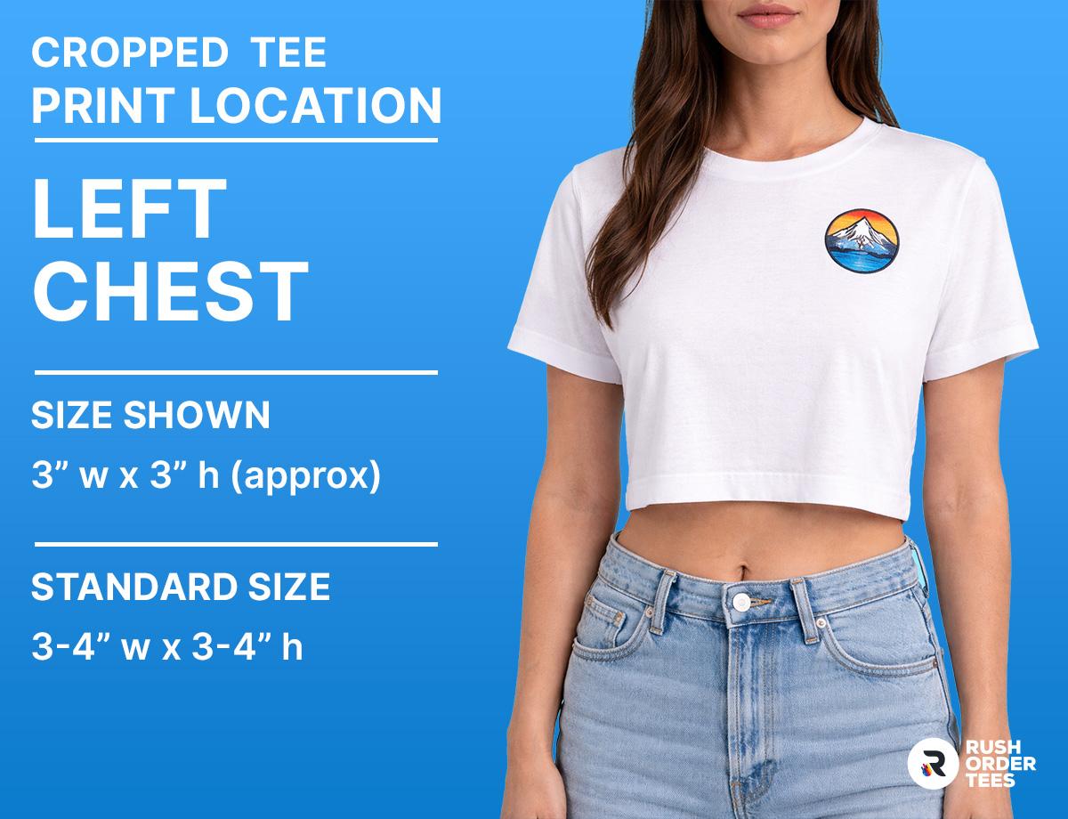
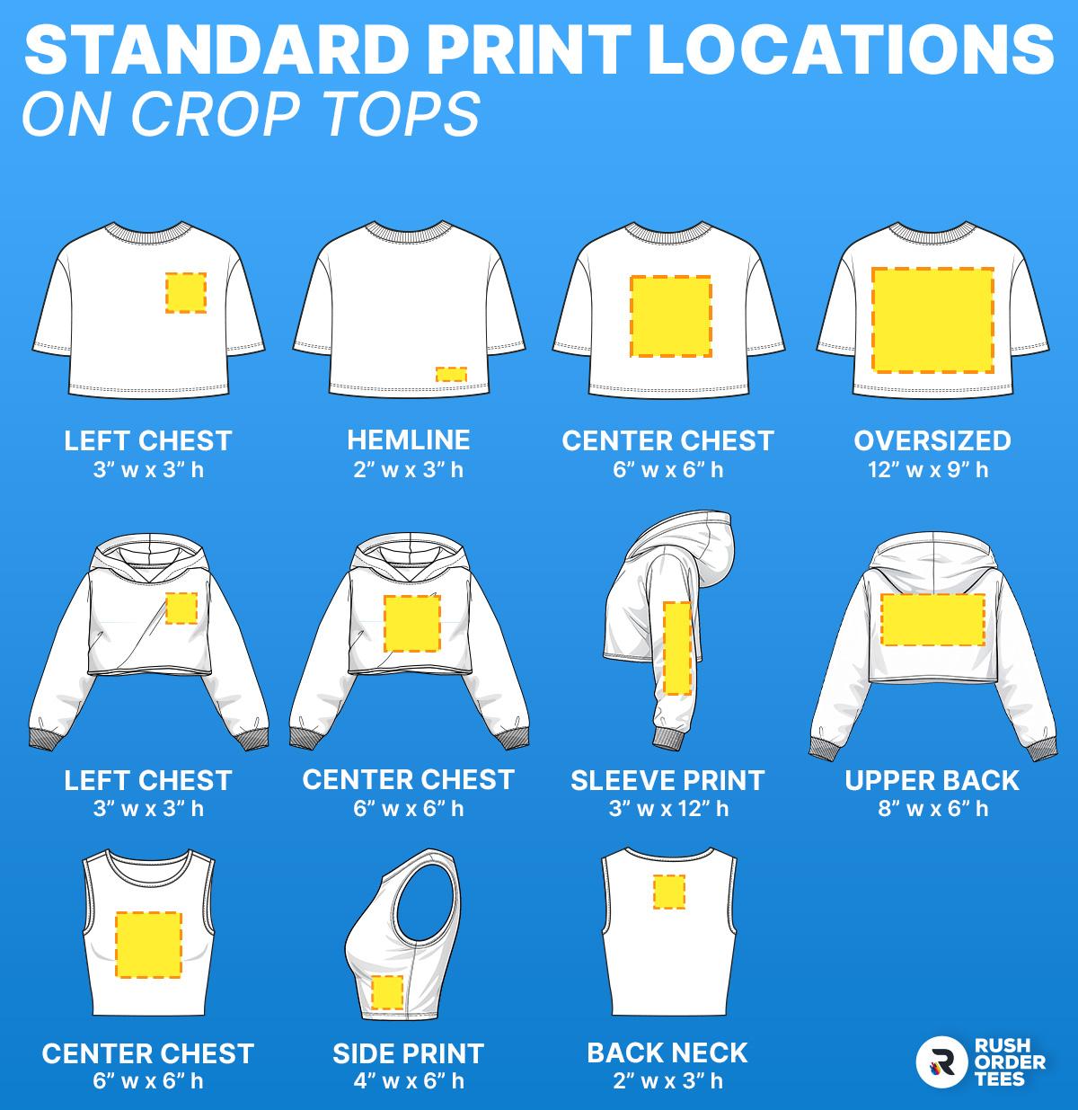
Left Chest (Mini Logo)
The left chest is the most versatile placement on a cropped tee, and it works on practically every fit, from boxy to slim. Keep the logo between 3" and 4" wide, same as you would on a standard tee. This placement reads clean and intentional whether you're printing for a brand, a team, or an influencer merch drop. It pairs especially well with boxy crops, where the relaxed silhouette gives the small logo room to breathe. If you want a second print location, a left chest plus an upper back or sleeve creates a balanced, polished look without crowding the garment.
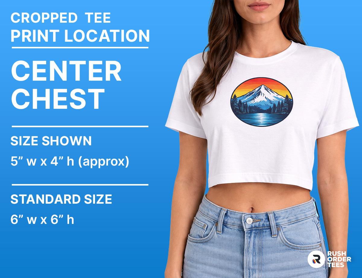
Center Chest (Small to Medium Logo)
Center chest works well for slogans, simple icons, and minimalist branding. On a cropped tee, place the design about 2" to 2.5" below the neckline, which keeps it high enough to read well on the shorter body. Size-wise, aim for 6" to 8" wide rather than pushing toward the 10" range you might use on a full-length shirt. This is a strong choice for screen printing a single-color wordmark or a clean graphic that you want front and center.
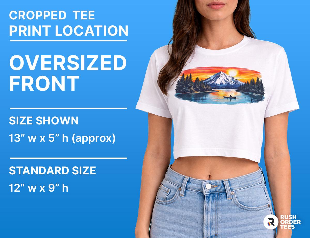
Oversized Front Graphic
An oversized print on a crop is a different animal than on a standard tee. You're working with less vertical space, so think wide rather than tall. Keep the top of the graphic close to the neckline (2" to 3" below) and let it fill the width of the garment, up to about 12" to 14" depending on the size run. This placement lands best on boxy, relaxed-fit crops where the fabric lays flat. On fitted crops, large graphics are more likely to stretch and distort. If your design extends toward the hem, revisit the edge-printing tip from the previous section.
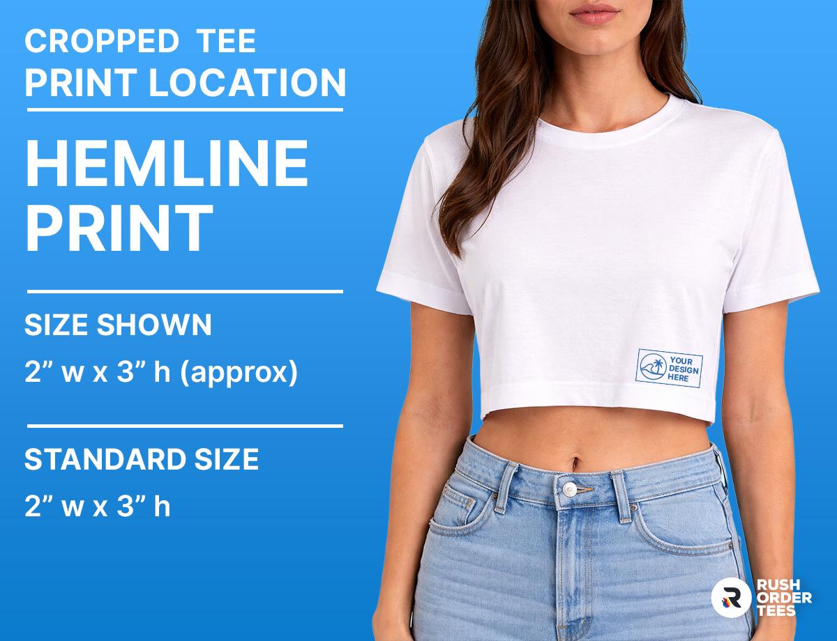
Hemline Prints
Hemline placement puts your logo or wordmark right along the bottom edge of the crop, which gives off a subtle, streetwear-influenced look. This works best as small, horizontal branding, think a brand name, URL, or simple icon running across the lower 2" to 3" of the garment. Keep in mind the 0.5" to 1" margin from the edge, and remember that this area is the most likely to shift, fold, or ride up during wear. It's a cool accent placement, but not the spot for anything that needs to be legible at all times.
Best Logo Placements for Cropped Hoodies
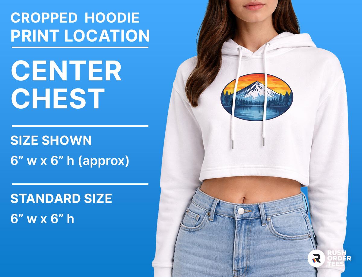
Center Chest (Medium Logo)
Cropped hoodies tend to run roomier and boxier than cropped tees, which gives center chest prints a nice, balanced canvas. Place the design about 2" to 2.5" below the neckline and keep it in the 6" to 10" range. The extra fabric weight of a hoodie holds the print in place better than a lightweight tee, so you can go slightly larger here without worrying as much about distortion. This is a go-to for gym brands, campus organizations, and lifestyle labels printing a primary logo.
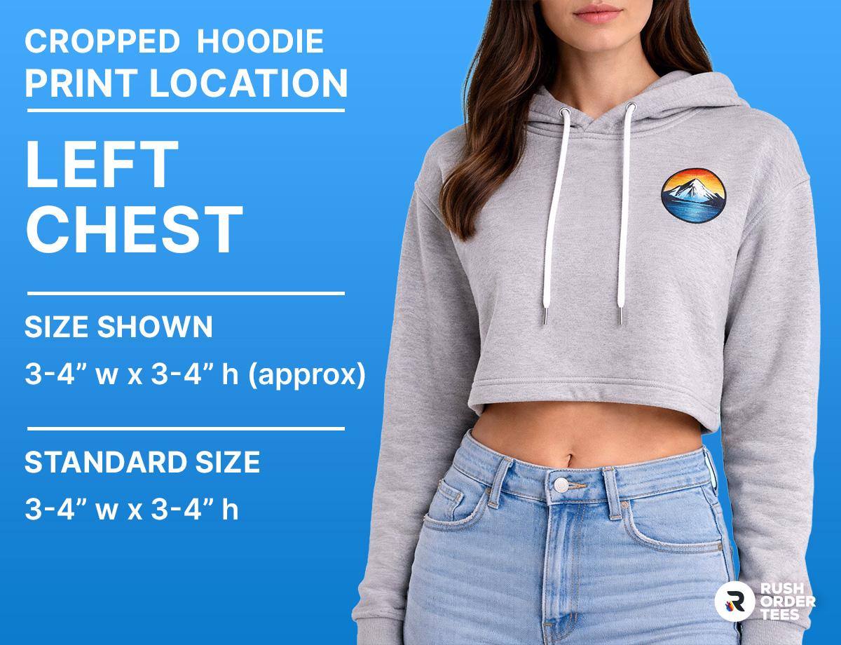
Left Chest
A left chest logo on a cropped hoodie hits the same sweet spot it does on any other garment: understated, professional, endlessly wearable. Standard sizing of 3" to 4" wide applies here. This placement works equally well on pullover and zip-up cropped hoodies, though on zip-ups, make sure the logo sits far enough from the zipper that it won't be partially hidden when the hoodie is half-zipped. A solid choice for dance teams, fitness studios, and lifestyle brands that want everyday wearability.
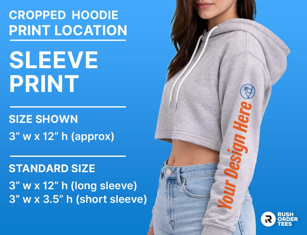
Sleeve Prints
Vertical sleeve branding has become a staple in streetwear, and cropped hoodies are a natural fit for it. The standard sleeve print is about 3" wide, positioned roughly an inch from the cuff. On a cropped hoodie, sleeve prints carry extra visual weight because there's less competing with them on the body of the garment. Running a brand name or logo vertically down the sleeve pairs perfectly with a clean, unprinted front for that minimal aesthetic. You can also do a small horizontal sleeve hit near the bicep for a more subtle approach.
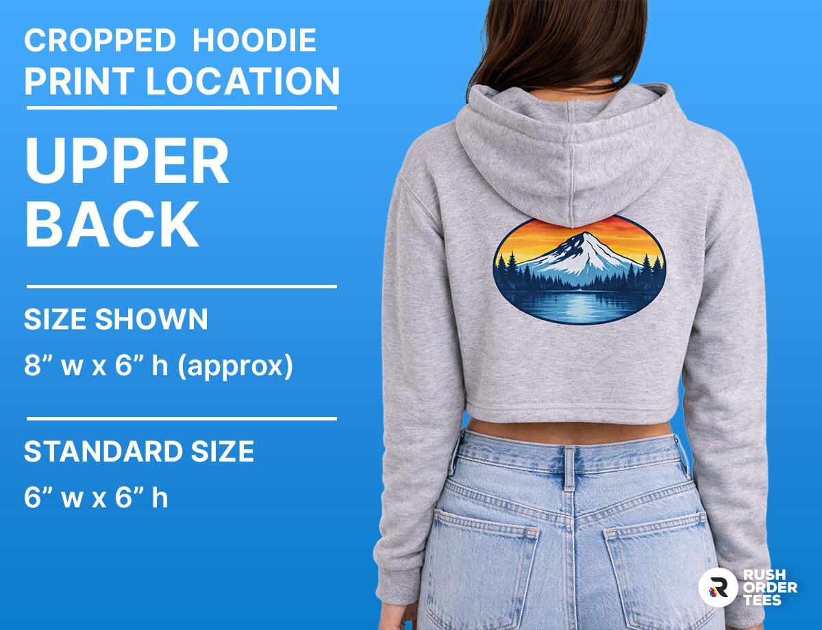
Back Print (Upper Back)
Oversized back prints on cropped hoodies look sharp, but placement is everything. Start the design at the shoulder blade line, roughly 3" to 4" below the collar, and keep the graphic in the upper third of the garment. Since the hoodie is already shorter, a back print that drops too low will get lost at the hem or look unintentionally cropped. Standard back print sizing of 12" wide works well here, just scale the height to fit within the available space. DTF transfers handle detailed, full-color back prints well on the heavier fleece fabrics typical of hoodies.
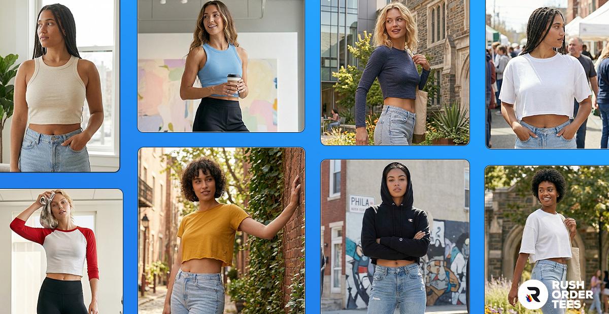
Best Logo Placements for Cropped Tanks and Sports Crops
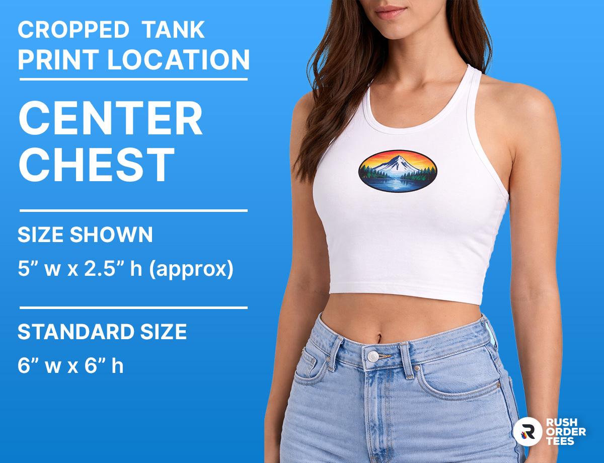
Center Chest (Small Logo)
The center chest is the most flattering placement on a cropped tank, keeping the design high and centered where it's always visible. Size it smaller than you would on a tee, around 4" to 6" wide, since tanks have a narrower front panel and wider arm openings that eat into the printable area. This is the go-to for fitness studios, yoga brands, Pilates studios, and dance teams. The clean, compact look translates well across racerbacks, standard straps, and one-shoulder styles alike.
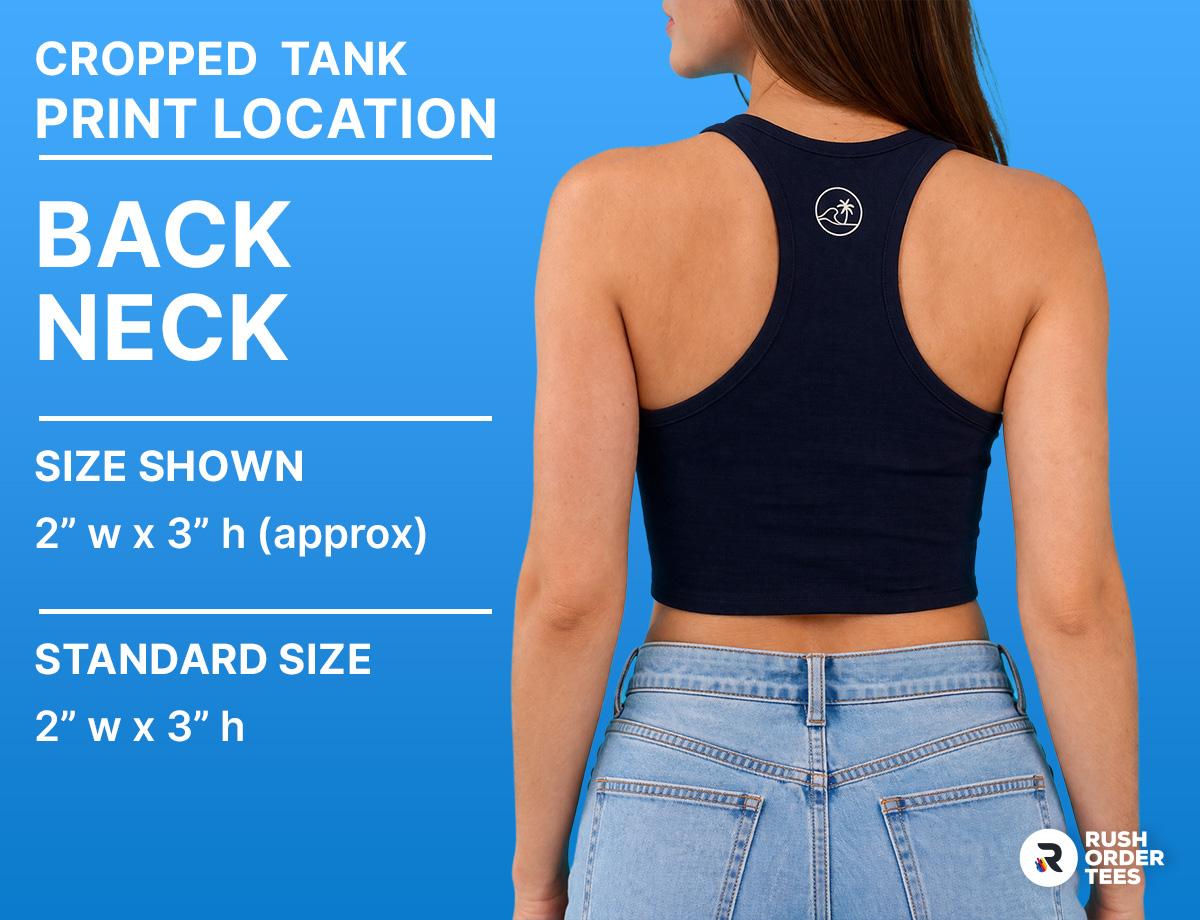
Back Neck Branding
A small logo at the back of the neck, about 2" to 3" wide and placed roughly 1" below the collar, delivers clean, minimal branding that doesn't compete with the front. This is a popular spot for interior-label-style branding, where you want people to notice your logo without it being the focal point. It works on every tank style and pairs well with a center chest print on the front for a two-location setup. It's also the same size range used for racerback placements, so you can run the same design across different tank styles in one order.
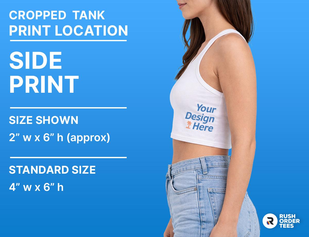
Side Prints
Side placement takes advantage of the open panels on racerback or one-shoulder tanks where the fabric faces outward along the ribs. This spot accommodates a small vertical logo or wordmark, usually 2" to 3" wide. It reads as an intentional, fashion-conscious detail rather than traditional branding. Side prints work best with DTF transfers or DTG printing since the print area can curve with the body, and the flexibility of these methods handles that better than screen printing on a small, contoured surface.
Placement and Sizing at a Glance
The single biggest constraint with cropped apparel is vertical space. On a standard tee, you might have 16" or more of printable height. On a crop, you're working with roughly 8" to 12" depending on the garment and size. That shapes every decision.
- Left chest logo: 3" to 4" wide. Same placement as a standard garment. No adjustment needed.
- Center chest: 6" to 8" wide on tees and tanks, up to 10" on hoodies. Place 2" to 2.5" below the neckline.
- Wide horizontal graphics: Go bold side to side (up to 12" to 14" wide on boxy fits), but keep the height compact. A wide, short design reads much better on a crop than a tall, narrow one.
- Back prints: Start at the shoulder blade line. Stay in the upper third of the garment. Standard 12" width works, but limits height to what the garment allows without crowding the hem.
- Sleeve prints: 3" wide, about 1" from the cuff. Vertical text or logos work especially well here and sidestep the vertical space issue entirely.
- Hem margin: Prints need at least 0.5" to 1" clearance from the edge. Factor that into your available height.
- Cut-off designs: If you want a graphic that intentionally runs past the hem, position it over the edge in the Design Studio and add a Design Note. Just account for the hem margin in the final result.
If you're coming from a standard-garment mindset, the main shift is this: think horizontal, think compact, and let the cropped silhouette do the work. Big, bold type running across the chest or back fits the aesthetic. Tall, detailed graphics that need every inch of vertical space don't.
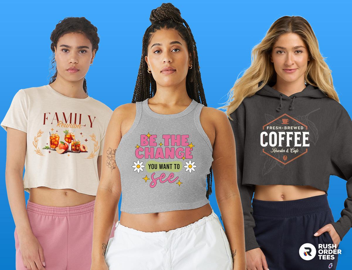
Some Of Our Favorites (Example Designs)
Get Started with Your Custom Cropped Design
Cropped apparel gives you a smaller canvas, but that's a creative advantage, not a limitation. Stick with standard placements, think horizontal over vertical, and size your designs to the available space. If you want to push boundaries with edge prints or unexpected locations, go for it. Just use a Design Note so our team knows the intent, and you'll get exactly what you're after.
At RushOrderTees, we've printed millions of custom orders across every garment type, and our art department reviews every single setup before it goes to production. If something in your design needs adjusting for a cropped fit, we'll catch it and reach out. Between free shipping, no minimums, and a team that actually cares about getting your placement right, you're in good hands. Browse our full collection of cropped styles and start designing today.

About the Author
A graduate of the Multimedia program at the University of the Arts in Philadelphia, Imri Merritt is an industry veteran with over 20 years of graphic design and color separations experience in the screen printing industry.