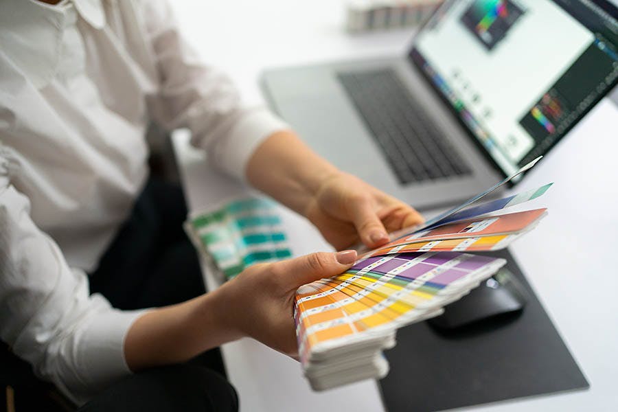
Choosing colors can be one of the most important decisions for your designs, brand, clothing, or home interiors. The problem is we all experience colors differently– and imagine them differently. We don’t even use the same names.
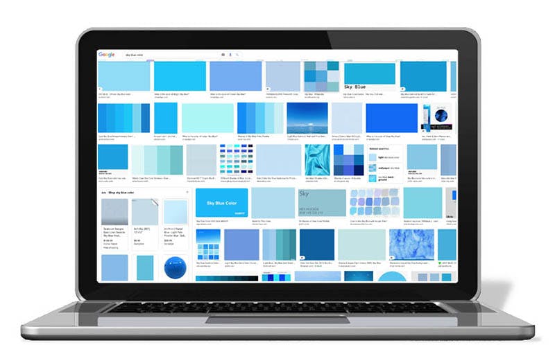
If you tell someone “sky blue”, are you both thinking of the same color? Most likely not. How about periwinkle blue? Or is periwinkle more of a purple? Exactly.
The Pantone company’s solution to this age-old problem is the gold standard of the creative industries: a universal color system that assigns a numeric code to each of almost two thousand spot colors, that is referenced across platforms and materials all around the world.
All day every day.
Here’s a quick guide to what the Pantone system is, how it works, how you can use it to color your latest project, and more. Plus links to some tools available online that will help make sure the colors you want are the colors you get.
What is Pantone?
Pantone is the company best known for developing their proprietary Pantone Matching System (PMS), the much-loved and widely-used color space and management system used across industries like graphic design, fashion, product design, textiles, and commercial printing.
It began in the 1950s when two brothers in New Jersey who owned a company called M & J Levine Advertising hired a guy named Lawrence Herbert to run the printing size of their business.
He brought his chemistry knowledge to the table, systemizing their ink production. In 1962, he bought out their technology and renamed it Pantone. The company is now the world standard for color mixing and matching, along with color trend forecasting and color consulting.
What are spot colors?
Spot color is a printing term meaning a single, solid color of ink, as opposed to process color (CMYK). Spot colors can be standard (sometimes called bucket or in-house colors), or they can be specially mixed into a formula (such as the Pantone Matching System).
Since process printing has become so ubiquitous, these days the term spot color typically means specialty inks such as metallic or neon– or a Pantone color.
What are the Pantone Color Systems?
The Pantone color systems provide a universal language of color, allowing designers, brands, and manufacturers to make color-critical decisions through every stage of the workflow. Over 10 million people around the world rely on the Pantone system and its products.
Being able to define, communicate and control color “from inspiration to realization” and across various materials and finishes is crucial for all kinds of graphic, fashion, and product design. And Pantone makes that possible.
Here at Rush Order Tees, we use the Pantone Matching System (PMS) on a daily basis to accurately fulfill our customer’s vision or brand requirements. We can make any Pantone color your heart desires. We know our Pantones!
We even created an Instagram account called Ink Mixers for those who are into that kind of thing.
Pantone offers two distinct color systems
- THE PANTONE MATCHING SYSTEM (PMS): More accessible, used for branding and marketing. Wide selections of colors that are designed to pop. Available in color book and swatch formats, as well as extensive online tools including extensions, add-ons, and apps. Good for print, packaging, digital, and screen printing.
- THE PANTONE FASHION, HOME + INTERIORS (FHI) SYSTEM: More advanced, expensive, and targeted at manufacturing professionals. Uses unique coding: TCX for textiles and TPG for pigments and coatings. Features more whites, blacks, and neutrals in their palette. Available in color book and swatch formats as well as fabric swatches. Good for paints, cosmetics, and accessories as well as apparel fabrics and soft goods.
This post focuses on the Pantone Matching System. Learn more about the FHI system here.
Pro tip: Pantone Connect
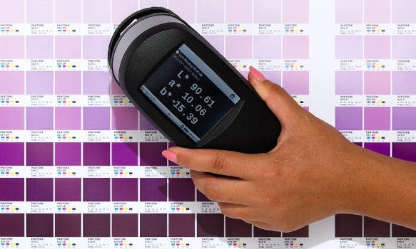
How does the Pantone Matching System work?
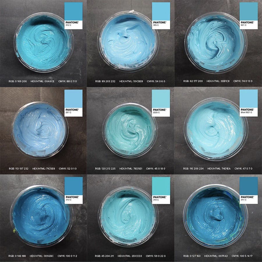
The Pantone Matching System is an accurate, reliable, and standardized way to reproduce color. Each of 1,867 spot colors (and growing) has an assigned number and code, along with a formula to mix it using 13 base pigments in a specified ratio based on weight.
Every ink company, commercial printer, paint, textile, or product manufacturer can then calibrate to this formula using their own set of base pigments. Each PMS color corresponds to a matching HTML color (Hex), process printing (CMYK), or screen-based (RGB) formula to allow for consistency across platforms and materials.
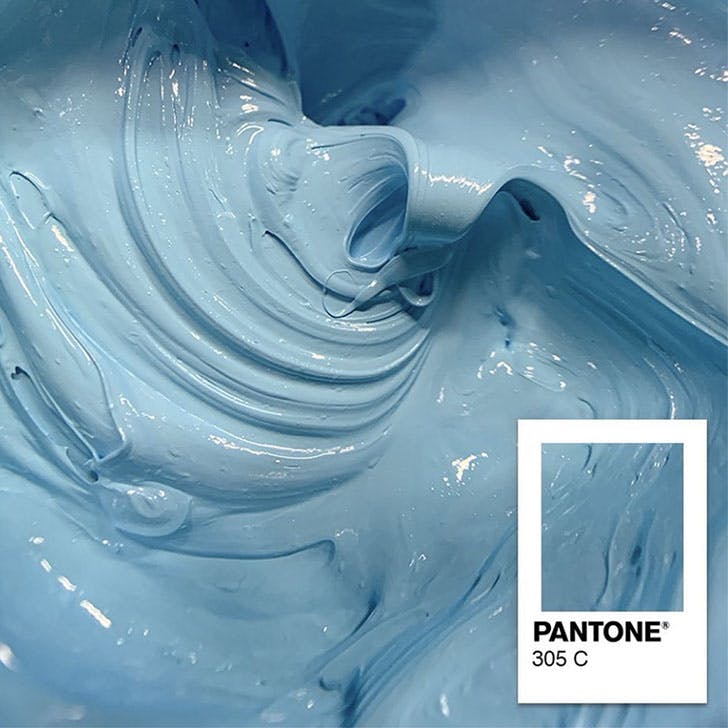
An example Pantone number referenced is PMS 312 C. Also known as Sky Blue. Or is it…?
PMS colors are commonly used in branding and but have recently found their way into government legislation and military standards to describe the colors of flags and seals. Countries such as Scottland, Canada, and South Korea, many organizations, and some US states have chosen specific Pantone colors for their flags.
Nowadays your favorite color doesn’t have to be just purple. It can be Purple 265 C.
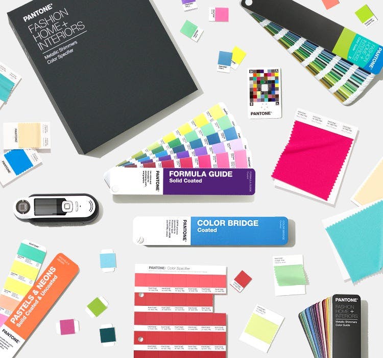
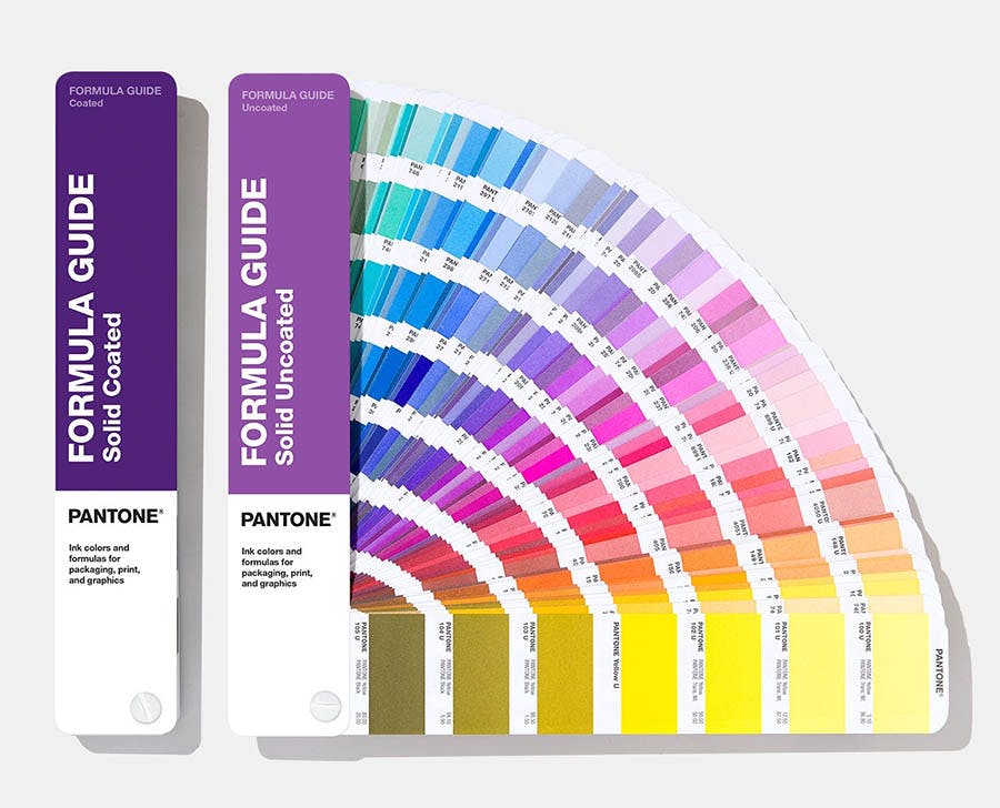
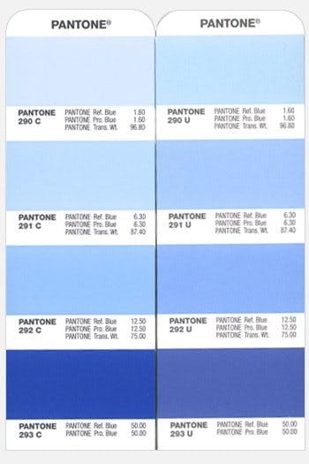
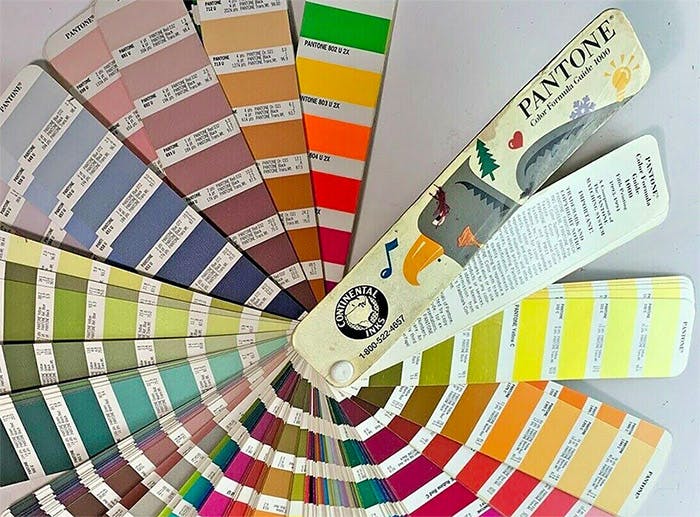
What are Pantone color books?
Pantone color books are portable, hand-held fan decks featuring a library of colors labeled with their corresponding numbers and formulas. In other words, they are handy sets of swatches. The more advanced books allow you to compare colors across multiple color systems as well as materials.
What is the standard Pantone color book?
Coated & Uncoated Formula Guide. These two books also provide matches to the Pantone Fashion, Home + Interiors System for greater color consistency across various materials.
For screen printing T-shirts, the standard book is the coated library (C), since Plastisol ink is inherently glossy. But if you only have U numbers, no worries– your printing company will be able to find the corresponding C number to achieve a visual match.
For more about inks, check out this post comparing Plastisol vs water-based inks.
Ordering through us? To request Pantones as your spot colors, first, choose among our standard spot colors in the Design Studio as placeholders, then specify your desired Pantones in the Design Notes section. Feel free to call or chat.
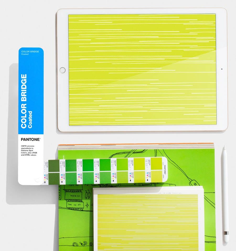
What is the best Pantone color book?
The ultimate books are the Coated & Uncoated Color Bridge Guide Set. These do everything the standard set does, plus translates every Pantone color into its CMYK, HTML (HEX), and RGB counterparts. An essential tool for designers working across a variety of materials, and for companies to keep their brand consistent.
What’s the difference between C and U?
C is printed on coated (glossy) stock and U is for uncoated (matte) stock. Since the same ink color can appears differently on these two types of surfaces, using two libraries allows you to achieve a visual match by choosing a different Pantone number.
For example, you’d choose a U number for printing on matte cardboard packaging, and a C number for a glossy brochure.
The glossy surface of coated paper doesn’t allow the ink to permeate, so the color is more saturated, while uncoated paper absorbs the ink, and in the process, can diffuse the color. A pale imitation of its former self.
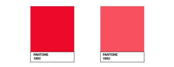
In the example above, the same ink (Red 185) looks a lot different printed on coated vs uncoated paper. So you’d want to pick a different C number and U number for them to visually match. Do you want fire-engine-red or salmon-red?
Inks on the lighter side have more chance at matching using the same Pantone number, but darker inks tend to have a bigger difference because there is more density of pigment. (Is there a nighttime version of sky blue?)
How long do Pantone books last?
Pantone will tell you that the colors start changing after a year, so (hint hint) buy a new set annually. But from my experience, they are accurate for at least a few years, especially if you keep them put away when not in use (seriously). So get yourself a brand new set with the latest colors and updates.
Are Pantone books expensive?
The standard set currently runs about 75 USD, while the advanced books are 25 new. The Fashion, Home & Interiors books start around 40 USD for a set and go way up from there, with a wide array of products and tools.
Pro tip: You may see used Pantone books for sale on eBay, but we don’t recommend buying used ones. Older books can be faded, which throws all the colors off. Or they could have pages missing, dirt, and other anomalies.
Why use PMS matching for your brand?
Science has shown that humans are very responsive to colors, with some studies indicating certain colors can drive decision-making and affect people’s moods. Marketers have known this for years, and artists long before that. PMS matching puts this power in your hands:
- Psychology – Inspire the mood, feeling, and character you want to be associated with your brand.
- Originality – Ability to hand-pick specific and unique colors that are meaningful or especially powerful.
- Accuracy – Final printed product and any reproductions will have the exact same colors that were chosen.
- Recognition – Specific colors can establish brand awareness, differentiation from competition, and credibility.
- Consistency – Brand colors will match across any and all platforms, products, and printed materials.
- Loyalty – Consistency over time establishes familiarity, authority, and trustworthiness.
Why are color standards important?
Pantone boasts that their color libraries are “highly curated and backed by scientific achievability to meet market and manufacturing needs”. Sounds legit. And it’s true.
Since their system is globally available when a designer in Los Angeles specifies a certain Pantone Color Number, a manufacturer in Sout Korea immediately knows exactly which color they want and how to achieve it– even though they may not speak the same language, they both know Pantone.
So Pantones are great for business-to-business coordination– but what about customers?
Absolutely. It sets a particular expectation to be met by the printer, avoiding boring standard colors, disappointment with results, and any quibbling over the red is more actually of a red-orange. With Pantone matching, it’s either 185 C… or it’s not.
Is Pantone free to use?
The system itself is free to use in the sense that a language is free to use. If you have a computer or a smartphone, you can make use of the Pantone website and other free online tools. Beyond that, color books and other products, tools, and memberships must be purchased.
Keep in mind: if you’re not going to purchase the Pantone books, you will be relying on the accuracy of your monitor for color matching, and monitors are notoriously different in the way they display colors. You can confidently rely on Apple products like smartphones and tablets, but beyond that, it’s important to calibrate your monitor correctly.
Is printing with Pantone colors more expensive?
Printing with Pantone colors will typically add a single additional cost per color, to cover the cost of making a custom mix, and will vary from printer to printer. Certain specialty inks may have an additional cost (such puff), while others don’t (such as metallic).
Want a specialty ink to glow crazy for? Check out this post about printing glow-in-the-dark ink.
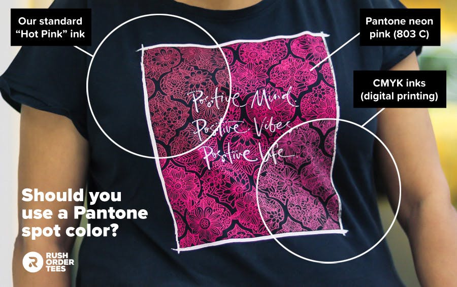
When to use a Pantone spot color
Pantone spot colors are not necessary if you’re not particular about your color choices, and standard in-house would be sufficient. Use Pantone spot colors when:
- You need exact color matches (for branding consistency)
- You have a particular color choice that is not available in standard in-house colors
- You want the colors to be as bright and vibrant as possible
- You need a specialty ink (such as metallic or neon)
How Pantone colors are mixed
Pantone formulas are based on ratios, and inks are measured by weight. Companies in the printing business use software dedicated to translating Pantone formulas into measurements based on a particular brand of base colors. Input the Pantone code of the color to be mixed, and the software provides the ratio.
What are hex colors?
Hex colors are used in HTML (web pages), CSS (style sheets), SVG (vector files), apps, and other computing applications to represent color. The six-digit, three-byte combination represents the red, green, and blue (RGB) components of the color. Hex colors can be converted to Pantones and vice versa.
For more about color modes, check out this post about the difference between RGB, CMYK, and more.
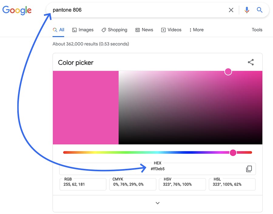
How to convert Pantone to HEX colors (and vice versa) without Photoshop
Converting Pantone to HEX code and vice versa has never been easier. Simply Google the Pantone number and the Google Color Picker will be the top search result, giving you the HEX code as well as RGB, HSB, and more. You can also use Pantone’s free online Color Finder.
Pantone color of the year
Pantone has positioned themselves as cultural influencers, with annual Fashion Trend Reports, regularly publishing books and articles, and forecasting global color trends, all through their Pantone Color Institute.
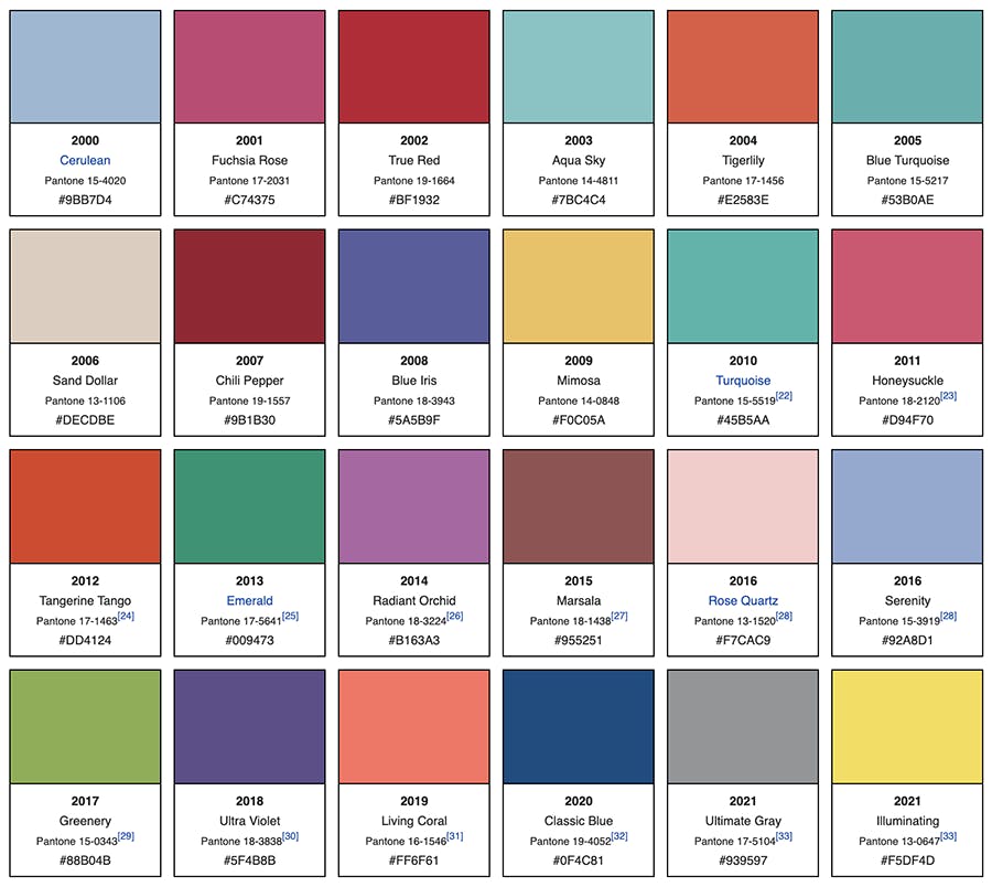
Most notably, they put out the Pantone Color of The Year every December, setting the tone (literally) for the coming year– and always to much fanfare and discussion.
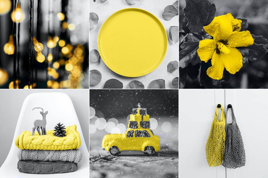
Since 2020 was such a crazy year, many people were curious what direction Pantone would take with their pick for 2021. They surprised everyone by choosing two colors for the first time in 20 years of color-of-the-year picks.
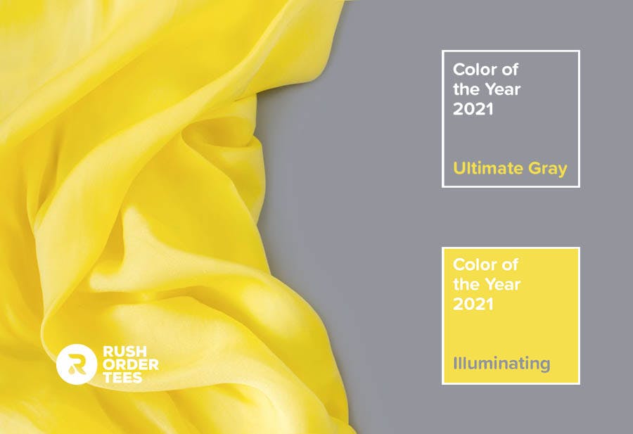
“A message of happiness supported by fortitude, the combination of PANTONE 17-5104 Ultimate Gray + PANTONE 13-0647 Illuminating is aspirational and gives us hope. We need to feel that everything is going to get brighter – this is essential to the human spirit,” says their marketing copy.
As arbitrary as their chosen color can seem to an outsider, or how outlandish their pronouncements (in 2019 they claimed “Classic Blue” has magical properties), many people take it seriously. Every year following their press release there is always a torrent of companies and creators ready to capitalize on the newly birthed color trend.
Not to take away from the expertise of the Pantone Color Institute, mostly it’s just a marketing exercise.
And it’s an effective one.
They expertly channel their authority and influence into various revenue streams, like color psychology courses, color consulting for major companies, and partnering with global brands and social media platforms (look for the corresponding Instagram and Facebook filters when they announce the 2022 Color of The Year later this year).

If you can find any rhyme or reason in their picks for the last 20 years, or some kind of pattern, let us know:
In the end, the true value of the Pantone company is their brilliantly standardized color system, relied on by millions of individuals and companies across the world. Now if you’ll excuse me, I have some ink colors to mix.
Think you know ink mixing?

Imri Merritt
About the Author
A graduate of the Multimedia program at the University of the Arts in Philadelphia, Imri Merritt is an industry veteran with over 20 years of graphic design and color separations experience in the screen printing industry.